What Is Typography? A Practical Guide for 2026
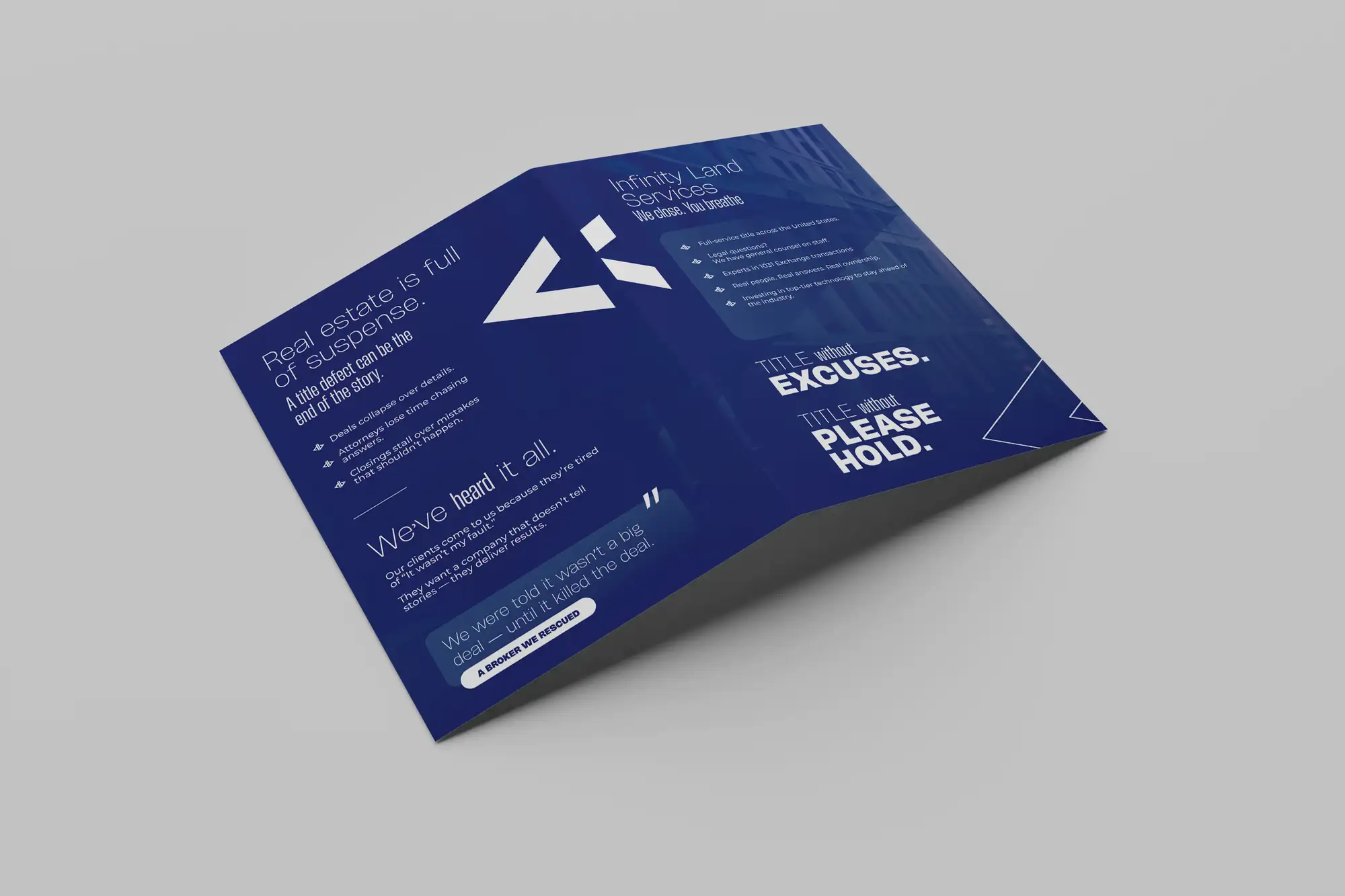
Typography is the craft of arranging type, choosing typefaces and then setting their size, spacing, line length and hierarchy, so that written words are easy to read and carry the right tone. It's often confused with picking a font, but that's only the first decision; typography is everything you do after that to make the words work. The same paragraph in the same typeface can feel cramped and amateurish or open and expensive depending entirely on the spacing, size and line length around it. Good typography is largely invisible: you don't notice it, you just find the text effortless to read and the page pleasant to look at. Bad typography is the opposite, you feel the friction, the design looks cheap, and you leave before you've finished reading, usually without ever realising the type was the reason. Since the overwhelming majority of any website, brand or document is text, typography quietly determines how professional the whole thing feels.
This guide explains what typography really is, the anatomy and vocabulary worth knowing, how to pair typefaces, the rules that make text readable, and a step-by-step way to set type well. It's the same craft we apply on graphic design projects across 8+ years and 3,000+ projects in 30+ countries as a Top Rated Plus agency on Upwork.
Typeface vs font: the vocabulary that matters
Before you can set type well, a handful of terms make everything else easier to talk about, because "make it a bit tighter" or "increase the leading" are precise instructions once you know the words. The most common mix-up is typeface versus font: a typeface is the design (Helvetica), while a font is a specific size and weight of it (Helvetica Bold 12pt). In everyday use people say "font" for both, and that's fine, but the rest of the vocabulary is worth getting right.
| Term | What it means | Why it matters |
|---|---|---|
| Typeface | The overall design of the letters | Sets the personality of the text |
| Weight | How thick the strokes are (light–black) | Creates contrast and emphasis |
| Leading | The vertical space between lines | The single biggest lever for readability |
| Kerning | Spacing between two specific letters | Fixes awkward gaps in headings |
| Tracking | Overall spacing across a run of text | Loosens or tightens whole words |
| Measure | The length of a line of text | Too long or short and reading slows |
Typefaces fall into a few broad families, and knowing them helps you choose with intent. Serifs (with small feet on the letters, like Times) feel traditional and are excellent for long-form reading. Sans-serifs (without feet, like Helvetica) feel clean and modern and dominate screens. Then there are slab serifs (bold, blocky feet), scripts (handwriting styles, use sparingly), and monospace (every character the same width, associated with code). Once you can see type in terms of family, weight and spacing rather than just "a nice font," you can adjust it deliberately, and that control is where typography stops being decoration and starts being a tool.
How to pair typefaces
Most designs use two typefaces, one for headings and one for body text, and the pairing is where a lot of amateur work goes wrong. The goal is contrast with harmony: the two should be clearly different so the hierarchy reads, but they should share a compatible mood so they don't clash. These approaches give you reliable pairings without guesswork:
- Pair a serif with a sans-serif. The classic, near-foolproof combination, a sans-serif heading over serif body text, or the reverse. The structural difference does the contrast for you while both stay easy to read.
- Use one superfamily. Many typefaces ship in both serif and sans versions designed to work together (a "superfamily"). Pairing within one is the safest option of all because harmony is built in.
- Contrast weight, not just style. A heavy heading over a regular body weight can create plenty of hierarchy even within a single typeface, no second font required.
- Limit yourself to two. Two typefaces is almost always enough; three is the practical maximum. More than that and the design starts to feel disorganised rather than rich.
The safest pairing advice of all: when in doubt, use one good typeface for everything and create hierarchy with size and weight alone. A single well-chosen family used across three or four sizes and two weights looks far more professional than two fonts that don't quite belong together. Most typographic problems come from too much variety, not too little, so restraint is usually the right instinct. Reach for a second typeface only when there's a real reason.
The rules of readable text
A beautiful typeface can still be painful to read if the settings are wrong, and readability is where good-looking type most often breaks down. These are the levers that decide whether people actually read your text or bounce off it, and they matter far more than which font you picked:
| Setting | The comfortable range | What goes wrong outside it |
|---|---|---|
| Body text size | 16px+ on screens | Smaller and people strain or zoom |
| Line height (leading) | 1.4–1.6× the font size | Too tight and lines blur together |
| Line length (measure) | 45–75 characters | Too long and the eye loses its place |
| Contrast | Meets WCAG 4.5:1 | Low-contrast text excludes readers |
| Alignment | Left-aligned for long text | Justified or centred slows reading |
Notice that none of these are about the typeface itself, they're about how you set it. Line height and line length in particular do an enormous amount of quiet work: text set at a comfortable 1.5 line height and a 60-character measure feels effortless, while the same words crammed edge-to-edge with tight lines feel like a wall. Contrast is also an accessibility requirement, not just an aesthetic one, light-grey body text may look elegant to a designer but is genuinely hard to read for many people. Get these settings right and even a modest typeface reads beautifully; get them wrong and the finest typeface in the world can't save the page.
One decision beats almost all others for on-screen text: set your body copy no smaller than 16px. It's the size browsers were built around, it's comfortable on phones, and it single-handedly fixes the most common readability complaint. Designers often shrink body text to fit more on screen or to look "refined," but readers overwhelmingly prefer text they don't have to squint at. When in doubt, size up.
Typography and hierarchy
Typography is one of your strongest tools for visual hierarchy, the order in which the eye takes things in. By varying size, weight, colour and spacing, you tell the reader what's a headline, what's a subheading and what's body text, all before they read a single word. A clear typographic hierarchy is what lets someone scan a page and instantly understand its structure, which is how most people actually read on the web.
The practical tool here is a type scale, a fixed set of sizes (say 16px body, 20px, 24px, 32px, 48px) that you use consistently instead of picking arbitrary numbers. A scale keeps the relationships between sizes deliberate and harmonious, and it's a core part of any design system. Weight and colour reinforce the same structure: a bold, dark heading naturally outranks lighter body text. Used together, size, weight and spacing turn a flat block of text into something with a clear beginning, middle and end, which is exactly what makes long-form content and landing pages easy to navigate.
How to set type well, step by step
You don't need to be a type designer to set type that looks professional, you need a repeatable process and the discipline to keep it restrained. Here's the approach we use on real projects.
- Choose a body typeface first. Start with the text people will read most, not the headline. Pick a typeface that's genuinely comfortable at small sizes, everything else is built around it.
- Set the body size and line height. Lock in 16px or larger with a line height around 1.5 before you touch anything else. Get the reading experience right at the foundation.
- Fix your measure. Constrain line length to roughly 45–75 characters so the eye doesn't lose its place. On the web this usually means capping the width of text containers.
- Add one heading typeface (or not). Pair a contrasting typeface for headings, or create hierarchy with size and weight in your body typeface alone. Two typefaces maximum.
- Build a type scale. Define a small, fixed set of sizes for body, subheadings and headings, and use only those. Consistency here is what makes a design feel systematic.
- Check contrast and spacing. Test every text-and-background pairing against WCAG ratios, and give paragraphs and headings enough breathing room. Readable beats pretty every time.
- Document it. Record the typefaces, sizes, weights and spacing so they're applied consistently everywhere. Undocumented type drifts within weeks as different people guess.
Done in this order, typography stops being a series of one-off guesses and becomes a system you can reuse. If the type is for a brand rather than a single design, this feeds straight into your font choices for the brand and sits alongside your colour palette and brand guidelines, so every piece you produce looks like it belongs to the same family.
Common typography mistakes to avoid
Most typographic problems come from a handful of predictable habits rather than a lack of taste. Watch for these:
- Using too many typefaces. More fonts rarely means more interesting, it usually means less coherent. Two is plenty; a single family often looks best of all.
- Body text that's too small. Shrinking text to fit more on screen is the most common and most damaging mistake, because it fails the people you most want to reach.
- Ignoring line height and measure. Cramped lines and over-long lines slow reading more than any font choice, yet they're the settings most people never touch.
- Centring or justifying long text. Both look tidy but hurt readability; left-aligned is easiest for the eye to track down a page of body copy.
- Forgetting contrast. Low-contrast grey text may look refined, but it excludes readers and fails accessibility standards, so no amount of elegance makes it worth it.
The bottom line
Typography is the craft of arranging type, choosing typefaces and then setting size, spacing, line length and hierarchy, so words read clearly and carry the right tone. It rests on a few durable ideas: a small vocabulary that lets you adjust type deliberately, restrained pairing that favours one or two families, readability settings (16px+ body, generous line height, a sensible measure, real contrast) that matter more than the font itself, and a type scale that turns flat text into clear hierarchy. Get it right and your text reads effortlessly and your work looks unmistakably professional; get it wrong and even strong layouts and copy struggle, because the type is quietly working against you. If you'd rather have your brand's typography, and everything built on it, handled by a team that's done it across 30+ countries, our graphic design service turns typography into work that looks intentional and reads with ease. See the Upwork profile for verified reviews.
Frequently asked questions
What is typography in simple terms?
Typography is the craft of arranging type so written words are easy to read and send the right message. It's more than choosing a font, that's just the first decision. Typography is everything you do afterwards: the size of the text, the space between lines, the length of each line, how letters are spaced, and how you use size and weight to create a hierarchy of headings and body text. Because most of any website, brand or document is text, typography quietly decides how professional and readable the whole thing feels. Good typography is largely invisible, you simply find the text effortless to read; bad typography creates friction and makes a design look cheap, usually without the reader realising the type was the cause.
What is the difference between a typeface and a font?
A typeface is the overall design of a set of letters, for example Helvetica or Times New Roman. A font is a specific version of that typeface at a particular weight and size, such as Helvetica Bold at 12 point. In the days of metal type, each size and weight was a separate physical font, hence the distinction. In everyday digital use the words are used interchangeably and most people say "font" for both, which is perfectly fine. The distinction still helps when you're being precise, a typeface has a personality and a family of related weights and styles, while a font is one specific instance you're actually setting text in. When choosing type, you pick a typeface first, then decide which fonts (weights and sizes) within it to use.
How many fonts should I use in a design?
As a rule, use two typefaces at most: one for headings and one for body text. Two gives you enough contrast to create a clear hierarchy without the design feeling disorganised. Three is the practical maximum and is rarely needed. In fact, one well-chosen typeface used across a few sizes and two weights often looks more professional than two fonts that don't quite belong together, because harmony is guaranteed. If you do pair two typefaces, make them clearly different (a common approach is a serif with a sans-serif) so the hierarchy reads, but keep their moods compatible so they don't clash. Most typographic problems come from too much variety rather than too little, so when in doubt, use fewer fonts and create contrast with size and weight instead.
What makes text readable?
Readability is decided mostly by how you set the type, not which typeface you pick. The biggest levers are size, line height and line length. On screens, set body text at 16px or larger so people don't have to squint. Give lines a comfortable line height of about 1.4–1.6 times the font size so they don't blur together. Keep each line to roughly 45–75 characters so the eye doesn't lose its place, on the web that usually means capping the width of text containers. Make sure text has enough contrast against its background to meet the WCAG accessibility ratio of 4.5:1 for normal text. Finally, left-align long passages rather than justifying or centring them, as that's easiest to read. Get these settings right and even a modest typeface reads beautifully.
Want this done for you?
FRPROTECH is a Top Rated Plus Upwork agency with 3,000+ projects delivered across 30+ countries. Tell us your goals and we'll handle the rest.
Written by the FRPROTECH design team. 8+ years building brands and websites for clients in 30+ countries, with a 100% Job Success Score on Upwork.