What Is Visual Hierarchy in Design? A Practical Guide for 2026
Visual hierarchy is the arrangement of elements in a design so the eye moves through them in the order you intend, seeing the most important thing first, the next most important second, and so on down to the details. It's how a good poster, page, or slide tells you where to look without you having to think about it. Designers create it by making some elements bigger, bolder, brighter, or more isolated than others, so attention flows naturally from the headline to the supporting text to the call to action. When hierarchy is right, a viewer grasps your main message in a second or two and knows exactly what to do next. When it's missing, everything competes for attention, nothing wins, and people bounce, confused about what they were even meant to notice. In short, visual hierarchy is the difference between a design that communicates and one that just decorates.
This guide explains what visual hierarchy really is, the core principles designers use to control where the eye goes, and a practical step-by-step way to build it into any layout. It's the same thinking we apply on graphic design projects across 8+ years and 3,000+ projects in 30+ countries as a Top Rated Plus agency on Upwork.
What visual hierarchy is (and why it works)
Human eyes don't scan a design evenly, they triage it. In the first moments of looking at anything, your brain decides what's worth attention and ignores the rest. Visual hierarchy is simply the designer working with that instinct: using size, contrast, colour, and position to signal importance so the eye lands where it should. It's not about making things pretty; it's about ranking information visually so the message gets through in the order that makes sense.
The reason it matters so much is that people don't read designs, they glance at them. A viewer gives a flyer, an ad, or a web page a fraction of a second before deciding whether to engage. If the most important element, the offer, the headline, the button, isn't the thing their eye hits first, the design has already failed, no matter how polished it looks. Hierarchy is what makes sure the right thing wins that first glance.
Why visual hierarchy matters
It's easy to treat hierarchy as an invisible nicety, but it's doing heavy lifting in every design that works. Here's what strong hierarchy actually buys you:
- Faster comprehension. A clear hierarchy lets someone understand your main point in a glance instead of hunting for it, which is the whole game when attention is measured in seconds.
- Better conversion. When the eye is guided straight to the call to action, more people take it. On a landing page that converts, hierarchy is often the difference between a click and a bounce.
- Less cognitive load. A ranked layout tells people what to process and in what order, so they don't have to work to figure out where to look. Effortless designs feel trustworthy.
- A more professional feel. Amateur work usually fails on hierarchy, everything is the same size and weight. Deliberate hierarchy is a big part of why a design reads as polished and finished.
- Accessibility. Clear structure, real heading levels, and strong contrast help everyone, including people using screen readers or with low vision, follow the content in the right order.
A fast test for any design: squint at it, or shrink it to a thumbnail, and see what you notice first. If the element you notice isn't the most important one, your hierarchy is fighting you. This one-second squint test catches more layout problems than any amount of pixel-level fiddling.
The principles that create visual hierarchy
Hierarchy isn't one technique, it's a toolkit. Designers combine several of these levers at once to make some elements dominate and others recede. Here are the ones that do the most work, and how each one shifts attention.
| Principle | How it guides the eye | Use it for |
|---|---|---|
| Size & scale | Bigger elements read as more important | Headlines, hero images, key numbers |
| Colour & contrast | Bright or high-contrast elements jump forward | Buttons, offers, warnings |
| Weight & typography | Bold, heavy type outranks light, thin type | Titles vs. body text |
| Whitespace | Space around an element isolates and elevates it | Calls to action, single key messages |
| Position & alignment | Top-left and centre get seen first (in LTR reading) | Logos, primary headlines |
| Repetition & grouping | Similar styling signals items belong together | Lists, cards, related content |
Size and scale
The simplest and most powerful lever: bigger equals more important. Your eye goes to the largest element first, which is why headlines dwarf body copy and a hero image anchors a page. Scale creates instant ranking, the trick is to make the size differences bold and deliberate. Timid, similar sizes read as flat and confused; a clear jump from level to level reads as confident.
Colour and contrast
A single element in a standout colour will pull the eye no matter how small it is, which is exactly why a call-to-action button is usually the brightest thing on a page. Contrast against the background is what makes an element pop, so your most important action should have the strongest contrast. This is where your palette earns its keep, and it's worth building one deliberately, our guide to choosing brand colours covers how to pick colours that carry hierarchy as well as personality.
Typography and weight
Type creates hierarchy through size, weight, and style. A bold heading, medium subheading, and regular body text form a clear ladder that tells readers how the content is organised before they read a word. Consistent type levels are the backbone of readable design, and choosing the right typefaces makes them work harder, see how to choose fonts for your brand for pairing type that contrasts cleanly across levels.
Whitespace and proximity
Empty space isn't wasted space, it's one of the strongest hierarchy tools there is. Surrounding an element with room isolates it and makes it feel important, which is why premium brands give their key message so much air. Proximity works alongside it: elements placed close together read as related, and space between groups signals a break. Generous, intentional whitespace is a hallmark of confident, high-end design.
Position and the reading path
Where you place something shapes when it's seen. In left-to-right cultures, eyes tend to start top-left and move across and down, often in an F or Z pattern for text-heavy and sparse layouts respectively. Put your most important elements along that natural path, top-left for a logo, top or centre for a headline, and lead the eye down toward the action. Working with the reading path, rather than against it, is what makes a layout feel effortless.
How to build visual hierarchy, step by step
You don't need to be a trained designer to apply hierarchy deliberately, you need to decide what matters most and then use the tools above to make it obvious. Here's a practical order to work in.
- Rank your content first. Before touching the layout, list every element and number it by importance: what must people see first, second, third? This decision, not the styling, is what hierarchy really is. Skip it and you're decorating without direction.
- Give the number-one element the most weight. Make your single most important element the biggest, boldest, or highest-contrast thing in the design. There should be no doubt about what wins the first glance.
- Build clear, distinct levels. Set obvious steps between your headline, subheadings, and body, in size and weight. If two levels look almost the same, merge them or push them further apart; near-identical levels read as no hierarchy at all.
- Use one standout colour for the key action. Reserve your brightest, highest-contrast colour for the thing you most want people to do, the button, the offer, so it's unmistakable. Don't spend that attention-grabbing colour on decoration.
- Add whitespace to elevate what matters. Give your key elements room to breathe and group related items with proximity. Space is what turns a crowded layout into a calm, scannable one.
- Follow the reading path. Arrange elements so the eye flows naturally from the most important down to the call to action, working with the F or Z pattern rather than scattering focus.
- Test with the squint. Step back, squint, or shrink the design to a thumbnail. Whatever you notice first should be your number-one element. If it isn't, adjust size, contrast, or space until it is.
The most common hierarchy mistake is trying to make everything important. When you emphasise the headline, three sub-points, a badge, and the button all at once, you've emphasised nothing, the eye has no clear winner. Real hierarchy means deliberately making some things quieter so the important thing can be loud.
Common visual hierarchy mistakes
Most hierarchy failures come down to a handful of recurring habits. Here are the ones we see most often, and how to fix each.
| Mistake | Why it hurts | Fix |
|---|---|---|
| Everything the same size | No element wins, nothing gets seen first | Create bold, deliberate size jumps |
| Emphasising too much | Competing focal points cancel out | Pick one clear number-one element |
| Weak colour contrast | The key action blends into the page | Give the CTA the strongest contrast |
| No whitespace | A crowded layout is exhausting to scan | Add space around and between groups |
| Ignoring the reading path | The eye bounces around at random | Lay elements along the F or Z pattern |
The thread through all of these is restraint. Strong hierarchy comes from contrast, and contrast only exists when most of the design is calm. The goal isn't to shout with every element, it's to make one thing clearly loud by keeping the rest quiet, which is the same discipline behind a clear design brief that names a single priority for the work.
Your visual hierarchy checklist
Before you call a layout finished, run through this:
- You've ranked your content by importance before styling anything.
- Your single most important element is unmistakably the biggest or boldest.
- There are clear, distinct levels between headline, subheadings, and body.
- Your key action uses your strongest, highest-contrast colour.
- Important elements have whitespace around them; related items are grouped.
- The layout follows a natural reading path toward the call to action.
- The squint test lands on your number-one element first.
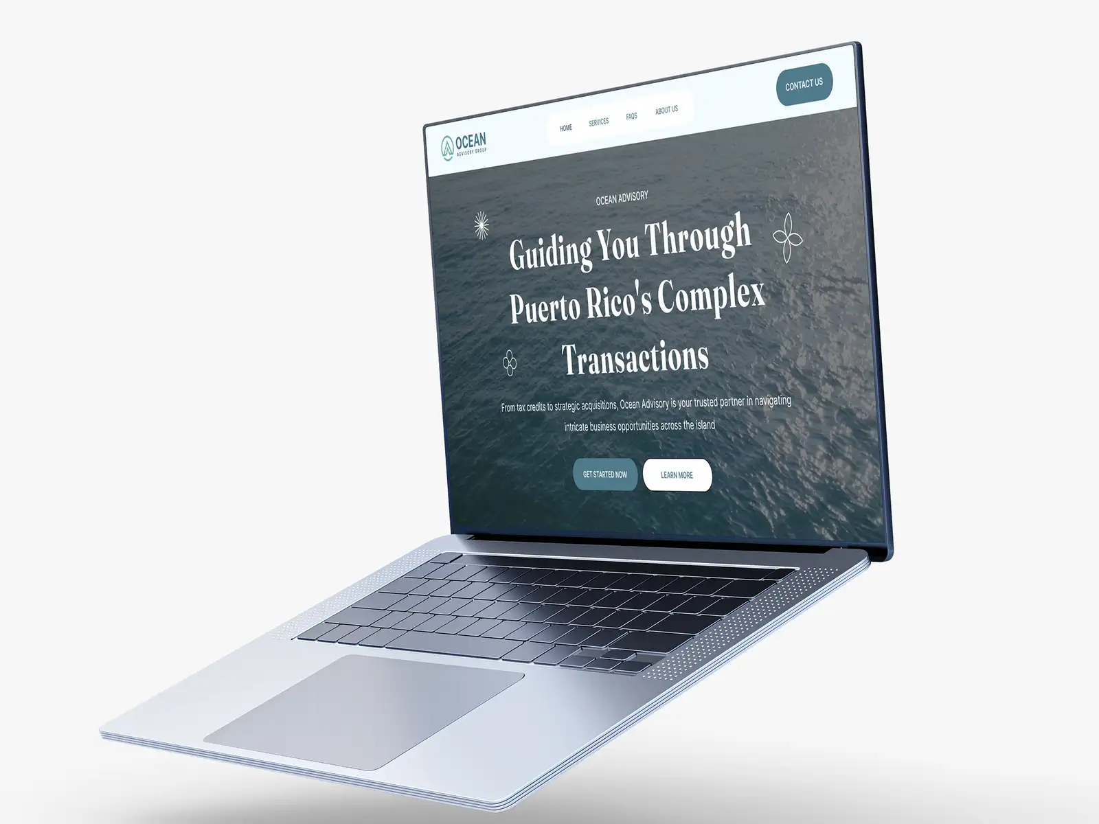
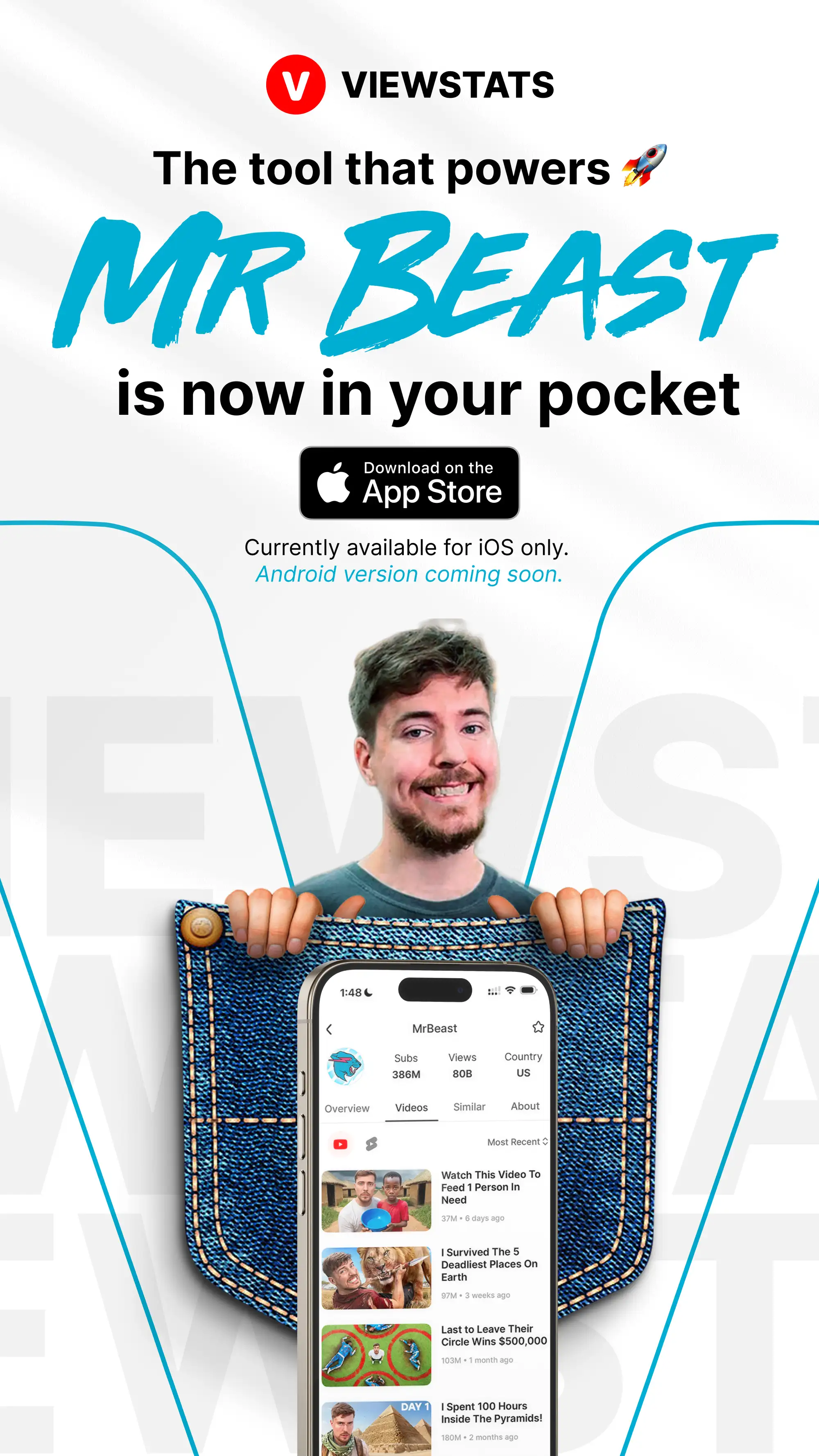
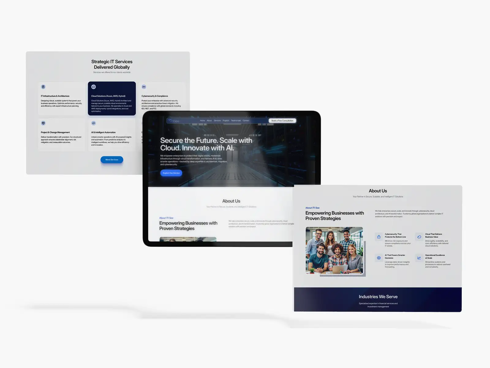
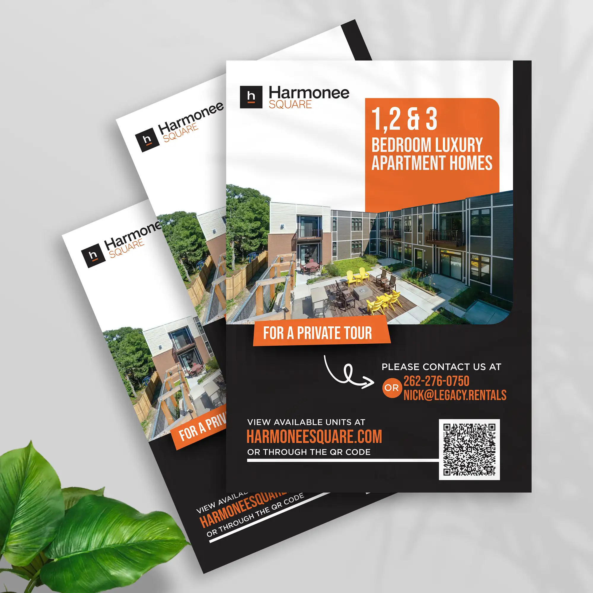
Get hierarchy right and your designs stop being a flat wall of elements and start guiding people, telling them what to look at, in what order, and what to do next. It's one of the highest-leverage skills in design because it decides whether your message lands at all. If you'd rather have flyers, decks, ads, or a full brand's collateral built with hierarchy that converts, our graphic design service delivers exactly that, and you can see verified results on our Top Rated Plus profile on Upwork.
Frequently asked questions
What is visual hierarchy in simple terms?
Visual hierarchy is the way a design tells your eye what to look at first, second, and third. Designers create it by making the most important element bigger, bolder, brighter, or more isolated than everything around it, so attention flows naturally from the main message down to the details and the call to action. When it's done well, you understand a design's main point in a glance without having to work for it. When it's missing, everything competes for attention and nothing stands out, so people get confused about where to look.
What are the main principles of visual hierarchy?
The core tools are size and scale (bigger reads as more important), colour and contrast (bright, high-contrast elements jump forward), typography and weight (bold, heavy type outranks light type), whitespace (space around an element elevates it), position (top-left and centre get seen first in left-to-right layouts), and repetition or grouping (similar styling signals items belong together). Designers combine several of these at once, making one element dominate while keeping the rest calm, so the eye moves through the design in the intended order.
Why is visual hierarchy important in design?
Because people glance at designs rather than read them, and they decide in a fraction of a second whether to engage. Visual hierarchy makes sure the most important thing, your headline, offer, or button, is what the eye hits first, which speeds up comprehension and lifts conversion. It also reduces the mental effort of figuring out where to look, makes a design feel professional and finished, and, when built with real heading levels and strong contrast, helps make content accessible to everyone, including people using assistive technology.
How do I create visual hierarchy in a layout?
Start by ranking your content: decide what people must see first, second, and third before you style anything, because that decision is what hierarchy actually is. Then give your number-one element the most visual weight, size, boldness, or contrast, and build clear, distinct levels between your headline, subheadings, and body. Reserve your brightest colour for the key action, add whitespace around what matters, and arrange everything along a natural reading path toward the call to action. Finally, squint at the design or shrink it to a thumbnail; whatever you notice first should be your most important element.
Want this done for you?
FRPROTECH is a Top Rated Plus Upwork agency with 3,000+ projects delivered across 30+ countries. Tell us your goals and we'll handle the rest.
Written by the FRPROTECH design team. 8+ years building brands and websites for clients in 30+ countries, with a 100% Job Success Score on Upwork.