How to Choose Brand Colours: A Colour Psychology Guide for 2026
To choose brand colours, start with your brand strategy, not your favourite shade: decide who you serve and how you want to feel to them, then pick one primary colour that carries that feeling, two or three supporting colours that balance it, and a neutral base for text and backgrounds. Test the whole palette for contrast and accessibility, and check it looks right everywhere it will live, from a tiny app icon to a printed sign. Colour is the fastest signal a brand sends, people register it before they read a word, so the goal is a palette that's distinctive, legible, and true to what you actually are, not just one that looks nice on a mood board.
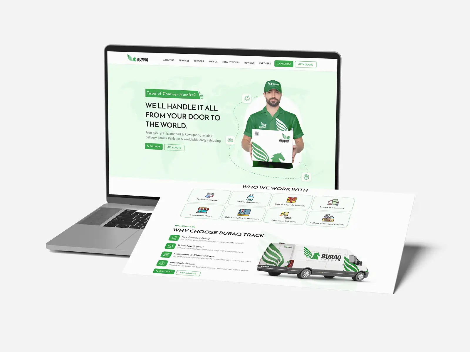
This guide covers what colour psychology really tells you (and what it doesn't), how to build a palette step by step, and the mistakes that quietly weaken a brand. It's the same approach we apply on branding and visual identity projects across 8+ years and 3,000+ projects in 30+ countries as a Top Rated Plus agency on Upwork.
Why brand colour matters more than people think
Colour is the part of your identity that does the most work for the least effort. It's processed almost instantly and remembered far longer than a tagline or a clever logo detail. Think of the brands you can picture purely by their colour, the red of a soft-drink can, the brown of a delivery van, the particular blue of a payments app. That recognition is an asset built one consistent impression at a time, and colour is its single biggest lever.
It also shapes perception before anyone consciously evaluates you. The right palette can make a startup feel established, a budget product feel premium, or a clinical service feel approachable. The wrong one quietly undercuts everything else you've built, no matter how good your logo or full brand identity is. Getting colour right isn't decoration; it's strategy made visible.
A simple test of whether your colour is working: could someone identify your brand from a cropped corner of an ad, with no logo and no words showing? The brands that own a colour can. If yours blends into a sea of the same safe blue your whole industry uses, you're spending attention to build the category's recognition, not your own.
What colour psychology actually tells you
Colour psychology is real but routinely overstated. There is no universal rule that blue "means" trust or green "means" health, associations shift across cultures, contexts, and individuals. What's reliable is the broad emotional temperature a colour tends to set, and the expectations a category builds up over time. Use those as a starting point, then let your strategy decide.
| Colour | Tends to feel | Often used by |
|---|---|---|
| Blue | Trustworthy, calm, dependable | Finance, tech, healthcare |
| Red | Energetic, urgent, bold | Food, sport, retail, sales |
| Green | Natural, healthy, growth-focused | Wellness, finance, sustainability |
| Black | Premium, sophisticated, serious | Luxury, fashion, high-end tech |
| Yellow / orange | Optimistic, friendly, affordable | Leisure, food, youth brands |
| Purple | Creative, premium, imaginative | Beauty, creative, lifestyle |
Notice that blue, green, and several others appear across very different industries. That's the point: a colour doesn't carry a fixed meaning, it carries a direction, and context does the rest. The more useful question isn't "what does this colour mean?" but "what do I want my customer to feel, and which colours, used the way my competitors don't, get me there?"
Borrow from your category, then break from it
Look at what your competitors use, not to copy it but to find the gap. If every brand in your space leans on the same corporate blue, a confident, distinctive alternative will stand out on a shelf or a search results page where they all blur together. Fitting in earns trust; standing out earns attention. The best palettes do a measured amount of both, familiar enough to feel right for the category, different enough to be remembered.
How to build a brand colour palette, step by step
A working palette is a small, deliberate system, not a random set of colours you like. Here's the structure we use, which scales from a one-person business to a full brand identity system.
- Start from strategy. Write down who you serve, the three words you want your brand to feel like, and where the palette must work (screen, print, packaging, signage). Every colour choice answers to this, not to taste.
- Choose one primary colour. This is the colour you want people to associate with you, the one that carries your core feeling and shows up most. Pick it to be distinctive in your category, then commit to it.
- Add two or three supporting colours. These balance and complement the primary, giving you range for backgrounds, sections, and states without competing with it. Keep the set tight, more colours mean less recognition.
- Pick one or two accent colours. Used sparingly, an accent draws the eye to the things that matter most: buttons, links, calls to action. On a high-converting landing page, the accent is often what the entire layout points toward.
- Set your neutrals. Most of a real interface or document is text on a background. Choose a near-black for text and one or two greys and an off-white, these do the quiet heavy lifting and let your brand colours stand out when they appear.
A reliable proportion to start from is the 60-30-10 rule: roughly 60% a dominant neutral or base, 30% your primary, and 10% an accent. Brands that drown every screen in their primary colour exhaust the eye and lose the contrast that makes a call to action pop. Restraint is what makes colour powerful.
Define every colour precisely
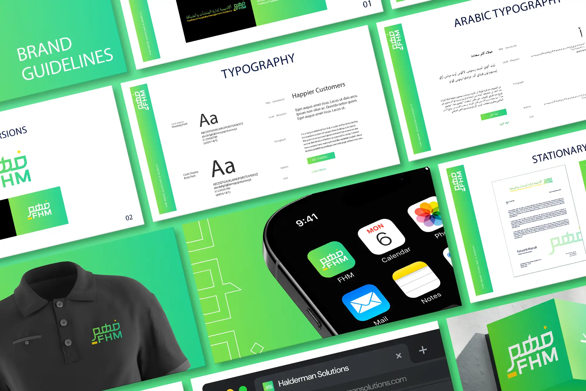
A colour you can't reproduce exactly isn't a brand colour, it's a suggestion. Record each one in the formats it will actually be used in, and write them into your brand guidelines so every designer, developer, and printer uses the same values:
- HEX and RGB for anything on screen, websites, apps, social, email.
- CMYK for anything printed, so your colour doesn't shift on a brochure or business card.
- Pantone (PMS) where exact reproduction matters, packaging, merchandise, signage.
- Tints and shades (lighter and darker versions) so the palette has range without adding new colours.
Don't skip accessibility
A beautiful palette that people can't read is a failed palette. Colour contrast is one of the most common accessibility failures on the web, and it directly affects whether customers can use your site. The fix is simple and worth building in from the start rather than retrofitting.
Aim for the WCAG contrast minimums: a ratio of at least 4.5:1 for normal body text against its background, and 3:1 for large text and meaningful interface elements. Never rely on colour alone to convey information, pair it with text, icons, or shape so colour-blind users (around one in twelve men) aren't left guessing. Check your combinations with a free contrast tool before you commit, especially your accent colour on white and your text on every brand background.
Common brand colour mistakes
Most colour problems aren't about taste, they're about discipline. These are the ones we see most often, and each is easy to avoid once you know to look for it:
| Mistake | Why it hurts | Fix |
|---|---|---|
| Too many colours | Dilutes recognition, looks chaotic | One primary, a few supporting, one accent |
| Following the category exactly | You disappear into competitors | Find the gap and own a distinctive colour |
| Ignoring contrast | Text and buttons become unreadable | Meet WCAG ratios; test before launch |
| Only testing on screen | Colour shifts badly in print | Define CMYK/Pantone; proof on real material |
| Inconsistent values | Brand looks sloppy across channels | Lock exact codes in brand guidelines |
The thread running through all of these is consistency. A colour palette only becomes a brand asset when it's used the same way everywhere, over and over, for long enough that people start to recognise it. That's why colours belong in documented guidelines, the same place you'd define the difference between your logo and your wider identity, so the system survives new designers, new agencies, and new channels.
Your brand colour checklist
Before you lock your palette, run through this:
- Your colours come from your brand strategy and audience, not personal preference.
- You have one clear primary, two or three supporting colours, and one or two accents.
- Your neutrals (text, greys, off-white) are defined for everyday layouts.
- The palette is distinctive within your category, not a copy of competitors.
- Every colour has HEX, RGB, CMYK, and where needed Pantone values recorded.
- Text and interactive elements meet WCAG contrast minimums.
- No information depends on colour alone.
- You've checked the palette on screen and in print, large and tiny.
- Everything is documented in brand guidelines so usage stays consistent.
Choose colour deliberately and it becomes one of the hardest-working parts of your brand, instantly recognisable, quietly persuasive, and consistent everywhere you show up. If you'd rather have a palette and full identity built and documented for you, our branding and visual identity service designs colour systems that are distinctive, accessible, and ready for every channel, and you can see verified results on our Top Rated Plus profile on Upwork.
Frequently asked questions
How many colours should a brand have?
Keep it tight: one primary colour, two or three supporting colours, and one or two accents, plus a set of neutrals (a near-black for text, one or two greys, and an off-white) for everyday layouts. More colours mean weaker recognition and a messier brand, so resist the urge to expand the palette. A reliable proportion to start from is the 60-30-10 rule, roughly 60% neutral base, 30% primary, and 10% accent, which keeps screens balanced and makes your call-to-action colour stand out.
Does colour psychology actually work?
Partly. Colour reliably sets a broad emotional temperature and triggers category expectations, but it carries no fixed, universal meaning, associations shift across cultures, contexts, and individuals. Treat the common associations (blue feels dependable, red feels energetic) as a starting direction, not a rule. The better question is what you want your customer to feel and which colours, used in a way your competitors don't, get you there while still meeting contrast and accessibility needs.
How do I choose colours that stand out from competitors?
Map what your competitors use first. If everyone in your space leans on the same colour, a confident, distinctive alternative will stand out on a shelf or a search results page where they all blur together. The aim is a measured balance: familiar enough to feel right for your category, different enough to be remembered. Fitting in earns trust and standing out earns attention, and the strongest palettes do a deliberate amount of both rather than copying the category outright.
What's the most common brand colour mistake?
Using too many colours and using them inconsistently. A sprawling palette dilutes recognition and looks chaotic, while the same brand colour appearing in slightly different values across your site, print, and social makes the whole brand feel sloppy. Fix both by keeping the palette small, defining every colour precisely (HEX, RGB, CMYK, and Pantone where needed), checking contrast for accessibility, and documenting it all in brand guidelines so every designer and printer uses identical values.
Want this done for you?
FRPROTECH is a Top Rated Plus Upwork agency with 3,000+ projects delivered across 30+ countries. Tell us your goals and we'll handle the rest.
Written by the FRPROTECH design team. 8+ years building brands and websites for clients in 30+ countries, with a 100% Job Success Score on Upwork.