Packaging Design for Skincare Brands: A 2026 Guide to Shelf-Ready, Scroll-Stopping Beauty Packaging
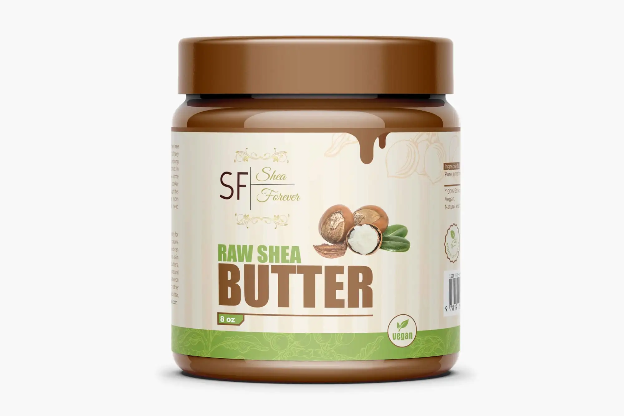
Packaging design for skincare brands is the work of designing the physical presentation of a skincare product — the bottle, jar, tube, dropper, label, carton and outer box — so it signals the right price point, communicates the formula's promise in a single glance, survives a steamy bathroom shelf and a close-up unboxing video, and still carries every piece of legally required cosmetic information. For a skincare brand, packaging is not decoration bolted on at the end — it is the product the customer holds, photographs, keeps on a shelf and reviews, and it is usually the single biggest factor in whether a browser decides your serum is worth £40 or £14. The best skincare packaging in 2026 does four jobs at once: it looks unmistakably like it belongs at its price point, it makes the formula's benefit obvious before a word is read, it reads cleanly at thumbnail size on a crowded marketplace listing, and it stays legal and legible once every mandatory claim, ingredient list and symbol is on the label. Get those right and the packaging does the selling; get them wrong and even a brilliant formula looks like a pharmacy own-brand.
If you are launching a skincare line or repackaging one that is not converting, your packaging is doing quiet sales work in every marketplace thumbnail, every shelf and every reel. We design packaging and brand identities for beauty, wellness and D2C businesses as a Top Rated Plus studio on Upwork — 8+ years, 3,000+ projects across 30+ countries and a 100% Job Success score — so the guidance below is what we actually tell skincare clients, not theory. It narrows our broader product label design service to the skincare niche, and sits alongside our work on supplement packaging design and sustainable packaging for D2C brands.
What does packaging design for a skincare brand actually cover?
Skincare packaging design is rarely one artwork — it is a small system that has to hold together across a whole range. For a single product it usually means the primary container (bottle, jar, tube or airless pump), the label or direct-print artwork, the dropper or applicator, the folding carton or secondary box, and often the shipper and unboxing inserts. Across a range it also means a template that keeps every SKU recognisably part of the same family while letting the customer tell the cleanser from the night cream at a glance — usually through a consistent layout with a changing accent colour or a clear product-name hierarchy.
Skincare packaging design is the design of a cosmetic product's physical container, label and outer carton so it signals quality and price point, communicates the formula's benefit instantly, carries all legally required information, and stays recognisable across an entire range.
Why is skincare packaging harder than ordinary product packaging?
Skincare carries more weight than most categories because the customer is putting the product on their body and judging a formula they cannot test through a screen. That raises the bar in ways general packaging does not have to worry about:
- It has to earn trust, not just attention. A customer buying a face serum is making a safety and efficacy judgement from the outside of the box. Clean typography, restraint and clear ingredient callouts read as credible; clutter and hype read as risky.
- It lives in a wet, warm environment. Labels have to survive a bathroom shelf, a shower and wet hands without peeling, smudging or going cloudy — so material and finish choices are functional, not just aesthetic.
- It is photographed constantly. Skincare is reviewed, unboxed and shelf-flat-laid more than almost any product. The packaging is your most-shared marketing asset, so it has to look good in a reel, not only on a shelf.
- It is heavily regulated. Cosmetic labels must carry specific mandatory information — an ingredient list, net quantity, warnings and more — and the design has to accommodate all of it legibly without becoming a wall of text.
- Tiny formats, long text. A 15 ml eye-cream tube still needs the full legal copy. Designing hierarchy into a surface the size of a thumb is a real craft.
What information is legally required on skincare packaging?
Before you fall in love with a layout, map the mandatory information, because it dictates how much room your branding actually has. Cosmetic labelling rules differ by market — the EU Cosmetic Products Regulation, the UK's post-Brexit regime, and the US rules under the FDA (tightened by the Modernization of Cosmetics Regulation Act, MoCRA) are not identical — so always confirm the exact requirements for the markets you sell into with a regulatory specialist. That caveat aside, most skincare packaging needs to show the following somewhere on the primary container or carton:
- The product name and its function — what the product is (e.g. "hydrating face serum"), so the customer is not left guessing.
- A full ingredient list in INCI names — the standardised International Nomenclature of Cosmetic Ingredients, in descending order of quantity.
- Net quantity — the amount of product by weight or volume (e.g. 30 ml / 1 fl oz).
- A period-after-opening (PAO) symbol or a best-before date — the little open-jar icon with a number like "12M", or a durability date for products that degrade.
- A batch code or lot number — for traceability and recalls.
- The responsible person's name and address — the business accountable for the product in that market.
- Warnings and precautions of use — any required cautions (patch-test advice, "avoid contact with eyes", sunlight sensitivity, and so on).
The practical takeaway for design is simple: lay out the mandatory text first, usually on the back or base, in a clean, genuinely legible size, and then design the front of the pack around the space that remains. Trying to reverse that order is how brands end up with a beautiful front and an illegal or cramped back.
What packaging styles and finishes sell skincare in 2026?
There is no single winning look — the right direction depends on your positioning and price point. Four directions cover most skincare brands that sell well, and the table shows what each one signals and who it suits.
| Direction | What it looks like | Signals / best for |
|---|---|---|
| Clinical minimal | White or near-white, a single accent, precise sans-serif type, ingredient-led copy | Active, science-forward brands (retinol, vitamin C, peptides) at a mid-to-premium price |
| Warm natural | Earthy neutrals, kraft or matte stock, botanical cues, soft serif or humanist type | Natural, 'clean beauty' and wellness positioning |
| Quiet luxury | Heavy glass, soft-touch matte carton, debossing or a single foil, generous white space | Premium and prestige lines where the unboxing is part of the product |
| Bold / expressive | Saturated colour, confident display type, playful shapes | Gen-Z and challenger brands that win on marketplace thumbnails and social |
On finishes, the material does as much talking as the artwork. Heavy glass and an airless pump signal quality and protect active ingredients; a soft-touch matte laminate on the carton reads as premium the moment it is picked up; a single spot of foil or a clean deboss adds perceived value far more effectively than loud, all-over decoration. Keep the palette and type disciplined — one or two colours plus black and white — and make sure the design still works in a single flat colour, because small tubes, embossing and foil all need a solid shape. If you are choosing the brand palette from scratch, our guide to how to choose brand colours walks through it step by step.
How do you design sustainable skincare packaging without looking cheap?
Sustainability is now a buying factor in skincare, not a nice-to-have — but done badly it can read as cut-price rather than considered. The trick is to make the sustainable choice look deliberate. A few approaches that work in 2026:
- Design for refills. A premium outer vessel the customer keeps plus a lower-cost refill pouch or pod is both greener and a repeat-purchase mechanic. It only works if the refill is genuinely easy and the hero vessel feels worth keeping.
- Favour mono-materials and PCR. Packaging made from a single, easily recycled material — or from post-consumer recycled (PCR) plastic or glass — is easier to recycle and easy to state honestly on-pack. Avoid mixed-material laminates and hard-to-separate droppers where you can.
- Use less, better. Removing the secondary carton, shrinking the box to the product, and dropping unnecessary cellophane often looks more premium, not less — restraint reads as confidence.
- Make the claim specific and true. "Carton made from 100% recycled board, printed with vegetable inks" beats a vague green leaf icon. Avoid greenwashing — specificity is what customers and regulators both reward.
We cover the broader principles in our guide to sustainable packaging design for D2C brands, which applies directly to skincare lines selling direct-to-consumer.
What files and specifications does your printer need?
A skincare pack that looks perfect on screen can still fail at the printer. Make sure your designer delivers production-ready artwork, and that you own the editable source files:
- A dieline (cutter guide) supplied by your printer or box manufacturer, with every element positioned inside it — labels, cartons and tubes each have their own template and safe zones.
- Correct bleed and safe margins so nothing important is trimmed off or cut through at the fold.
- CMYK plus any Pantone (spot) colours specified exactly, so your brand colour prints consistently across every SKU and every run.
- Special finishes as separate spot layers — foil, spot UV, deboss and varnish each need their own named layer so the printer can make the right plates.
- Vector source files (AI, PDF, SVG) plus packaged fonts and links, so the artwork scales from a 10 ml tube to a gift box without blurring.
- A scannable barcode and, increasingly, a QR code at the right size and quiet-zone, tested before the run.
If your range is mostly simple bottles and jars, our product label design service guide covers label-specific specs in more detail, and the same discipline we describe for supplement packaging — where regulated copy and small formats collide — applies almost one-to-one to skincare.
Skincare packaging mistakes that cost you sales
A handful of recurring mistakes separate packaging that sells from packaging that quietly underperforms. Most are easy to avoid once you know to look for them:
- Designing the front and forgetting the legal back. Cramming mandatory copy in afterwards produces an illegible, cramped label — or a non-compliant one. Lay out the legal text first.
- A thumbnail that disappears. If your pack is unreadable at the size of a marketplace search result or an Instagram grid tile, it loses the sale before the customer ever clicks. Test the design small, early.
- Too many finishes. Foil plus holographic plus gloss plus neon reads as cheap, not luxurious. One considered finish on a restrained design always looks more expensive.
- Inconsistent range. When the cleanser, toner and moisturiser do not look like a family, the brand looks improvised and the customer buys one product instead of the routine.
- Vague sustainability claims. A generic green leaf with no substance invites scepticism and regulatory risk. Say exactly what is recycled, refillable or recyclable.
- A dropper or pump that leaks or looks flimsy. The component is part of the design. A beautiful label on a wobbly pump undoes all the trust the artwork built.
How to brief a designer for your skincare packaging
The quality of the packaging depends as much on the brief as on the designer. Before you start, get clear on a few things so the designer can reach a strong result in fewer rounds:
- Your positioning and price point. Clinical active brand, natural wellness line, or prestige luxury? This decides the entire visual direction and the materials.
- The full range and the roadmap. Share every current SKU and what is coming, so the designer builds a system that scales rather than a one-off that breaks on product two.
- Your components and suppliers. The bottle, jar, tube, pump and carton specs — ideally with dielines — so the artwork is designed to the real surfaces from day one.
- The mandatory copy and markets. Which countries you sell into and the exact legal text required, so compliance is designed in, not bolted on.
- Three references and why. Packs you admire and what specifically you like about each — the finish, the typography, the restraint — gives the designer a precise target.
Packaging rarely travels alone: the colours, type and logo on the box should match your website, your social media marketing and your ads. If you are building the brand from scratch, it is usually cheaper and far more consistent to design the packaging inside a complete brand identity package for small businesses so everything is designed together. If you already have a formula ready and need packaging and graphic design that makes it look worth the price, that is exactly the work we do — 3,000+ projects across 30+ countries, with public Upwork reviews to back it up.
Frequently asked questions
What information is legally required on skincare and cosmetic packaging?
Most markets require a cosmetic label to show the product name and its function, a full ingredient list in INCI names (in descending order of quantity), the net quantity, a period-after-opening (PAO) symbol or best-before date, a batch or lot code, the responsible person's name and address, and any required warnings. The exact rules differ between the EU, the UK and the US (where MoCRA has tightened requirements), so always confirm the specifics for the markets you sell into with a regulatory specialist. For design, the practical rule is to lay out the mandatory text legibly first — usually on the back or base — then design the front around the space that remains.
What is the best sustainable material for skincare packaging?
There is no single best material — the greenest realistic option depends on the format and your supply chain. In general, glass and mono-material plastics are easier to recycle than mixed-material laminates, post-consumer recycled (PCR) plastic and recycled board reduce virgin material, and a refillable system (a premium vessel the customer keeps plus a low-cost refill) is often the biggest win because it cuts packaging per use and drives repeat purchase. Whatever you choose, make the claim specific and true — "carton from 100% recycled board" beats a vague green leaf — because customers and regulators both reward honesty and penalise greenwashing.
Should my skincare packaging be minimalist or bold and colourful?
Let your positioning decide, not a trend. Clinical, science-forward actives (retinol, vitamin C, peptides) usually sell best with a minimal, ingredient-led design that reads as credible and premium. Natural and wellness brands suit warm, earthy, botanical directions. Prestige lines lean into quiet luxury — heavy glass, soft-touch cartons and a single foil. Bold, saturated colour works for Gen-Z and challenger brands that need to win on busy marketplace thumbnails and social feeds. Whichever direction you pick, keep it disciplined — one considered finish on a restrained design almost always looks more expensive than many loud ones.
How long does skincare packaging design take?
For a single product with the brand already defined, expect roughly one to three weeks for design, then additional time for printer proofs and production. A full range, or a project that includes developing the brand identity first, takes longer — often four to eight weeks — because the system has to be designed once and then applied consistently across every SKU. The biggest delays usually come from missing dielines, unconfirmed legal copy, or components that change mid-project, so locking those down before design starts is the fastest route to a finished pack.
Want this done for you?
FRPROTECH is a Top Rated Plus Upwork agency with 3,000+ projects delivered across 30+ countries. Tell us your goals and we'll handle the rest.
Written by the FRPROTECH design team. 8+ years building brands and websites for clients in 30+ countries, with a 100% Job Success Score on Upwork.