What Is a Design System? A Practical 2026 Guide for Growing Brands
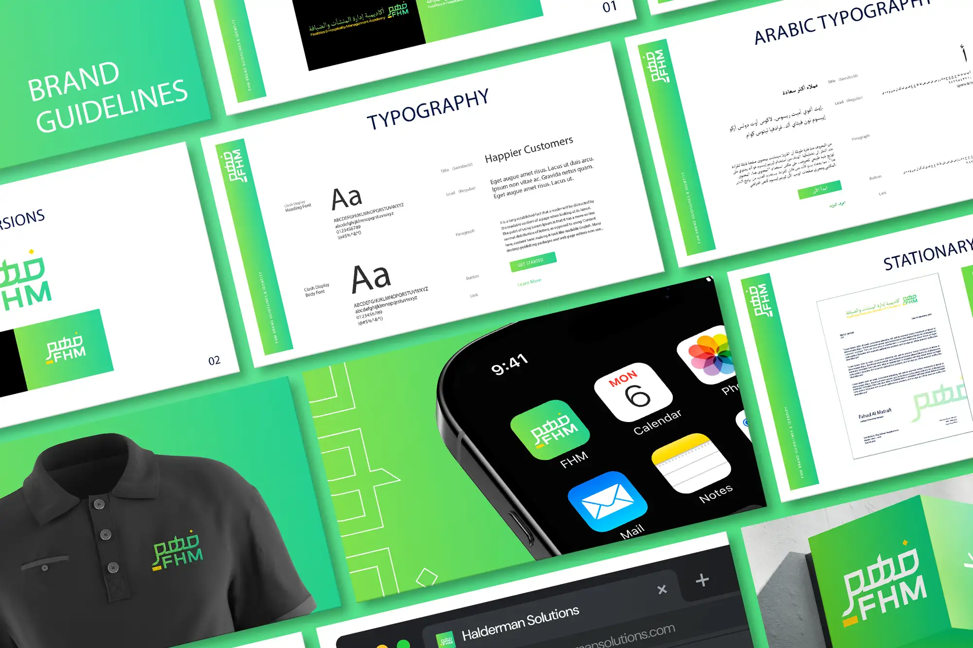
A design system is a single, shared library of reusable design and code components, your colours, type, spacing, buttons, forms, and the rules for using them, that keeps a product looking and behaving consistently everywhere it appears. It's not just a style guide and it's not a logo; it's the connective tissue between your brand, your designers, and your developers, so a button looks and works the same on every screen and a new feature ships in days instead of weeks. You need one as soon as consistency starts slipping and your team keeps rebuilding the same elements from scratch, usually the moment more than one person designs or builds your product.
This guide covers what a design system actually includes, how it differs from a brand style guide, when your business genuinely needs one, and how to build one without over-engineering it. It's the same approach we apply on UI/UX and product design projects across 8+ years and 3,000+ projects in 30+ countries as a Top Rated Plus agency on Upwork.
What a design system actually is
Think of a design system as the single source of truth for how your product looks, feels, and behaves. Instead of every screen being designed from a blank canvas, designers and developers assemble interfaces from a shared kit of pre-built, pre-approved pieces, a primary button, an input field, a card, a navigation bar, each defined once and reused everywhere. Change the component once, and the change flows through every screen that uses it.
Crucially, a real design system spans both design and code. The designer's Figma component and the developer's coded component are two sides of the same definition, so what's drawn is what ships. That link is what separates a true design system from a pretty PDF nobody opens: it lives in the tools your team works in every day, and it stays current because using it is easier than ignoring it.
The simplest test of whether you have a design system: when you need a new button, does someone reach for an existing, documented component, or do they eyeball the last screen and rebuild it by hand? If it's the second, every screen drifts a little further from the last, and your product slowly stops looking like one product.
Design system vs. style guide vs. component library
These three terms get used interchangeably, but they're different layers of the same idea. Knowing which you actually have, and which you need, saves a lot of wasted effort.
| Term | What it is | Best for |
|---|---|---|
| Brand style guide | Rules for logo, colour, type, and voice | Keeping marketing and brand on-message |
| Component library | A reusable kit of UI elements in design and/or code | Building screens faster and consistently |
| Design system | Components plus tokens, patterns, and documented rules | Scaling a product across teams and time |
A brand style guide governs how your brand presents itself, the logo, the colour palette, the tone of voice. A component library is the buildable kit of interface parts. A design system wraps both together and adds the connective rules: the design tokens underneath, the interaction patterns, and the documentation that explains when and why to use each piece. You can start small with just a component library and grow into a full system as you scale.
What's inside a design system
A complete design system has three layers, from the smallest decisions up to the documentation that ties them together. You don't need all of it on day one, but knowing the full shape helps you build in the right order.
Design foundations (the tokens)
Tokens are the smallest, most reusable decisions, the named values everything else is built from. Define them once and every component inherits them, so a single change to your brand colour or base spacing updates the whole product at once:
- Colour — primary, secondary, accent, neutrals, plus semantic colours for success, warning, and error states.
- Typography — the type scale, weights, line heights, and how headings and body text step down in size.
- Spacing — a consistent scale (often based on a 4 or 8-pixel grid) so padding and gaps feel rhythmic, not random.
- Elevation, radius, and motion — shadows, corner rounding, and transition timings that give the interface a coherent physical feel.
Components and patterns
Components are the reusable building blocks; patterns are the proven ways of combining them to solve a recurring problem. Together they're the bulk of what your team uses day to day:
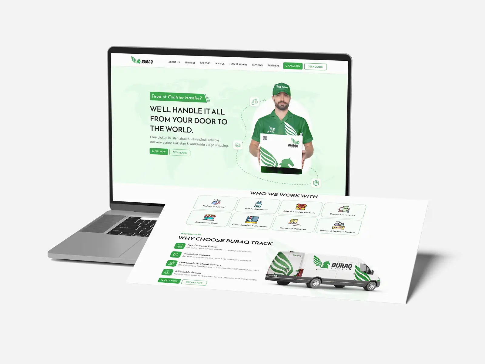
- Core components — buttons, inputs, dropdowns, checkboxes, cards, modals, tabs, and navigation, each with its states (default, hover, focus, disabled, error).
- Patterns — assembled solutions like a sign-up flow, an empty state, a data table, or a high-converting landing page layout that teams reuse rather than reinvent.
- Accessibility built in — components that meet WCAG contrast and focus requirements by default, so the whole product is usable without anyone re-checking each screen.
Documentation and guidelines
The components are only half the value; the rules for using them are the other half. Good documentation explains not just what each piece looks like but when to use it, when not to, and how it behaves, the difference between a primary and secondary button, what error text should say, how far apart cards should sit. Without this, two designers will use the same components in two different ways and the consistency you built quietly erodes.
When does your business actually need one?
A design system is an investment, and like any investment it can be premature. A one-page brochure site doesn't need one. A growing product with multiple screens, more than one person building it, and a brand it needs to protect almost certainly does. The honest signal is friction: when inconsistency and rework start costing you real time, the system pays for itself.
| You probably need one if… | You can probably wait if… |
|---|---|
| More than one designer or developer touches the product | It's a solo project or a single static page |
| Screens are drifting out of sync with each other | Your product is one or two simple screens |
| You're rebuilding the same buttons and forms repeatedly | You rarely add new screens or features |
| You're scaling the team or the product fast | You're still validating the core idea |
| The product no longer feels like one coherent brand | Consistency isn't yet a visible problem |
A practical rule of thumb: the moment a second person starts designing or building your product, you need at least a shared component library. Two people working from memory will always diverge. A documented system is what lets a team move fast without the product falling apart, and it's the difference between UI and UX that hold together at scale and a product that feels stitched from a dozen different hands.
How to build a design system without over-engineering it
The biggest mistake is trying to build everything up front, a sprawling system for components you don't use yet. The best systems grow from real product needs, starting small and expanding only as patterns repeat. Here's the order we recommend.
- Audit what you already have. Screenshot your existing screens and lay them side by side. You'll see the duplication immediately, five slightly different buttons, three blues, inconsistent spacing. That audit is your to-do list.
- Define your tokens first. Lock the foundations, colour, type, spacing, before building components. Everything inherits from these, so getting them right early saves rework later.
- Build the core components you use most. Start with the handful that appear on almost every screen: buttons, inputs, cards, navigation. Resist building rare components until you actually need them.
- Connect design and code. Make sure the Figma components and the coded components share the same names and tokens, so designers and developers speak one language and nothing gets lost in handoff.
- Document as you go. For each component, write a short note on when to use it and its key states. Documentation written alongside the work stays accurate; documentation deferred never gets done.
- Govern and evolve it. Decide who owns the system and how new components get added, so it grows deliberately instead of fragmenting back into the chaos you started with.
Treat the system as a living product, not a one-off deliverable. It should change as your brand and product change, the same way your brand identity evolves. A system that's frozen the day it ships is one your team will route around within months.
The payoff: speed, consistency, and trust
A good design system pays back in three compounding ways. It makes building faster, because teams assemble screens from ready-made parts instead of designing each from scratch. It makes the product consistent, so every screen feels like the same considered product, which is what makes users trust it. And it makes scaling safe, because new designers, developers, and even new agencies can plug into a documented system and produce on-brand work from day one.
That consistency is also a brand asset. A product that looks and behaves coherently signals competence before a user reads a word, the same way a distinctive colour palette does. Sloppiness signals the opposite. In a crowded market, the polish a design system enforces is often what separates a product that feels trustworthy from one that doesn't.
Your design system checklist
Before you commit time to building one, run through this:
- You've audited your existing screens and spotted the duplication and drift.
- Your tokens, colour, type, spacing, are defined before any components.
- You've built the core components you use most, with all their states.
- Design and code components share names and tokens so handoff is clean.
- Accessibility (contrast, focus, keyboard use) is built into components by default.
- Each component has short documentation on when and how to use it.
- Someone owns the system and there's a clear way to add to it.
- You're starting small and growing the system from real product needs.
A design system isn't overhead, it's the thing that lets a growing product move fast and stay coherent at the same time. Start small, build from what you actually use, and let it grow with you. If you'd rather have one designed, coded, and documented for you, our UI/UX and product design service builds design systems that connect Figma to real code and keep your product consistent as you scale, and you can see verified results on our Top Rated Plus profile on Upwork.
Frequently asked questions
What is a design system in simple terms?
A design system is a shared library of reusable design and code building blocks, your colours, type, spacing, buttons, forms, and more, plus the documented rules for using them. Instead of designing every screen from scratch, your team assembles interfaces from pre-approved pieces that look and behave the same everywhere. Change a component once and it updates across the whole product. It's the single source of truth that keeps a growing product consistent, faster to build, and unmistakably on-brand.
What's the difference between a design system and a style guide?
A brand style guide governs how your brand presents itself, logo, colour, typography, and tone of voice. A design system is broader and more functional: it includes the design tokens, the reusable UI components in both design and code, the interaction patterns, and the documentation for using them. Put simply, a style guide tells you how the brand should look, while a design system gives your team the actual building blocks and rules to build a consistent product with it.
Does my business really need a design system?
It depends on scale. A single static page or a project you're still validating doesn't need one. But the moment more than one person designs or builds your product, screens start drifting, or you're rebuilding the same buttons and forms repeatedly, a design system stops being a luxury and starts saving real time. The honest signal is friction: when inconsistency and rework cost you noticeably, even a small shared component library pays for itself quickly.
How long does it take to build a design system?
A lean, useful design system, core tokens and the handful of components you use most, can come together in a few weeks, not months. The mistake is trying to build everything up front. Start by auditing your existing screens, lock your colour, type, and spacing tokens, build the components that appear on almost every screen, connect design to code, and document as you go. Then let the system grow from real product needs rather than hypothetical ones.
Want this done for you?
FRPROTECH is a Top Rated Plus Upwork agency with 3,000+ projects delivered across 30+ countries. Tell us your goals and we'll handle the rest.
Written by the FRPROTECH design team. 8+ years building brands and websites for clients in 30+ countries, with a 100% Job Success Score on Upwork.