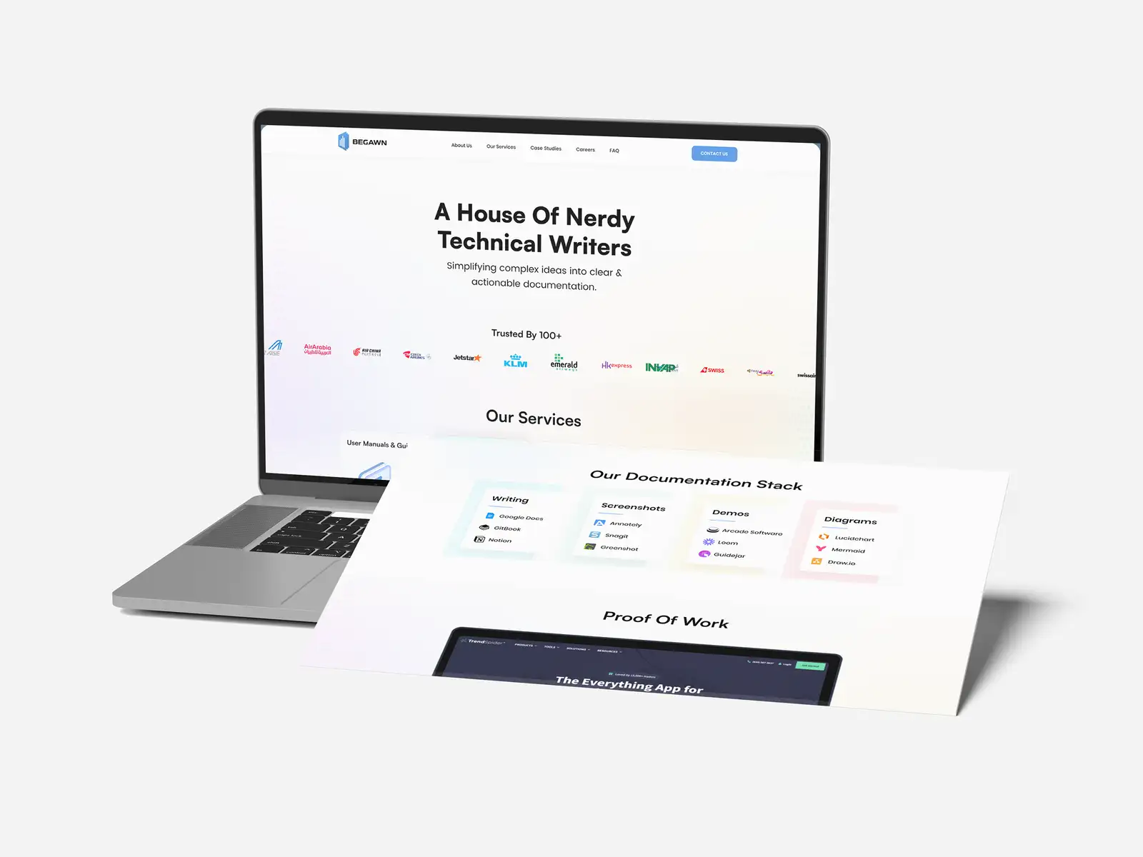
Website Design for Property Management Companies: Win Owners, Serve Residents (With 2 Real Sites)

Good website design for a property management company gives three different visitors their own clear path from the first screen: property owners looking for a manager they can trust, current residents who need to pay rent or report a repair, and applicants searching for a place to live. Owners are where new revenue comes from, so the homepage should be built around them, with a visible "Get a proposal" or "See if you qualify" button, while residents get a one-click "Resident login" or "Report a repair" link in the header. Most property management sites fail because they mix all three audiences into one page and let the owner enquiry get lost.
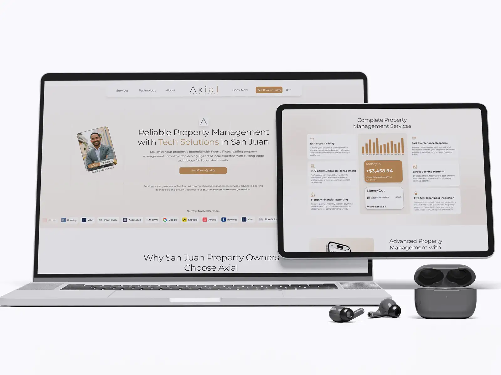
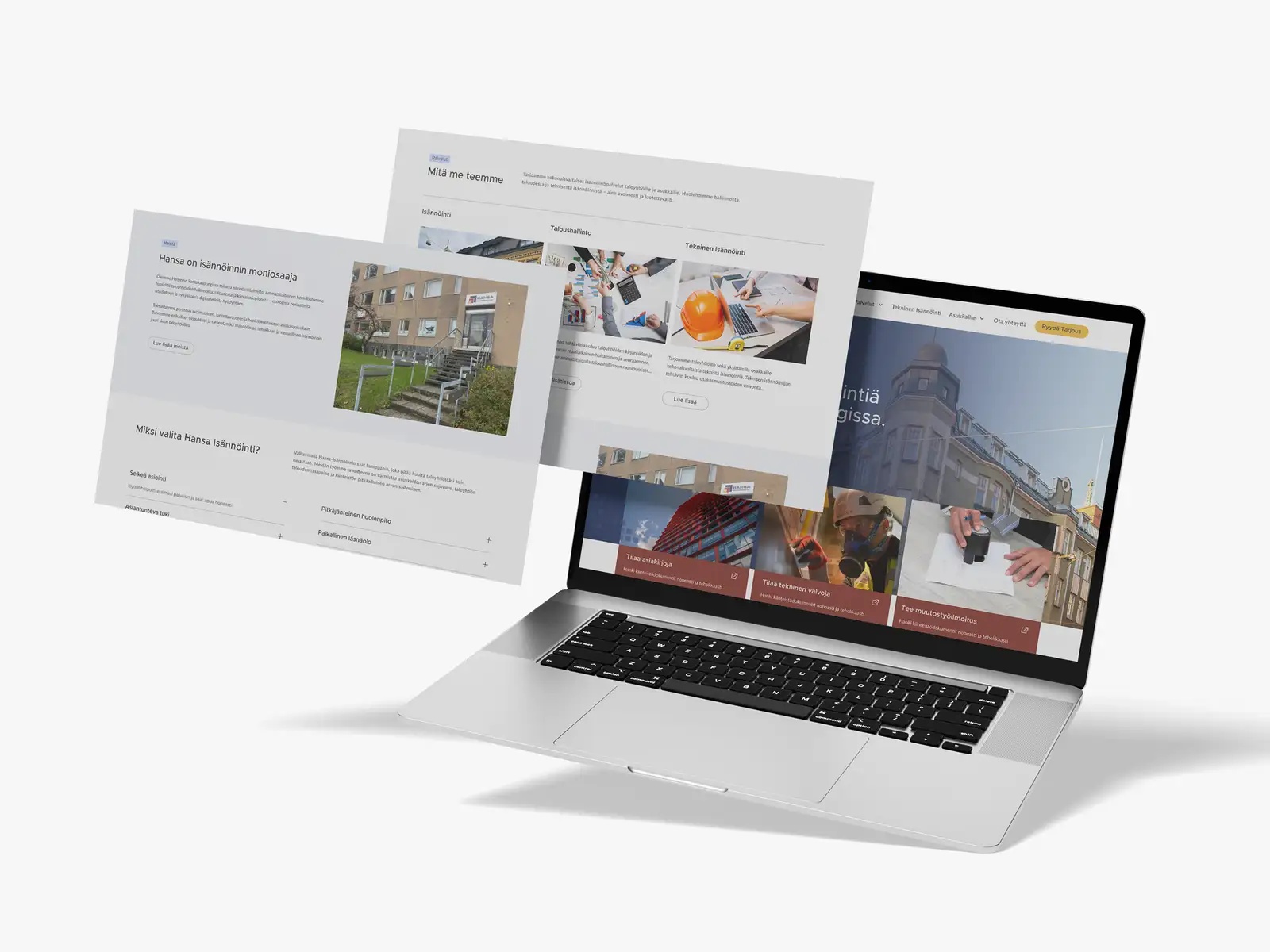
That's the short answer. Below is what each audience is looking for, the pages a property management site needs, how to connect your portal and listings without risk, the mistakes that quietly cost owner leads, and two real property management websites we designed and built: one for a long-term residential manager in Finland and one for a short-term rental manager in Puerto Rico.
Who is a property management website actually for?
Three groups visit, each with a different question and a different level of patience:
| Visitor | What they want to know | What the site must give them | Where it goes |
|---|---|---|---|
| Property owners and landlords | "Will this company look after my property and my income?" | Services, fees or how pricing works, reporting, local proof, a proposal or qualification form | Homepage hero and main navigation |
| Current residents | "How do I pay rent or get this fixed?" | Portal login, repair request, emergency number, documents and FAQs | A header link, one click from every page |
| Applicants and guests | "What's available and how do I apply or book?" | Listings or a booking engine, application steps, fair housing statement | A clear "Available properties" or "Book" link |
The owner path deserves the most design attention because it's the one that grows the business. Residents will find the portal link however small it is, because they have to. An owner comparing three management companies will leave the moment the site looks dated or vague about what you actually do.
Build the homepage for owners, the header for residents and a dedicated section for applicants. If an owner can't tell what you manage, where, and how to get a proposal within one scroll on a phone, the site is costing you management contracts.
What should the homepage show to win new owners?
- What you manage and where. "Residential lettings in Leeds", "Short-term rentals in San Juan" or "Housing companies across Helsinki" in the headline. Location is a ranking signal and a trust signal at the same time.
- One owner call to action, repeated. "Get a free rental appraisal", "Request a proposal" or "See if your property qualifies", in the header and under the headline.
- The services, split clearly. Tenant finding, rent collection, maintenance, inspections, financial reporting, compliance. One card each, with a short plain-language line.
- Proof of how you report. Owners worry about visibility. A simple example of a monthly statement or owner dashboard (with sample figures, clearly marked) answers that faster than any paragraph.
- Local and real people. A photo of the team or the office, years operating in the area and genuine reviews. A stock photo of a handshake tells an owner nothing.
What pages does a property management website need?
| Page | Its job | What it must include |
|---|---|---|
| Homepage | Turn owners into enquiries and route residents fast | Owner CTA, services, area, proof, header links for residents |
| One page per service or property type | Rank for specific searches and answer owner questions | What's included, how it works, reporting, who it suits, proposal form |
| Areas served | Win local searches | Real neighbourhoods or towns, local knowledge, not copy-pasted city pages |
| Residents | Cut support calls | Portal login, repair requests, emergency contact, documents, move-in and move-out guides |
| Available properties or booking | Fill vacancies | Live listings or booking engine, application steps, fair housing statement where required |
| About and contact | Build personal trust | Team photos, licences or memberships, office address, phone, secure form |
Separate service pages matter for search. An owner searching "HOA management" or "Airbnb management near me" should land on a page about exactly that, not on a homepage listing everything in one paragraph. Pair those pages with a well-kept Google Business Profile, as covered in our local SEO guide, and you can compete in the map pack for your own area.
How should a property management site handle residents and portals?
Most managers already run a resident portal through their property management software (AppFolio, Buildium and similar tools offer online rent payment and maintenance requests). The website's job is to get residents there in one click, not to rebuild it. The rules we follow:
- Put "Resident login" or "Pay rent" in the header, separate from "Owner login" if you have an owner portal. Residents should never have to hunt through the footer.
- Never take payments or bank details through a plain website form. Rent and deposits go through the portal, which runs on the software provider's secure system.
- Make repair requests and emergencies obvious. A "Report a repair" link to the portal, plus an out-of-hours emergency number for leaks, gas and lock-outs.
- Publish the documents people ask for most. House rules, move-in checklists, renovation notification forms. Every one you publish is a phone call your team doesn't take.
In the US, also show the Equal Housing Opportunity logo or a fair housing statement on your listings and site footer. HUD's advertising guidance treats it as evidence of good practice, and it's required in some cases, such as HUD-assisted housing; your adviser can confirm what applies to you. Keep listing copy about the property, not about who should live there.
What mistakes cost property managers owner leads?
- A homepage built for residents. A giant "Pay rent" hero tells owners this is a back-office tool, not a company they'd hire.
- Vague services. "Full-service property management" with no list of what's included. Owners compare line by line.
- No local proof. No team, no office, no areas served. Property is local, and owners want a manager who knows their street.
- Contact forms that ask for too little or too much. Ask for property type, location and number of units; leave everything else for the call.
- Slow, image-heavy pages. Uncompressed property photos and sliders make a phone visitor wait. Our guide on making your website load faster covers the fixes.
Which platform suits a property management website?
The platform matters less than the structure, but it decides who can update the site. Webflow suits managers who want a polished, fast site with little maintenance and a CMS for service and area pages; WordPress suits firms with many staff editors or a listings plugin they rely on. We compare both for this kind of business in Webflow vs WordPress for a service business website, and the wider choice in WordPress vs Webflow vs Framer. Before choosing, check how your property management software's listings widget or booking engine embeds on each platform, and test it on a phone.
Your brand has to hold up next to the platform logos and on the side of a maintenance van, too. If your logo looks dated, fix it alongside the website; our guide to logo design for real estate agents covers the restrained, trust-first style that works in property, and a full refresh is covered in rebranding services for small businesses.
How do we design and build a property management website?
FRPROTECH has delivered 3,000+ projects across 30+ countries over 8+ years, with a 100% Job Success score and Top Rated Plus status on Upwork, including multilingual sites like the Finnish one above. If you already have a site and owner enquiries are flat, start with a website UX audit. When you're ready for a new site, our website development service covers design and build end to end.
Frequently asked questions
What should be on a property management company website?
A property management website should include a homepage aimed at owners with a clear proposal or appraisal button, a page for each service or property type, an areas-served page, a residents section with portal login, repair requests and an emergency number, available properties or a booking engine, and an about page with real team photos and credentials. Put "Resident login" in the header so residents find it in one click without crowding the owner message.
How do property management websites get more owner leads?
Lead the homepage with what you manage and where, repeat one owner call to action such as "Get a free rental appraisal", list services specifically, show an example of the monthly reporting owners receive, and add local proof such as team photos, years in the area and genuine reviews. Separate service and area pages help you rank for the specific searches owners make, like HOA management or short-term rental management near me.
Should a property management website take rent payments?
Not through the website itself. Link residents to the secure portal in your property management software, such as AppFolio or Buildium, for rent payments, deposits and repair requests. Never collect bank or card details through a plain contact form. The website's job is to make the portal link obvious and to answer common questions so residents call less.
Do property management websites need the Equal Housing Opportunity logo?
In the US it's strongly recommended on rental listings and advertising, and HUD's advertising guidance treats the logo or a fair housing statement as evidence of compliance; for some housing, such as HUD-assisted properties, it's required. Many managers add it to the site footer and every listing. Check the rules that apply to your properties with your compliance adviser.
Want this done for you?
FRPROTECH is a Top Rated Plus Upwork agency with 3,000+ projects delivered across 30+ countries. Tell us your goals and we'll handle the rest.

Written by Faisal Rizwan, CEO & Founder of FRPROTECH. 8+ years and 3,000+ projects building brands and websites for clients in 30+ countries, with a 100% Job Success Score as a Top Rated Plus freelancer on Upwork.