Website Design for Dental Practices: What New Patients Check Before They Book
Good website design for a dental practice gets a nervous visitor from "is this the right dentist?" to a booked appointment in under a minute. In practice that means a booking button visible on every screen, the dentist's face and qualifications above the fold, one plain-English page per treatment, clear signals for anxious patients, fast mobile pages, and contact forms that don't put patient data at risk. Most dental sites fail on the first two: the booking link is buried and the homepage leads with a stock photo of a smiling stranger.
That's the short answer. Below is what new patients actually check, what each page needs, the compliance points that matter for forms and accessibility, and a periodontics site we designed and built. We've been building websites for 8+ years as a Top Rated Plus studio on Upwork, across 3,000+ projects in 30+ countries, including healthcare and dental clients.
What do patients look for on a dental practice website?
A patient choosing a new dentist is usually comparing two or three practices from a Google search or the map pack, on a phone, often while in some discomfort. They aren't reading. They're scanning for a few signals and leaving as soon as one is missing. These are the seven we design every dental homepage around:
- Can I book right now? A visible "Book an appointment" button in the header, repeated after each main section, plus a tap-to-call phone number on mobile.
- Who will I see? A real photo of the dentist or team, with name, qualifications and specialism. A stock smile tells the patient nothing.
- Do they do what I need? A clear list of treatments, each linking to its own page: check-ups, hygiene, implants, Invisalign or aligners, whitening, gum treatment, emergency care.
- Will it hurt, and will they judge me? Reassurance for anxious patients: sedation options, a calm tone, what happens at a first visit.
- Do they take my insurance or plan? Accepted insurers, NHS or private status in the UK, and payment or finance options, stated plainly.
- Where are they and when are they open? Address, map, parking, opening hours and emergency contact, all on one easy-to-find block.
- Do other patients trust them? Reviews pulled from Google, before-and-after photos where the patient has consented, and professional memberships.
A dental practice website should answer seven questions within one scroll on a phone: can I book now, who will I see, do they offer my treatment, will it be comfortable, do they take my insurance, where are they, and do other patients trust them. Anything that slows those answers down costs bookings.
What pages does a dental website need?
Most practices need fewer pages than they think, but each one has to do a specific job. Here's the structure we start from and what each page is for:
| Page | Its job | What it must include |
|---|---|---|
| Homepage | Get the visitor to book or call | Booking CTA, dentist photo, top treatments, reviews, location and hours |
| One page per treatment | Rank for treatment searches and answer questions | What it is, who it suits, what happens, recovery, FAQs, booking button |
| About / meet the team | Build personal trust | Real photos, qualifications, specialisms, a short human introduction |
| New patients | Remove first-visit anxiety | What to bring, what happens, insurance and payment, forms |
| Emergency dentistry | Capture urgent, high-intent searches | Phone number first, same-day availability, what counts as an emergency |
| Contact / location | Make the visit easy | Map, parking, transport, hours, phone, secure contact form |
Separate treatment pages matter for search as well as for patients. Someone searching "dental implants near me" should land on an implants page, not a homepage that lists twenty treatments in one paragraph. Pair that with a well-kept Google Business Profile and consistent address details, as covered in our local SEO guide, and the practice can compete in the map pack for its own area.
What does a good dental website look like in practice?
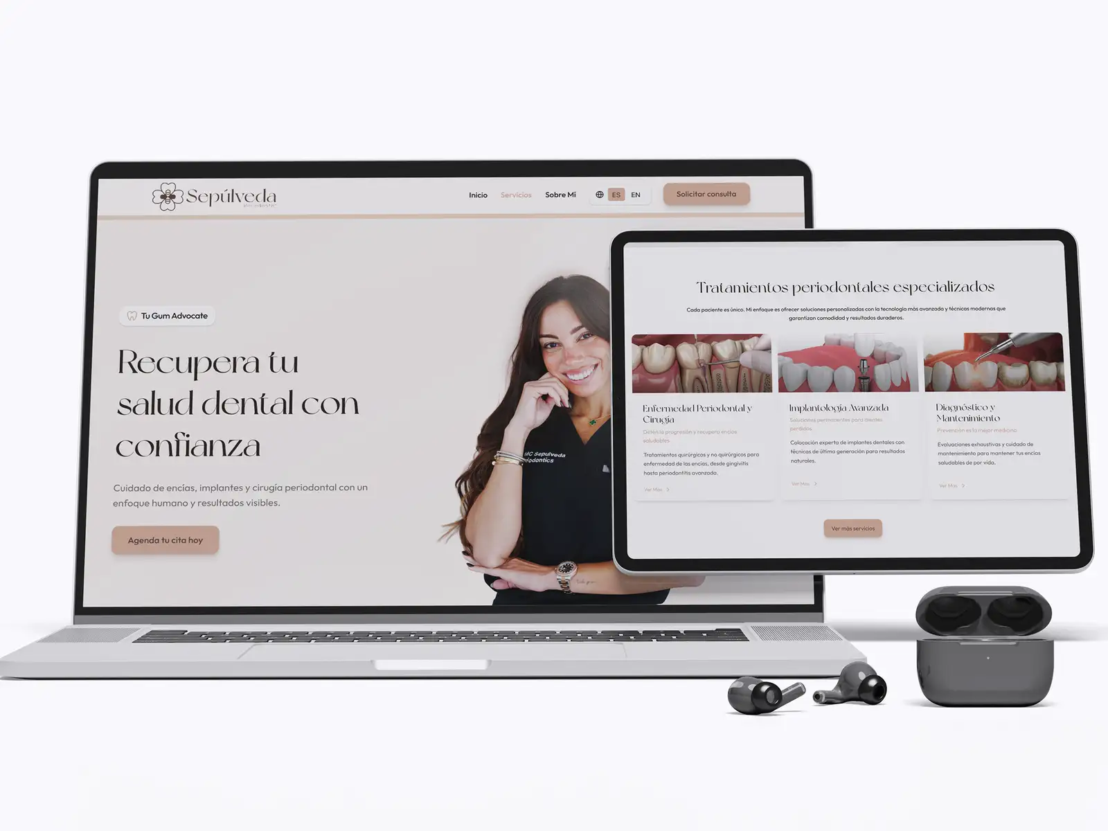
Notice what the design leaves out: no slider, no wall of text, no stock photography. Calm, uncluttered layouts work especially well for anxious patients, the same principle behind calm UI design for fintech and health apps. The palette and type should match the practice's position, too. A cosmetic or specialist practice can carry a more refined, premium look, while a busy family practice benefits from a brighter, friendlier one.
Are dental website contact forms a privacy risk?
They can be. A form that asks "What's the problem with your tooth?" collects health information. In the US, if that data counts as protected health information under HIPAA, the form provider handling it generally needs to sign a Business Associate Agreement, and many general-purpose form tools don't offer one. In the UK, health data is special category data under UK GDPR and needs extra care. The practical rules we follow:
- Keep the public contact form minimal: name, phone or email, preferred time and reason for visit in general terms. Don't ask for medical history on the open web form.
- Send clinical detail through the practice's own systems, such as the patient portal or practice management software the practice already uses under a proper agreement.
- Check the form tool and the email it sends to. HTTPS on the site doesn't mean form notifications are handled securely once they leave it.
- Be careful with tracking on booking pages. Analytics and ad pixels on appointment or treatment pages can pass data to third parties, so agree with the practice what is tracked and where.
This isn't legal advice, and the practice's compliance lead or adviser should sign off on the setup. Our job as designers is to raise these points at the brief stage, not after launch.
Does a dental website need to be accessible?
Yes, for patients and increasingly for the law. Dental patients include older people, people with low vision and people using screen readers, so readable type, strong contrast, labelled form fields and full keyboard navigation are basic usability. In the US, healthcare providers that receive HHS funding (for example through Medicaid) fall under the Section 504 rule, which sets WCAG 2.1 Level AA as the standard for their websites. In May 2026 HHS extended the compliance date for organisations with 15 or more employees to May 2027, so check the current dates for your practice. Our web accessibility guide covers what WCAG 2.1 AA means in practice.
Which platform should a dental practice use?
For most practices the platform matters less than the content and structure, but it does affect who can update the site. WordPress suits practices that want a large plugin ecosystem and many staff editors. Webflow suits practices that want a polished design that stays tidy and loads quickly with little maintenance. We compare them for this kind of business in Webflow vs WordPress for a service business website, and our WordPress vs Webflow vs Framer comparison covers the wider choice. Whichever you pick, make sure the booking widget your practice software provides works well on mobile before you commit.
How we design and build a dental practice website
If you already have a site and bookings are flat, start with an audit before a redesign. Our website UX audit guide shows how to find where visitors drop off. When you're ready for a new site, our website development service covers design and build end to end.
Frequently asked questions
What should be on a dental practice website homepage?
A dental homepage should include a booking button in the header and after each section, a tap-to-call phone number, a real photo of the dentist or team with their qualifications, the main treatments with links to their own pages, patient reviews, accepted insurance or payment options, and the address, map and opening hours. Put the booking button and the dentist's face on the first screen a phone user sees. Leave out sliders, long welcome paragraphs and stock photos of smiling strangers, which slow the page down and tell patients nothing.
Should a dental website have a separate page for each treatment?
Yes. A separate page for each main treatment, such as implants, aligners, whitening, gum treatment and emergency care, helps patients find answers to their specific question and gives the practice a page that can rank for searches like "dental implants near me". Each treatment page should explain what the treatment is, who it suits, what happens step by step, recovery, common questions and how to book. A single services page that lists everything in one paragraph serves neither patients nor search engines.
Can a dental website use a normal contact form?
A simple form asking for name, contact details and a preferred appointment time is usually fine, but be careful once the form asks about symptoms or medical history. In the US, health information covered by HIPAA should only go through a provider that will sign a Business Associate Agreement, and many general-purpose form tools won't. In the UK, health data is special category data under UK GDPR. The safest pattern is a minimal public form, with clinical details collected through the practice's own patient software. Get your compliance adviser to confirm the setup.
How long does it take to build a dental practice website?
Timelines depend on the number of pages, the content and how quickly photos and approvals arrive. A focused practice site with a homepage, treatment pages, team, new-patient and contact pages usually takes a few weeks from agreed plan to launch. The slowest part is almost always content: real team photography, treatment descriptions the dentist is happy with, and before-and-after images with patient consent. Gathering those early is the best way to keep the project moving.
Want this done for you?
FRPROTECH is a Top Rated Plus Upwork agency with 3,000+ projects delivered across 30+ countries. Tell us your goals and we'll handle the rest.

Written by Faisal Rizwan, CEO & Founder of FRPROTECH. 8+ years and 3,000+ projects building brands and websites for clients in 30+ countries, with a 100% Job Success Score as a Top Rated Plus freelancer on Upwork.