Logo Design for Real Estate Agents: A 2026 Guide to a Mark That Wins Listings
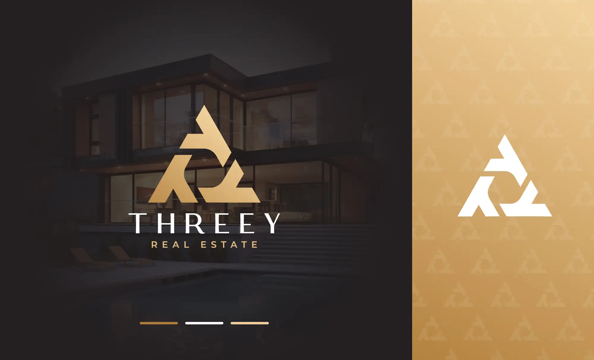
Logo design for real estate agents is the work of creating a simple, versatile mark — usually your name or initials set in a confident typeface, with one or two supporting colours — that signals trust and professionalism and stays legible everywhere an agent's brand appears: a yard sign seen from a moving car, a 320-pixel social avatar, a business card, an email signature and a brokerage lockup. The logos that work in 2026 are deliberately restrained — clean wordmarks and monograms beat intricate illustrations of houses, keys or roofs, because a busy icon turns to mush at small sizes and dates quickly. A good real estate logo is built as a small system rather than a single file: a primary horizontal version, a stacked version, an icon-only mark for avatars, and both dark and light variations, all in a tight palette (black-and-white and navy-and-gold remain the safest premium choices, with blue signalling trust and a warm accent adding approachability). Get those fundamentals right and the logo does its real job — it makes an agent instantly recognisable in a market where dozens of competitors post the same listings on the same day.
If you are an agent, a team lead or a new brokerage weighing up a logo, the stakes are higher than in most industries: your brand sits next to the biggest purchase of someone's life, and a mark that looks cheap quietly undermines the trust you need to win the listing. We design logos and brand identities for agents and property businesses as a Top Rated Plus studio on Upwork — 8+ years, 3,000+ projects across 30+ countries and a 100% Job Success score — so the guidance below is what we actually tell real estate clients, not theory. It narrows our broader logo design service for startups to the property niche, and pairs with our guide to social media graphic design for real estate agents so your logo and your feed pull in the same direction.
What makes a good real estate agent logo?
A good real estate logo does three jobs at once: it looks credible to a seller deciding who to trust with their home, it stays legible at every size from a billboard to a social avatar, and it holds up for years so you are not rebranding every eighteen months. In practice that means prioritising clarity over cleverness. The most common mistake is cramming a literal house, roofline or key into the mark — those symbols are so overused in property that they add nothing but clutter, and fine detail collapses the moment the logo is printed on a pen or shrunk to a profile picture. A strong wordmark, or a clean monogram of your initials, almost always outperforms them.
A real estate agent logo is a simple, scalable visual mark — typically a wordmark or monogram in a restrained palette — that identifies an individual agent, team or brokerage and signals enough trust and professionalism to help win a listing.
What logo styles work best for real estate agents in 2026?
There is no single right style — the best choice depends on whether you are a solo agent building a personal brand, a team, or a brokerage. The four styles below cover almost every real estate logo that works, and the table shows who each one suits best.
| Logo style | What it is | Best for |
|---|---|---|
| Wordmark | Your full name or business name set in a distinctive typeface, no icon | Solo agents and teams building recognition around a name |
| Monogram / lettermark | Your initials combined into a compact mark | Agents with long names, and anyone who needs a tidy social avatar |
| Combination mark | A wordmark plus a simple, abstract symbol that can also stand alone | Teams and brokerages that need a standalone icon for apps and signage |
| Emblem / crest | Name and symbol locked inside a badge or shield | Luxury and heritage positioning — used sparingly, as crests read poorly at small sizes |
Across top-producing agents the pattern in 2026 is restraint: simple wordmarks and monograms dominate, while detailed illustrations and ornate crests are the exception. If you want a standalone icon for your app, favicon and social avatar, a combination mark gives you the most flexibility — the wordmark for headers and signage, the symbol alone where space is tight.
Should a real estate logo use your name, a monogram, or an icon?
For most individual agents, lead with your name. Real estate is a relationship business and in your market you are the brand — buyers and sellers remember and refer a person, not an abstract symbol. A clean wordmark of your name, or a monogram of your initials for tight spaces, builds personal recognition faster than an invented icon ever will. Reserve a standalone symbol for when you genuinely need one: a team or brokerage that wants an app icon, a stamp for property signage, or a mark that works without words on merchandise. Even then, keep the symbol abstract and simple rather than a literal house — geometry and initials age far better than clip-art rooftops.
What colours should a real estate agent logo use?
Colour is positioning, so choose it to match the clients you want. A few combinations have become reliable shorthand in property branding, and it is worth knowing what each one signals before you pick:
- Black and white: the safest, most timeless choice and the most common among top agents. It reads as premium, prints perfectly and never fights your listing photography.
- Navy and gold: the default for luxury and high-end service — navy for trust and stability, gold for a sense of quality. Effective, but widely used, so lean on typography to stand apart.
- Blue: one of the most common single colours in real estate because it signals trust, calm and professionalism — a strong default for a broad, mainstream market.
- A warm accent (coral, terracotta, orange): signals energy and approachability, and helps a younger or more personable agent stand out from a sea of navy and grey.
Whatever you choose, keep the palette tight — one or two colours plus black and white. A logo that depends on four colours becomes a problem the first time it has to appear on a single-colour sign or a stamped folder. If you are choosing a palette from scratch, our guide to how to choose brand colours walks through the process.
What logo files and variations does every real estate agent need?
A logo is not one file — it is a small kit. Because an agent's mark has to work on a yard sign, a social avatar, an email footer and a brokerage document, you need several versions and formats from the start. Make sure your designer delivers all of these, and that you own the editable source files:
- A primary (horizontal) logo for website headers, email signatures and letterhead.
- A stacked version for square spaces and signage where a wide logo will not fit.
- An icon or monogram for social avatars, your favicon and app tiles — the 320-pixel circle is where most logos fail.
- Dark and light versions so the logo stays legible on a white listing page and on a dark photo or social background.
- Vector source files (AI, SVG, EPS) plus PNGs with transparent backgrounds — vectors scale to a billboard without blurring, while PNGs are for quick everyday use.
If your logo is part of a wider refresh, it is worth building it inside a complete brand identity package for small businesses so the colours, fonts and logo system are designed together rather than bolted on one at a time.
Real estate logo mistakes that make an agent look cheap
A few recurring mistakes separate a logo that wins trust from one that quietly costs it. Most are easy to avoid once you know to look for them:
- A literal house, key or roof icon. Overused, generic, and a detail magnet that disappears at small sizes. Abstract or name-led marks almost always look more professional.
- A free online or AI generator with no system. You get a single picture — no variations, no source files, and often a template dozens of other agents are also using.
- Too many colours or gradients. They look fine on screen and fall apart on a one-colour sign, a stamp or a low-quality document.
- A mark that ignores the brokerage lockup. If you are at a franchise, your logo has to sit cleanly beside the brokerage logo and meet its brand rules — design for that from the start.
- A trend-chasing design. A logo you rebrand every two years never builds recognition. Aim for a mark that still looks right in five years.
If you already have a logo that is holding you back, a focused logo redesign service is usually a better move than starting from zero — you keep the recognition you have built and fix only what is not working.
How to brief a designer for your real estate logo
The quality of a logo depends as much on the brief as on the designer. Before you start, get clear on a few things so the designer can reach a strong result in fewer rounds:
- Your positioning. Luxury, first-time buyers, a specific neighbourhood, commercial? The audience decides the whole visual direction.
- Where the logo will live. List the real places — yard signs, Instagram avatar, email signature, business card, brokerage documents — so it is designed to work in all of them.
- Your brokerage's brand rules. Share any franchise lockup requirements and colour or clear-space rules up front to avoid a redesign later.
- Three logos you like, and why. Visual references cut ambiguity faster than any description, and the why matters more than the examples.
- The deliverables you expect. Confirm you will receive all variations, both colour modes, vector source files and full ownership on final payment.
Get those five things down and you give any designer — freelancer or studio — what they need to design a mark that fits your market the first time.
Logo design for real estate agents comes down to one idea: in a market where everyone lists the same homes, a simple, confident, consistently-applied mark is what makes you the agent people remember and refer. Keep it restrained, build it as a system, own the files, and apply it everywhere — then let your social media graphics carry the same brand. If you would rather have it designed properly the first time, our brand and identity design service and our Top Rated Plus Upwork profile show the kind of work — across property and beyond — that helps a small brand look like the obvious choice.
Frequently asked questions
What is the best logo style for a real estate agent?
For most individual agents, a wordmark (your name in a distinctive typeface) or a monogram of your initials is the best style, because real estate is a relationship business and buyers and sellers remember a person rather than an abstract symbol. Teams and brokerages that need a standalone icon for an app, favicon or signage are better served by a combination mark — a wordmark plus a simple abstract symbol. Emblems and crests can suit luxury or heritage positioning but should be used sparingly, as the fine detail in a badge reads poorly at small sizes.
Should a real estate logo include a house or key symbol?
Usually not. House, roof and key icons are so overused in property branding that they add clutter rather than meaning, and the fine detail disappears the moment the logo is shrunk to a social avatar or printed on a pen. A clean wordmark or monogram almost always looks more professional and is easier to recognise. If you do want a symbol — for example a team that needs a standalone app icon — keep it abstract and geometric rather than a literal picture of a building, because simple geometry and initials age far better and scale cleanly.
What colours should a real estate agent use for their logo?
Keep the palette tight — one or two colours plus black and white — and choose it to match your positioning. Black and white is the safest, most timeless option and the most common among top agents: it reads as premium and prints perfectly. Navy and gold is the default for luxury and high-end service, while blue on its own signals trust and professionalism for a broad market. A warm accent like coral or terracotta signals energy and approachability, which helps a younger or more personable agent stand out. Avoid relying on four colours or gradients, as they fall apart on single-colour signs and stamps.
Can I design my own real estate logo, or should I hire a designer?
You can design a basic logo yourself with an online tool, but for a brand you will build a business on, a designer is usually worth it. A free generator typically gives you a single picture with no variations, no vector source files, and often a template other agents are also using — which is exactly what makes a logo look cheap. A designer delivers a small system (horizontal, stacked and icon versions, dark and light modes), vector source files you own, and a mark built to meet your brokerage's rules and work everywhere from a yard sign to a profile picture. If you already have a logo, a focused redesign that keeps your existing recognition is often a smarter move than starting over.
Want this done for you?
FRPROTECH is a Top Rated Plus Upwork agency with 3,000+ projects delivered across 30+ countries. Tell us your goals and we'll handle the rest.
Written by the FRPROTECH design team. 8+ years building brands and websites for clients in 30+ countries, with a 100% Job Success Score on Upwork.