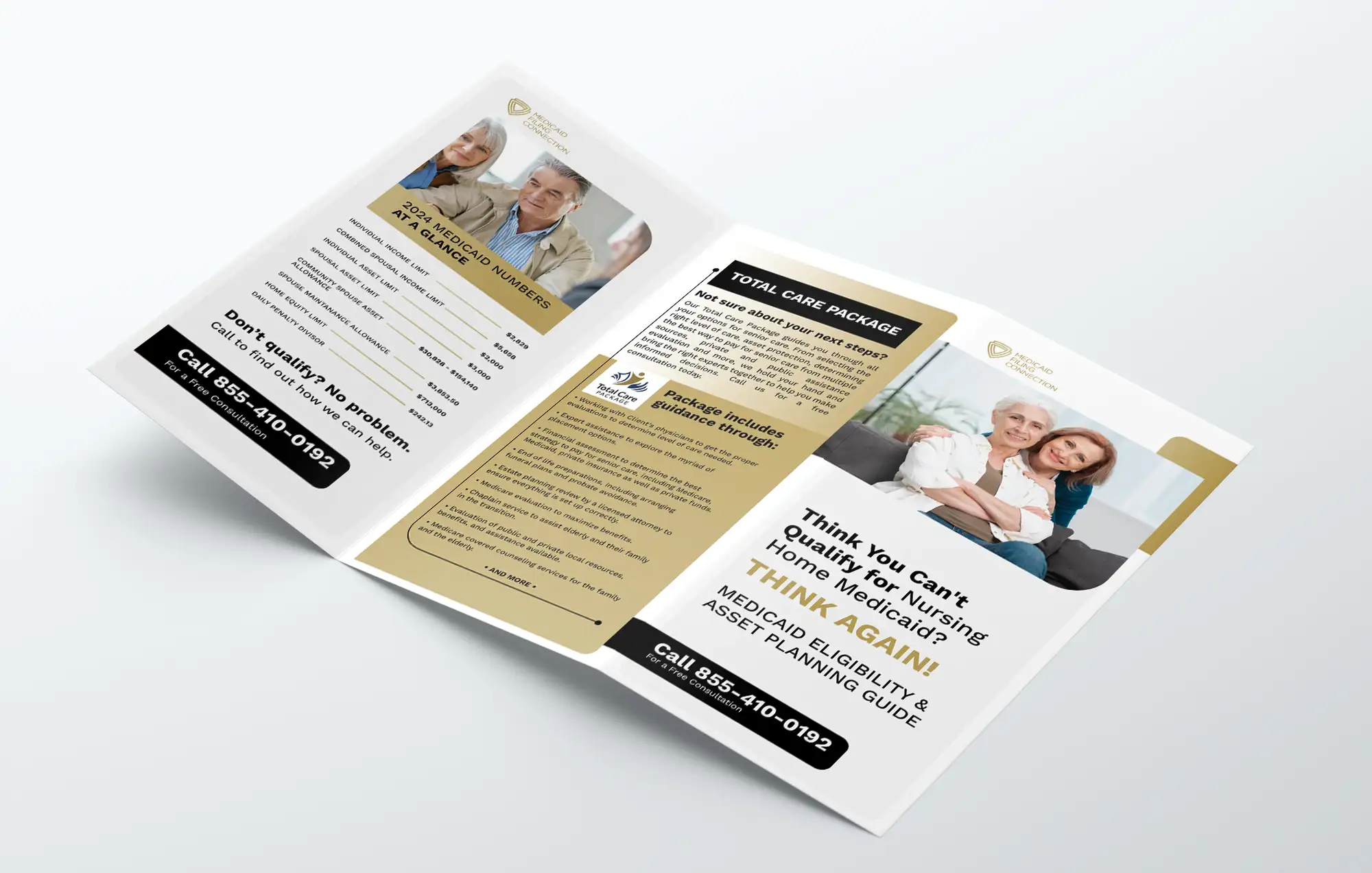
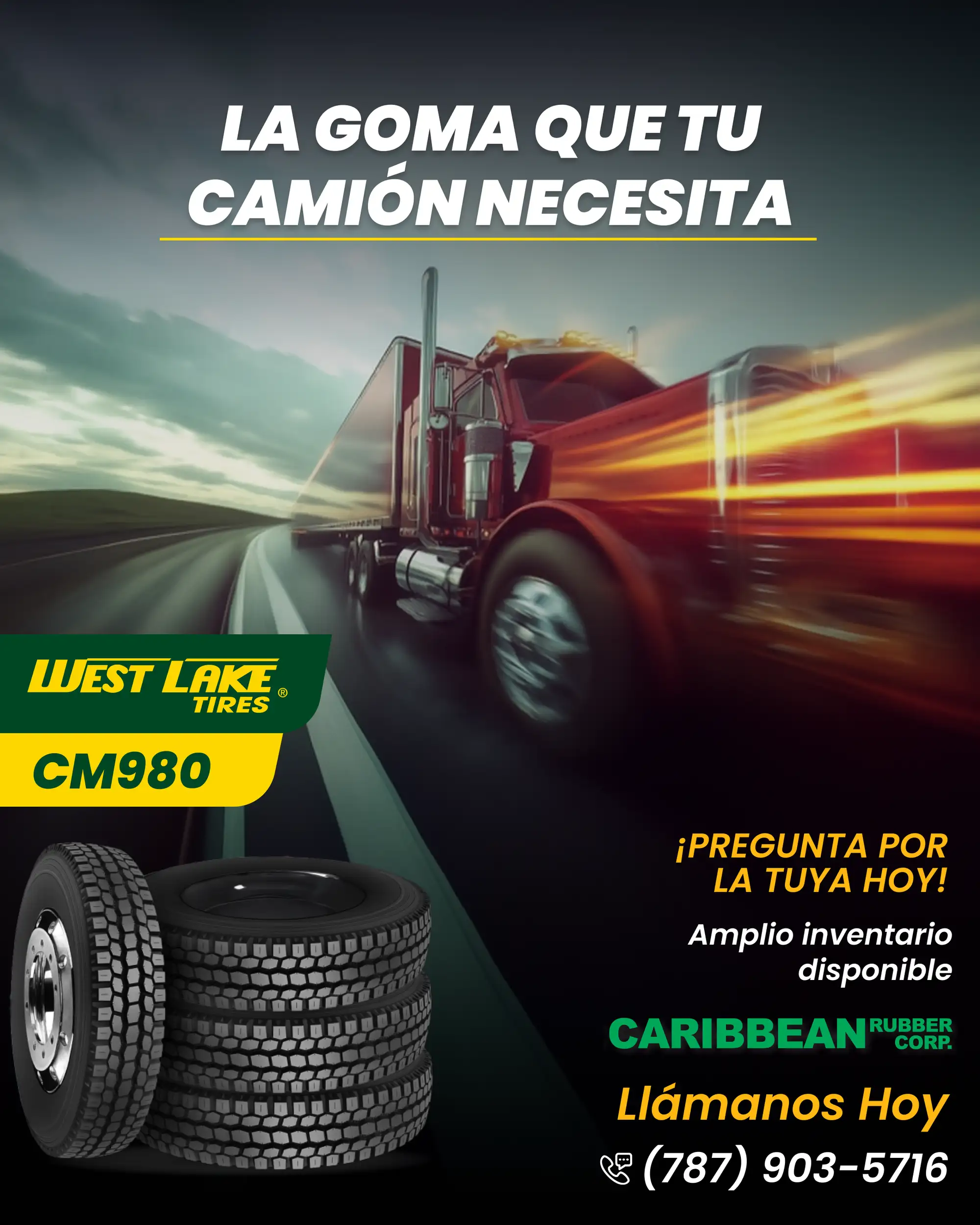
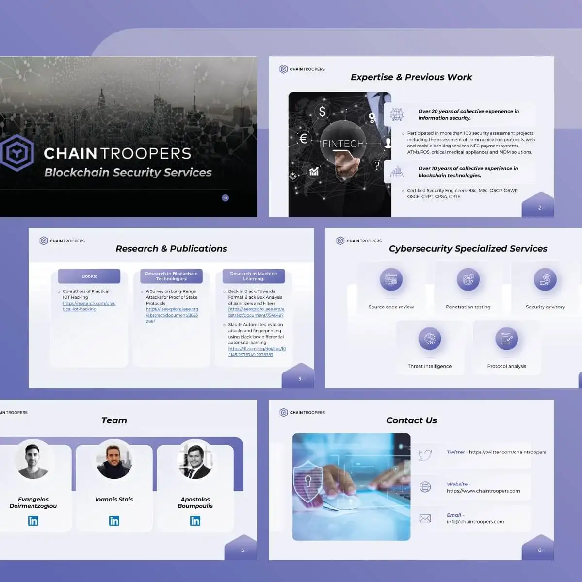
Roll-Up Banner Design for Trade Shows: 7 Rules We Use So a Banner Works From Across the Hall
Good roll-up banner design for a trade show comes down to one idea: the banner is read from three to five metres away, by someone walking past, in about three seconds. So your name and one short promise go in the top third, above people's heads and the table edge; the middle holds one strong image and no more than three short benefits; and the website, QR code and phone number sit at the bottom, clear of the 100–150 mm that disappears into the base. Everything else (paragraphs, long service lists, five logos) belongs on a brochure, not on the banner.
We design marketing collateral, from flyers and brochures to roll-up and event banners, as a Top Rated Plus studio on Upwork, with 8+ years and 3,000+ projects across 30+ countries. These are the rules we use on every roll-up, with two real banners from our portfolio to show them in practice.
Why is a roll-up banner harder to design than it looks?
A roll-up is tall and narrow, usually about 85 cm wide and 2 m high, and it's almost never seen whole. At a busy show the bottom half is hidden by your table, your team and the visitors talking to them. The top is seen from across the aisle, often over a crowd. And it competes with dozens of other banners using the same format, so a layout that looks fine on a laptop screen at full size often turns into a wall of small text in a hall.
That's why we never design a roll-up as a tall flyer. A flyer is held in the hand at 40 cm, and can carry a paragraph. A roll-up has to work like a road sign at the top and a business card at the bottom.
What are the 7 rules for a roll-up banner that works?
- Put the brand and the promise in the top third. This is the only part visible from across the aisle and over a table. Logo plus a headline of about seven words or fewer, saying what you do or what the visitor gets.
- One message per banner. If you sell three services to three audiences, pick the one this show is for. A second banner is cheaper than a confusing one.
- Size text for distance, not for the screen. A common sign-industry rule of thumb is about 1 inch (25 mm) of letter height for every 10 feet (3 m) of reading distance. In practice that means headlines of roughly 100 mm and up, and nothing that matters below about 30 mm.
- One hero image, not a collage. One clear photo or illustration reads at a distance. Six small photos read as noise.
- Three benefits at most, as icons and short lines. Two to four words each. Visitors scan them, they don't read them.
- Contact and QR code low, but above the hidden zone. Keep the website, phone number and QR code at the bottom, but well above the part that rolls into the base, and make the QR code large enough to scan from a step back.
- High contrast, few colours. Dark text on light or light on dark, in your brand colours. Hall lighting is uneven and often yellowish, and low-contrast pastel text disappears under it.
A trade show roll-up banner should pass the three-second test from three metres away: a visitor walking past can name your company and what you offer before they've passed your stand. If they need to stop and read to find out, the banner has too much on it.
What size is a standard roll-up banner, and how should the file be set up?
Sizes and file settings vary by printer and stand, so always design to your printer's own template. These are the common figures we see in printer specifications:
| Setting | UK and Europe | US | Why it matters |
|---|---|---|---|
| Most common size | 850 × 2000 mm (also 800, 1000 and 1200 mm wide) | 33 × 81 in (also 33.5 × 80 in and wider stands) | Width decides how long a headline line can be |
| Hidden base area | Usually an extra 100–150 mm that rolls into the cassette | Often around 3 in hidden by the stand; some templates add more | Nothing important can sit here |
| Bleed | Typically 3–10 mm on the top and sides | Often 1/16 in or more on all sides | Stops white edges after trimming |
| Resolution | Often 300 dpi at 25% scale, or 100–150 dpi at full size | Commonly 100–300 dpi depending on the printer | Large format is viewed from distance, so full-size 300 dpi is rarely needed |
| Colour and type | CMYK, fonts outlined or embedded | CMYK, fonts outlined or embedded | RGB colour shifts on press; missing fonts break the layout |
One practical point: design the visible area first, then extend the background into the hidden base area. A common mistake is to place the website or a logo strip right at the bottom edge of the file, which then sits inside the cassette at the show.
Where do people actually look at a roll-up banner?
Think of the banner in three zones, from the top down:
| Zone | Roughly | What goes there | Seen when |
|---|---|---|---|
| Top | Top third | Logo and headline | From across the hall, over heads and tables |
| Middle | Middle third | One hero image, up to three benefits or proof points | As visitors approach the stand |
| Bottom | Lower third, above the base | Website, QR code, phone, social handle | When someone is close and already interested |
The bottom zone is for people who've already decided to talk to you, which is why it can hold smaller text. It's also the part most likely to be blocked by a table, so it should never hold your headline or your only call to action.
What do these rules look like on a real roll-up banner?
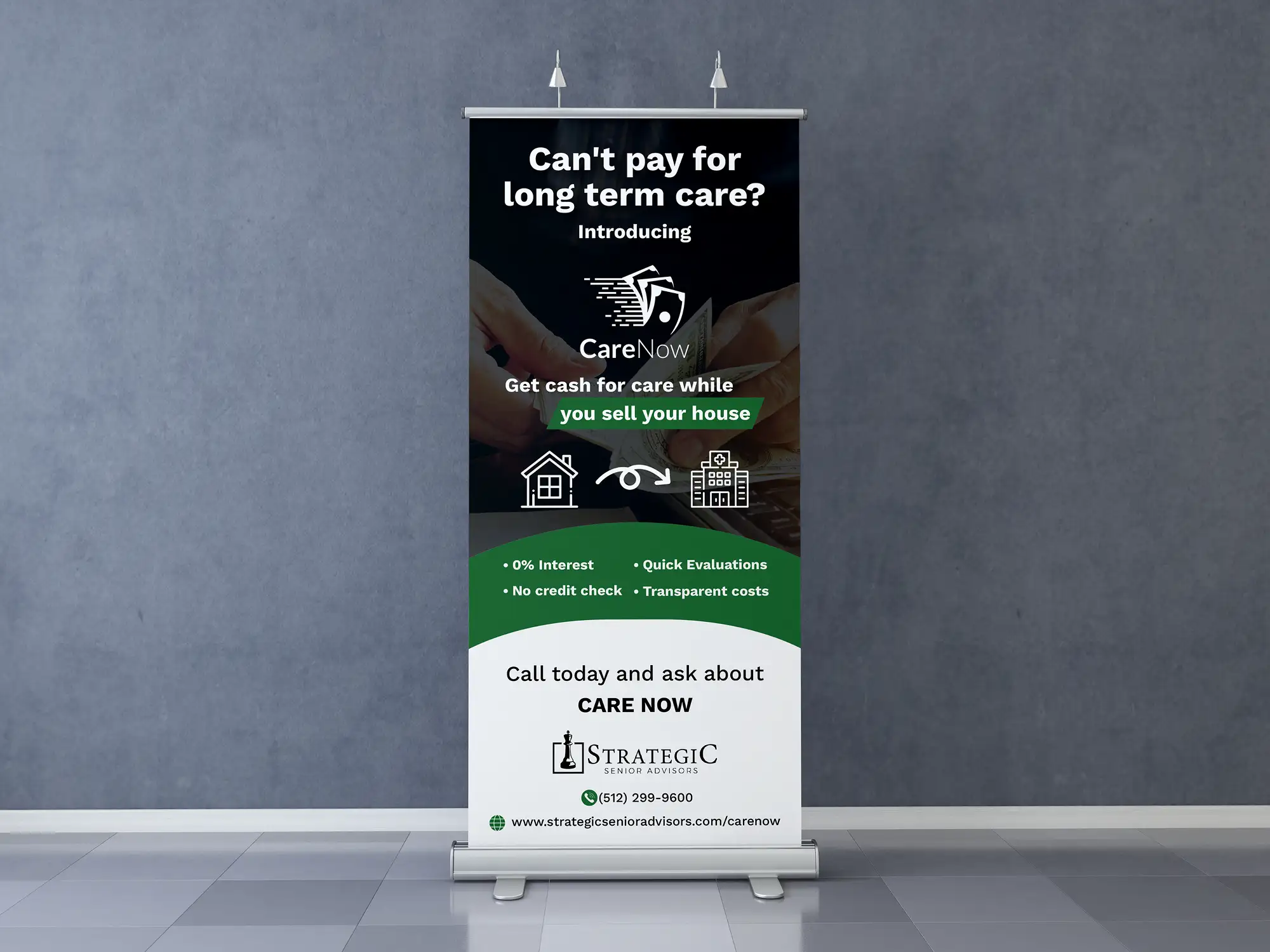
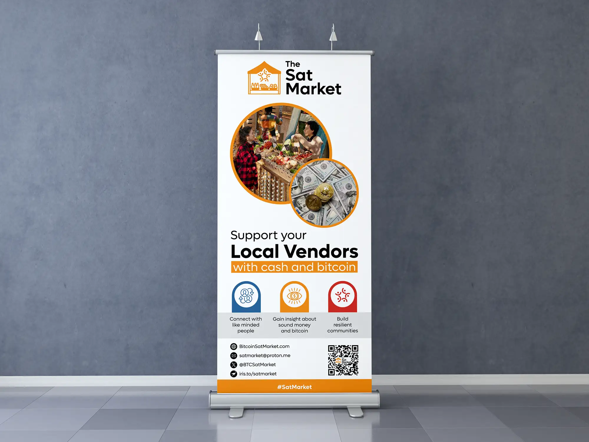
The two banners look different, but they follow the same order: who and what at the top, one visual idea in the middle, and the next step at the bottom. The second one also shows a tactic that works well for services people feel anxious about: name the visitor's problem as a question, then answer it. It's the same approach we use in medical brochure design for clinics.
What are the most common roll-up banner mistakes?
- Treating it like a brochure. Paragraphs and long service lists that nobody reads from the aisle.
- A small logo at the bottom. It ends up behind the table. Your name belongs at the top.
- Contact details inside the base area. The website rolls into the cassette and disappears.
- Low-resolution logos. A logo pulled from a website header blurs at two metres tall. Use a vector file (AI, EPS, SVG or PDF), which is why a proper responsive logo design system with print versions pays off.
- A different look from everything else. If the banner doesn't match your brochure, business cards and social posts, visitors don't connect them later. A brand identity package gives every printed piece the same colours, fonts and logo files.
- Too many logos. Partner, sponsor and accreditation logos all at the same size compete with your own. Group them small in the bottom zone, or leave them for the brochure.
How should a roll-up banner work with the rest of your stand?
The roll-up stops people; the rest of the stand converts them. We usually design the banner alongside a handout (a flyer or a small business brochure) and a set of social posts announcing the show, using the same headline and image. The QR code on the banner should go to a page about the offer on the banner, not just your homepage. If you're promoting the show on social media too, our guide to social media marketing packages for small businesses covers how pre-event posts fit into a monthly plan.
How do we design a roll-up banner?
The short recommendation
Design your roll-up banner for the visitor walking past three metres away: name and promise in the top third, one image and three short benefits in the middle, contact details and QR code at the bottom above the base. Get your printer's template before anyone opens a design file, and keep the banner consistent with your handouts and social posts. If you'd like us to design yours, see our graphic design service.
Frequently asked questions
What should go on a trade show roll-up banner?
Your logo and a short headline saying what you do or what the visitor gets (in the top third), one strong image, up to three short benefits, and your website, QR code and phone number near the bottom but above the base of the stand. Leave long descriptions, price lists and detailed service lists for a brochure or handout.
What is the standard size of a roll-up banner?
In the UK and Europe the most common size is 850 × 2000 mm, with 800, 1000 and 1200 mm wide versions also available. In the US the most common retractable banner is 33 × 81 inches, with 33.5 × 80 inches and wider stands also sold. Artwork files are usually taller than the visible area, because around 100–150 mm (about 3 inches or more) rolls into the base, so always design on your printer's template.
How big should text be on a roll-up banner?
A common sign-industry rule of thumb is about 25 mm (1 inch) of letter height for every 3 metres (10 feet) of reading distance. For a trade show, where people read from three to five metres, that means headlines of roughly 100 mm or more and no important text smaller than about 30 mm. Keep the headline to about seven words.
What resolution should a roll-up banner file be?
It depends on the printer. Many UK templates ask for 300 dpi at 25% scale, which works out at about 75 dpi at full size, while others ask for 100–150 dpi at full size, and some US printers ask for 300 dpi. Use vector files for logos and text, CMYK colour, and the resolution your printer's template specifies.
Want this done for you?
FRPROTECH is a Top Rated Plus Upwork agency with 3,000+ projects delivered across 30+ countries. Tell us your goals and we'll handle the rest.

Written by Faisal Rizwan, CEO & Founder of FRPROTECH. 8+ years and 3,000+ projects building brands and websites for clients in 30+ countries, with a 100% Job Success Score as a Top Rated Plus freelancer on Upwork.