Medical Brochure Design for Clinics: What Patients Read First (With 3 Real Examples)
Good medical brochure design for clinics comes down to answering three questions in the order a worried patient asks them: "Is this for my problem?", "Can these people help me?" and "What do I do next?" In practice that means a cover that names the condition or outcome in plain words, one short panel per treatment, real photos and credentials instead of stock smiles, a single booking step (phone number or QR code) repeated on the cover and the back, and body text of at least 12pt so older and anxious readers can actually read it.
Most clinic brochures fail on the order, not the look. They open with the clinic's name and history, bury the treatments in dense paragraphs and hide the phone number in tiny footer text. Below is the panel order we use on healthcare print, the specs your printer will ask for, the claims that can get a clinic into trouble, and three real healthcare pieces from our portfolio.
What should a medical clinic brochure include?
A brochure is usually picked up in a waiting room, handed over by a GP or referrer, or left on a reception desk. The reader has a minute, not ten. Everything on it should help them decide whether to call. In order of importance:
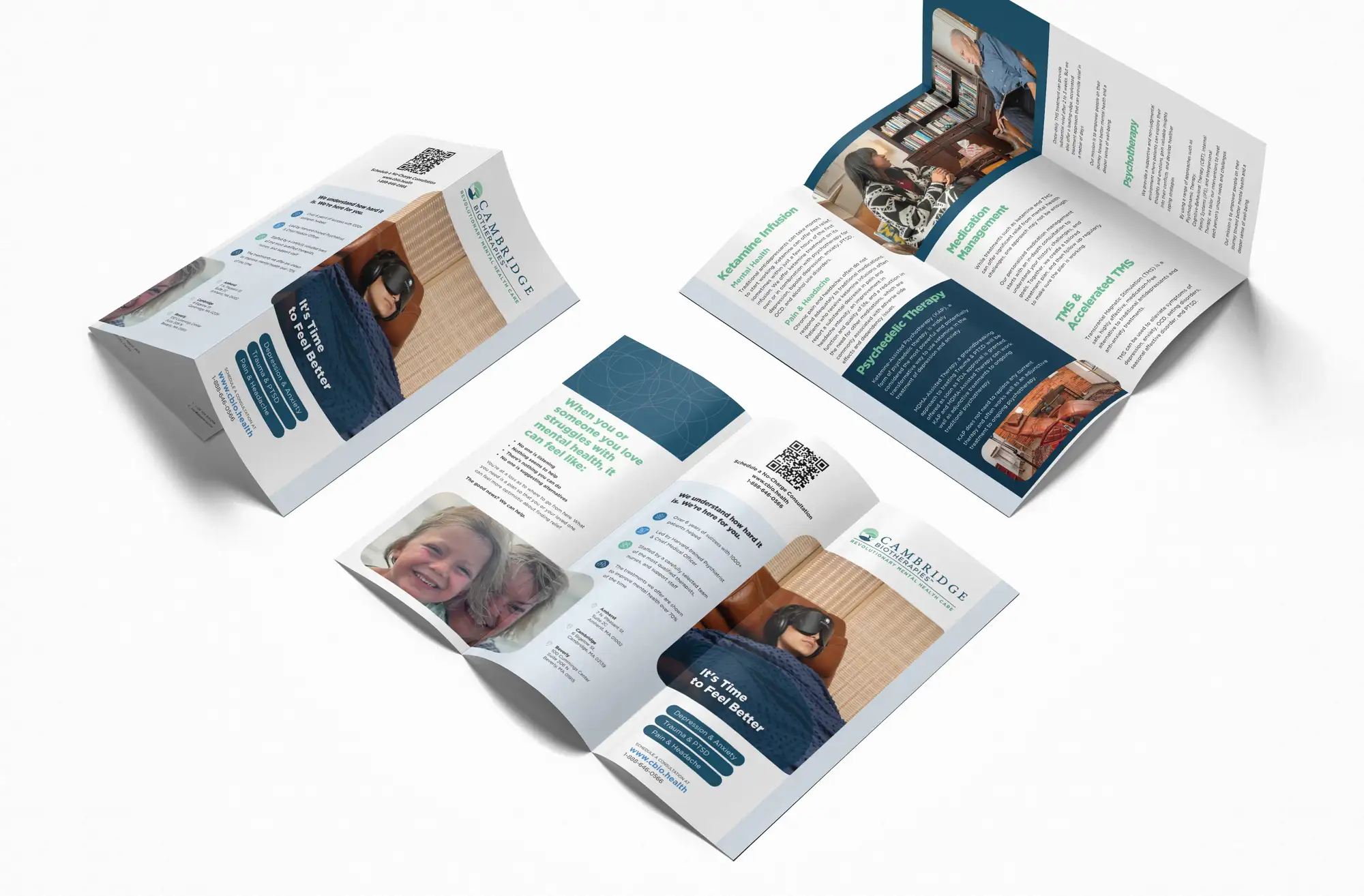
- A cover that names the problem or outcome. "It's time to feel better" next to "Depression & anxiety, trauma & PTSD, pain" beats a logo and a building photo. The patient should recognise their situation before they open it.
- One panel per treatment or service. A heading, two or three plain-English sentences on what it is and who it's for, and nothing else. Detail belongs on the website, which the brochure should point to.
- Proof that real people run it. Clinician photos, qualifications, registration or licensing statements, and years in practice. In healthcare these do more work than any design flourish.
- Practical answers. Locations, opening hours, how referral works, and which payment or insurance routes you accept. These are the questions reception gets asked all day.
- One booking step, repeated. The same phone number, QR code or URL on the cover and the back panel, styled as a clear call to action, not footer text.
A medical clinic brochure is a short, print piece that tells a patient whether the clinic treats their problem, why they can trust it, and exactly how to book. The best ones lead with the condition, keep each treatment to one panel, use 12pt+ body text and repeat a single booking step on the cover and back.
What order should the panels go in on a trifold clinic brochure?
A trifold has six panels, and people don't read them left to right. They see the cover, then the panel that flaps open first, then the full inside spread, and the back last (if at all). We plan the content to match that reading path:
| Panel | When the reader sees it | What goes on it |
|---|---|---|
| Front cover | First, often at arm's length on a rack | Clinic name, the condition or outcome in large type, one human photo, the booking step |
| Inside flap | First thing seen when opened | "Does this sound like you?" symptoms or situations, in the patient's own words |
| Inside spread (3 panels) | Once they're interested | One short block per treatment or service, with a heading each, plus clinician photos |
| Back panel | If they turn it over | Locations, hours, insurance or payment routes, referral info, the booking step again |
| Middle back (under the fold) | Rarely, when fully opened flat | Reassurance: credentials, licensing, a short note from the lead clinician |
The same thinking applies to a bifold or a single-page flyer; you just have fewer panels to spread it across. If you're weighing up formats in general, our guide to brochure design services for small businesses covers the main formats (trifold, bifold, single-sheet leaflet and booklet) and what a brochure project includes.
How big should the text be on a medical brochure?
Bigger than most designers make it. A lot of clinic patients are older, some have low vision, and almost all of them are reading while worried. UK clear-print guidance (the standard RNIB-based advice that councils and NHS bodies follow) sets 12pt as the minimum and 14pt as the recommended body size, with large print starting at 16pt. We treat 12pt as the floor for body copy on clinic print, never the target.
- Plain sans-serif body type with a generous x-height and no condensed or light weights.
- High contrast: dark text on a plain light background. No body text over photos or gradients.
- Left-aligned, not justified, so word spacing stays even and lines are easy to track.
- Short sentences and everyday words. US health bodies such as the AMA and NIH are widely cited as recommending patient materials at roughly a sixth- to eighth-grade reading level. "High blood pressure", not "hypertension", unless you explain it.
- Headings that are questions or plain labels, so a skimming reader can find their treatment in seconds.
Choosing a typeface that holds up at these sizes is a brand decision as much as a print one; our guide on how to choose fonts for your brand covers what to check.
What claims can a clinic put in a brochure?
This is where clinic print gets clinics into trouble. Design can't fix a non-compliant claim, so we flag risky copy in the brief before we lay anything out. The general rules:
- Prescription-only medicines (UK). Under the Human Medicines Regulations 2012 and CAP Code rule 12.12, prescription-only medicines and treatments can't be advertised to the public. The MHRA's guidance says this applies to displays on clinic premises too. Brochures that name a POM (weight-loss injections, botulinum toxin and similar) are a common reason for ASA rulings against clinics. Describe the consultation, not the drug.
- Health claims (US). The FTC expects health claims to be backed by competent and reliable scientific evidence, and state rules and professional boards add their own limits. Avoid "cure", "guaranteed" and "100% success".
- Testimonials and before-and-after images. Use only with written consent, never edited, and check your regulator's rules first; some professions restrict them.
- Patient photos. Use consented photos or clearly non-patient imagery. Never use a real patient's image without written permission.
This isn't legal advice, and the rules differ by country, state and profession. Have your compliance lead or regulator's guidance check the final copy before it goes to print.
What print specs does a clinic brochure need?
Your printer will ask for these, and getting them wrong is the most common reason a finished design comes back. We set the file up on the printer's own template where they have one.
| Spec | UK / Europe | US |
|---|---|---|
| Trifold flat size | A4 (210 × 297mm), folds to DL | Letter (8.5 × 11in) |
| Bleed | 3mm on every edge | 0.125in on every edge |
| Safe zone for text | At least 3–5mm inside the trim | At least 0.125–0.25in inside the trim |
| Inside flap | A few mm narrower so it folds in cleanly | Roughly 1/16–1/8in narrower |
| Colour mode | CMYK, images at 300ppi | CMYK, images at 300ppi |
| Paper | Silk or uncoated around 150–170gsm | Around 80–100lb text, matte |
A matte or uncoated finish is worth choosing for clinic print: it doesn't glare under waiting-room lights, and uncoated stock is easy for patients and staff to write notes on.
Should a clinic brochure match the website and social posts?
Yes. The brochure is often the first touchpoint and the website is the second, so the colours, type, photography style and wording should match. If the brochure says "It's time to feel better" in teal and the website opens with a grey stock photo and a different promise, the patient has to rebuild trust from scratch. The same goes for the treatment pages: our guide to website design for dental practices covers how to structure those pages so the brochure's QR code lands somewhere useful.
If your print, website and socials have drifted apart over the years, that's usually a sign the identity needs tightening first. A focused rebrand for a small business fixes the system once, so every brochure, flyer and post after it looks like the same clinic.
How do we design a clinic brochure?
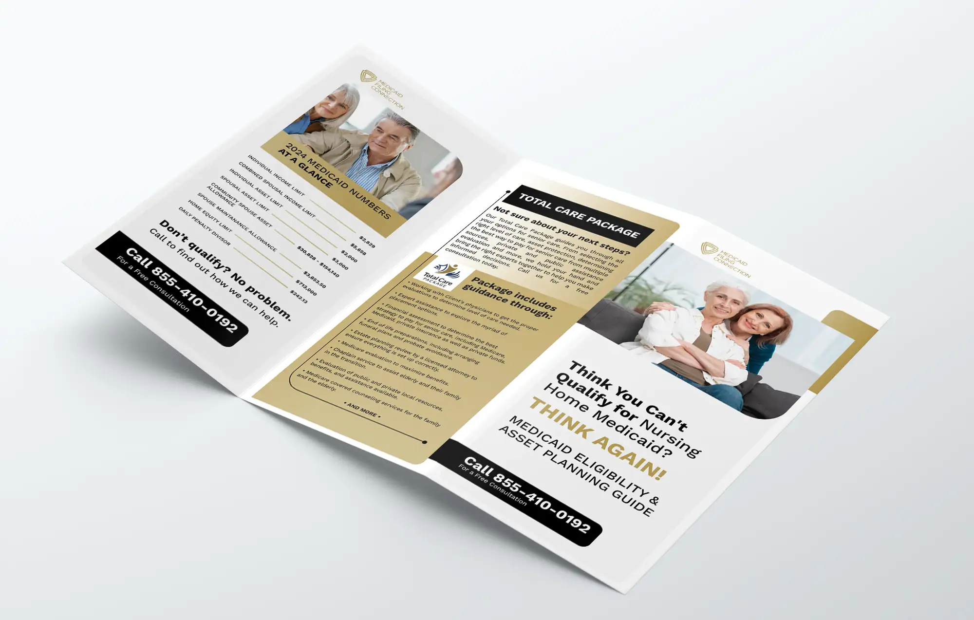
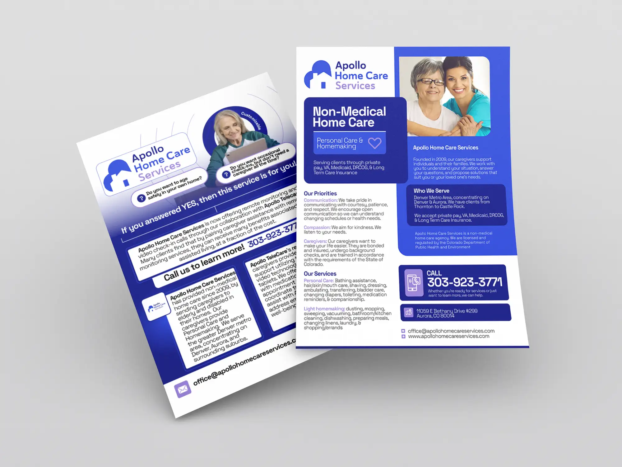
Our third healthcare piece, the trifold in this article's main image, is a Medicaid eligibility and asset planning guide. It shows the same principles in a different tone: a cover question that names the reader's doubt, a figures-at-a-glance panel and the same black call-for-a-free-consultation bar repeated on every panel. FRPROTECH has delivered 3,000+ projects across 30+ countries with a 100% Job Success score on Upwork, and healthcare print is a regular part of that work. See our graphic design services for brochures, flyers and other clinic collateral.
Frequently asked questions
What should be included in a medical clinic brochure?
A cover that names the condition or outcome in plain words, one short panel per treatment or service, clinician photos and credentials, practical details (locations, hours, referral and payment or insurance routes) and one clear booking step, such as a phone number or QR code, repeated on the cover and the back. Leave detailed clinical information to the website and point to it.
What font size should a medical brochure use?
Use at least 12pt for body text, and 14pt where space allows. UK clear-print guidance sets 12pt as the minimum and 14pt as the recommended size, with large print from 16pt. Use a plain sans-serif, dark text on a light background, left-aligned text and short, everyday sentences.
Can a clinic advertise treatments in a brochure?
Yes, with limits. In the UK, prescription-only medicines and treatments can't be advertised to the public under the Human Medicines Regulations 2012 and CAP Code rule 12.12, and that includes displays on clinic premises, so describe the consultation rather than naming the drug. In the US, health claims need scientific support under FTC rules, and state and professional rules add more. Have your compliance lead check the final copy.
Is a trifold or bifold better for a clinic brochure?
A trifold suits clinics with three to six treatments or services because each gets its own panel and it fits standard DL or letter racks. A bifold or single flyer works for one service or a simple offer, such as a home care agency or a single specialist clinic. Pick the format that gives each service a clear panel without cramming the text below 12pt.
Want this done for you?
FRPROTECH is a Top Rated Plus Upwork agency with 3,000+ projects delivered across 30+ countries. Tell us your goals and we'll handle the rest.

Written by Faisal Rizwan, CEO & Founder of FRPROTECH. 8+ years and 3,000+ projects building brands and websites for clients in 30+ countries, with a 100% Job Success Score as a Top Rated Plus freelancer on Upwork.