Pitch Deck Design That Raises Money: A Founder's Guide
A pitch deck has one job: get you the next meeting. Investors skim a deck in under three minutes on average, so design is not decoration, it is how you control what they understand and how fast they understand it. After 8+ years and 3,000+ projects, including pitch decks for funded startups, the pattern is clear: the strongest businesses still lose meetings when the deck buries the story.
This guide covers the slide order investors expect, the design rules that make a deck feel fundable, and the mistakes that quietly kill a raise.
What a pitch deck is actually for
Your deck is not the pitch, you are. The deck exists to do two things: keep a live conversation on track, and survive being forwarded without you in the room. Those are different jobs. A deck that wins on stage is often too sparse to stand alone in an inbox, which is why many founders keep two versions, a lean presentation deck and a self-explanatory send deck built from the same story.
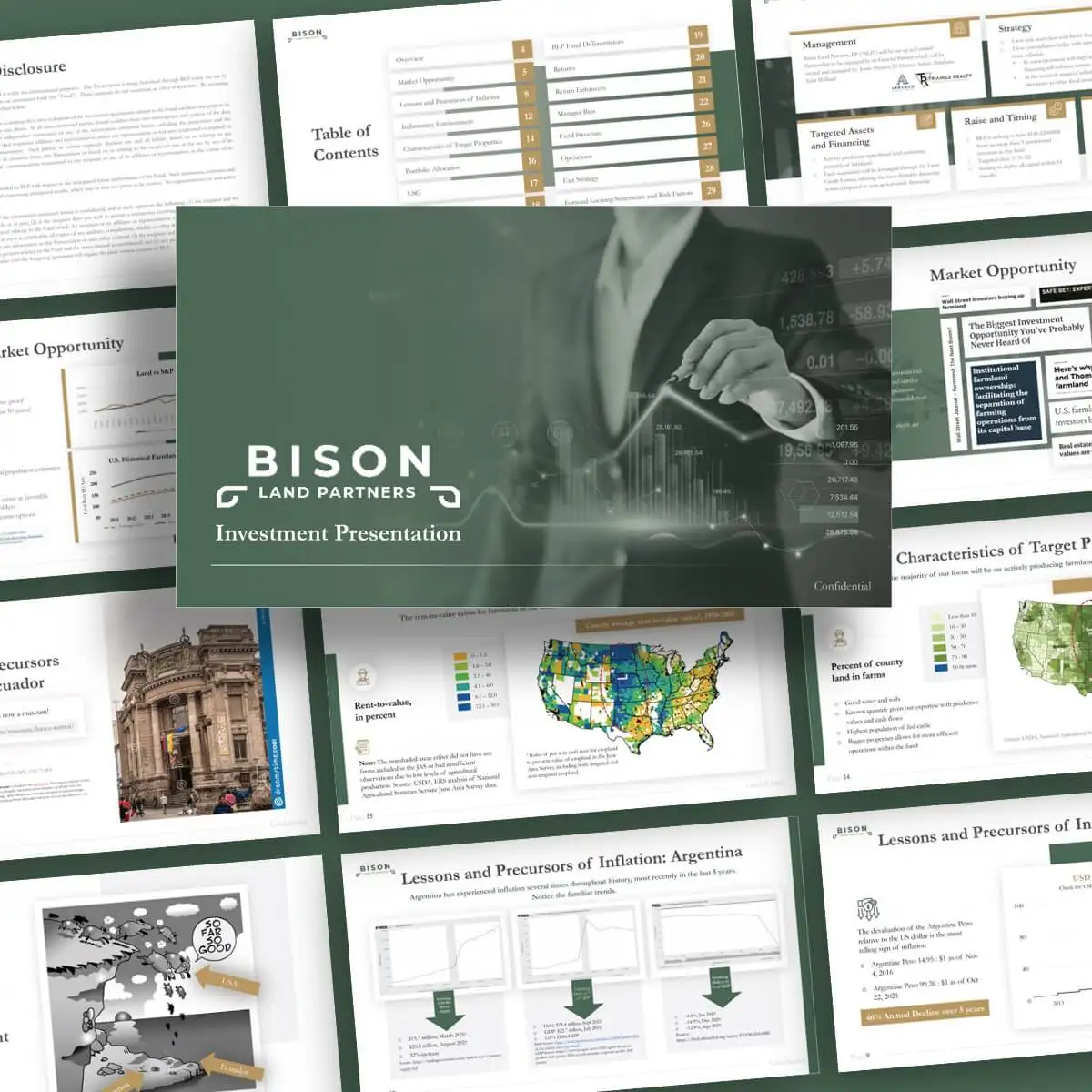
The 11 slides investors expect
Investors read hundreds of decks, so they pattern-match. Give them the slides they expect, in the order they expect, and they spend their attention on your business instead of hunting for basics.
- Cover, company name, one-line description, and your contact, so a forwarded deck is never anonymous.
- Problem, the painful, specific problem you solve, framed from the customer's point of view.
- Solution, what you do and why it actually fixes the problem, in plain language.
- Product, a real screenshot or photo, not a wireframe, so the solution feels built.
- Market size, the realistic, bottom-up opportunity (not just a giant top-down number).
- Business model, how you make money and what a customer is worth over time.
- Traction, the slide investors look at first: revenue, growth, users, or signed pipeline.
- Competition, an honest landscape and your durable edge, not an empty quadrant with you alone in the corner.
- Go-to-market, how you reach customers repeatably and what it costs to acquire them.
- Team, why you specifically are the people to win this, with relevant proof.
- The ask, how much you're raising, what it buys, and the milestones it funds.
Rule of thumb: traction earns the meeting, the ask closes it. If you have traction, move it earlier. If you don't, make the team and market do that work.
Design rules that build trust
A deck signals how you'll operate. Sloppy slides read as a sloppy company, even when the numbers are strong. These rules do most of the heavy lifting:
- One idea per slide, if a slide needs two headlines, it's two slides.
- A headline that's a sentence, write the takeaway as the title ("Revenue tripled in 9 months"), not a label ("Traction").
- Show, don't list, turn dense bullets into one chart, one number, or one image.
- A real type and colour system, two typefaces and a tight palette pulled from your brand identity, used the same way on every slide.
- Generous whitespace, crowding signals panic; space signals confidence.
- Readable from the back row, body text no smaller than 20pt, charts labelled directly.
Presentation deck vs. send deck
| Presentation deck | Send deck | |
|---|---|---|
| Used | Live, with you talking | Forwarded, read alone |
| Text per slide | Minimal, visual-led | Enough to stand on its own |
| Speaker notes | Detailed (for you) | Often folded into the slide |
| Risk if wrong | You over-read your slides | Reader misreads the story |
| Length | 10-12 slides | 12-15 slides |
Mistakes that quietly kill a raise
- Leading with the problem nobody disputes, spend the slide on why it's urgent and underserved, not that it exists.
- Top-down-only market size, "1% of a $50B market" tells investors nothing about your reachable customers.
- Hiding traction, if you have it, it belongs in the first third of the deck, not slide 12.
- The empty competition quadrant, claiming no competitors reads as naive, not first-to-market.
- A vague ask, "raising a round" without an amount, use of funds, or milestones stalls the conversation.
- Design drift, fonts, sizes, and colours that change slide to slide make the whole company feel improvised.
How to build yours
- Write the story first in plain text, one takeaway sentence per slide, before opening any design tool.
- Pull the strongest proof you have (revenue, growth, logos, signed pipeline) to the front.
- Design on your brand system so the deck looks like the same company as your site and ad creatives.
- Cut every slide that doesn't move an investor toward yes, then build the send version with the context you'd say out loud.
If you'd rather have this designed for you, our pitch deck and graphic design service turns your raw numbers and story into an investor-ready deck, and you can check verified results on our Top Rated Plus profile on Upwork.
Frequently asked questions
How many slides should a pitch deck have?
Aim for 10 to 12 slides for a live presentation and up to 15 for a deck you send to read alone. The goal is one clear idea per slide, not a fixed count, so cut anything that doesn't move an investor toward a yes.
What is the most important slide in a pitch deck?
For most early-stage raises it's traction, real revenue, growth, users, or signed pipeline. Investors look at it first, so if you have meaningful traction, move it into the first third of the deck rather than burying it near the end.
Do I need a designer for my pitch deck?
Not always, but design directly affects how credible the business looks in a three-minute skim. If the deck is going to investors, a consistent type and colour system, clear charts, and one idea per slide are worth getting professionally done.
What's the difference between a presentation deck and a send deck?
A presentation deck is sparse and visual because you're talking over it. A send deck has to explain itself when it's forwarded without you, so it carries a little more text and context. Build both from the same underlying story.
Want this done for you?
FRPROTECH is a Top Rated Plus Upwork agency with 3,000+ projects delivered across 30+ countries. Tell us your goals and we'll handle the rest.
Written by the FRPROTECH design team. 8+ years building brands and websites for clients in 30+ countries, with a 100% Job Success Score on Upwork.