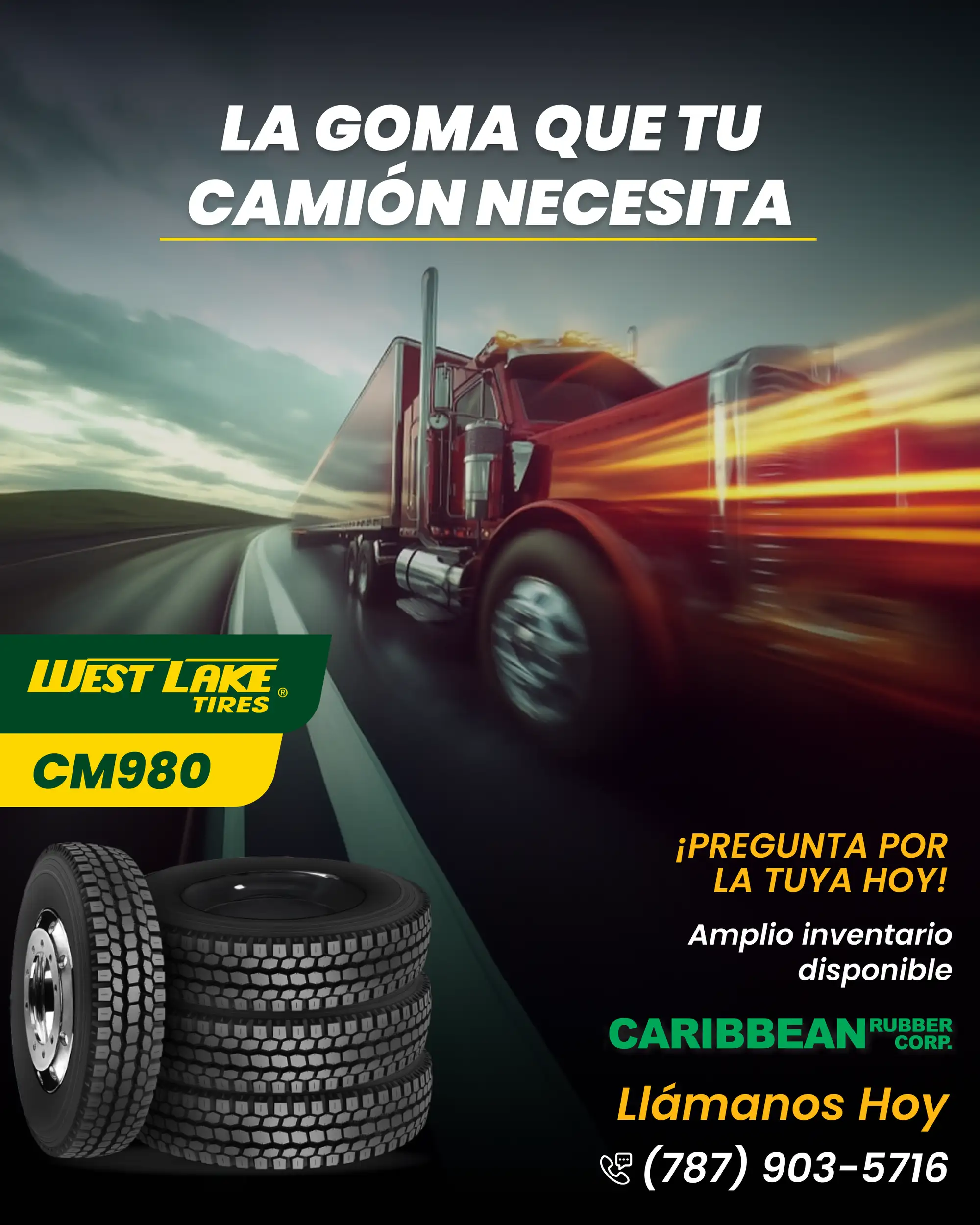
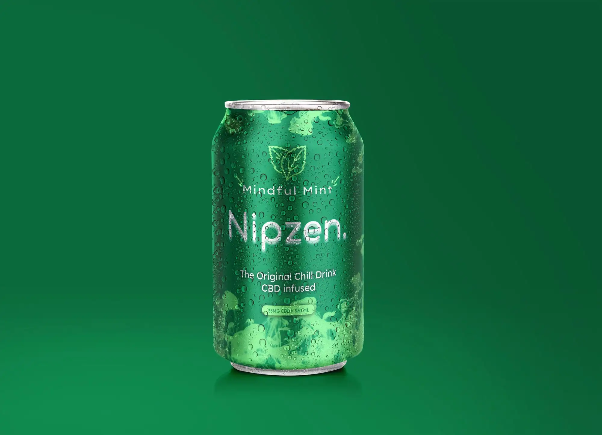
Ad Creatives That Convert: A Practical Guide for 2026
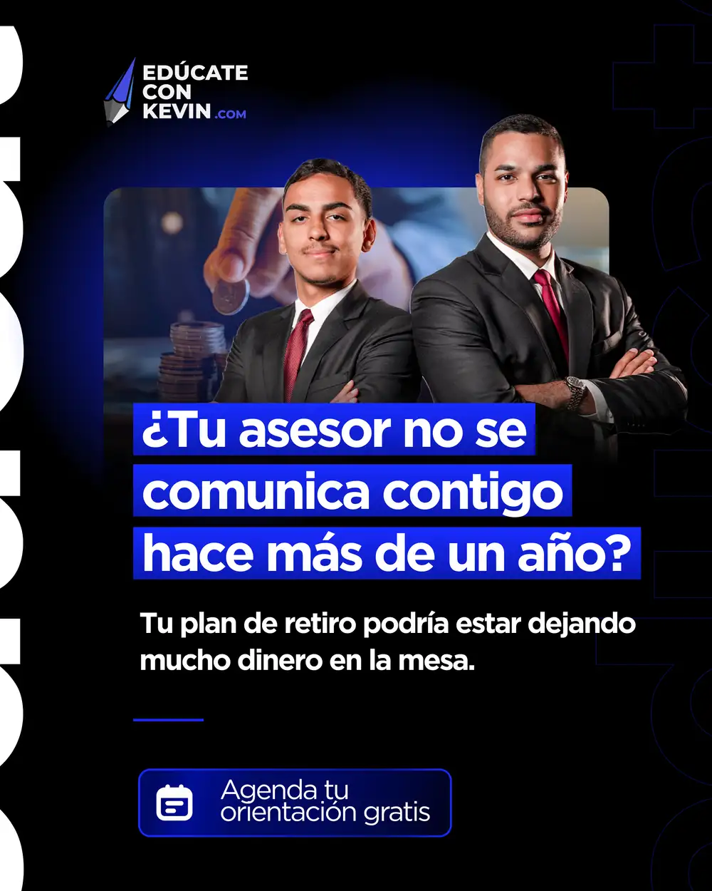
An ad creative converts when it does three things fast: stops the scroll, communicates one clear idea, and makes the next step obvious. Everything else is detail. Most underperforming ads fail because they try to say five things and end up saying nothing, a founder tries to fit the price, the guarantee, three features, and a testimonial into one static image, and the result reads as noise rather than a message.
This is the framework we use when we design graphic design and ad creatives for clients, drawn from thousands of campaigns as a Top Rated Plus agency on Upwork. The same three checks apply whether the format is a static feed image, a story, or the opening frame of a video, only the execution changes.
The anatomy of a converting ad
- One hook: a single, specific message or visual that earns the first second of attention.
- Clear hierarchy: the eye should land on the hook, then the benefit, then the call to action, in that order.
- High contrast: the key message and button must be readable at a glance, even at thumbnail size.
- One call to action: tell people exactly what to do next, once.
- On-brand, not off-brand: consistent with your identity so it builds recognition, not confusion.
Consistency matters more than people think. Ads that match your wider brand compound recognition over time, which is why a strong brand identity makes every ad work harder. The same visual hierarchy principles that guide a good UI layout, biggest, boldest element first, apply just as directly to a static ad or a video's opening frame.
What separates a good hook from a great one
A good hook stops the scroll. A great hook also pre-qualifies the viewer, it makes the right person lean in and the wrong person keep scrolling, which sounds counterintuitive but saves budget: clicks from people who were never going to buy cost the same as clicks from people who were, so a specific hook that speaks to one clear audience usually outperforms a broad one that tries to appeal to everyone.
Common mistakes that kill performance
- Cramming too much copy into the creative instead of letting the landing page do the work.
- A weak or generic hook that could belong to any competitor.
- Low contrast text over busy imagery, so nothing is readable on mobile.
- No clear call to action, or several competing ones.
- Designing for desktop and never checking the mobile preview, where most impressions happen.
Ad formats and where the rules bend
The core anatomy holds everywhere, but the details change by placement, and treating every format the same is a common way creative underperforms.
| Placement | Aspect ratio | What changes |
|---|---|---|
| Feed (image/carousel) | 1:1 or 4:5 | Competes with more surrounding content, so the hook has to be near-instant |
| Story / Reel | 9:16 | Full-screen and often sound-off first; captions and a bold visual hook matter more than audio |
| Display / banner | Varies widely | Tiny canvas, one message and a button is often all it can carry |
| Carousel | 1:1 per card | First card must work alone; later cards can build the story |
Two practical habits follow from this: design story and reel creative to work with the sound off (captions, on-screen text), and keep key text and the logo away from the top and bottom safe zones, where interface elements often sit on top of the content.
How much creative volume you actually need
Ad fatigue is real: the same creative shown to the same audience repeatedly loses performance as people tune it out, usually within one to three weeks depending on budget and audience size. Plan for a steady stream of variations rather than one "hero" ad you hope lasts the whole campaign. Watch frequency (how many times the same person has seen the ad) alongside click-through rate, a falling click-through rate at rising frequency is the clearest early signal that fatigue has set in, before spend is wasted chasing a tired creative.
A practical cadence is two to four hook variations per concept at launch, then a fresh batch every couple of weeks once you see which angle is working. This is also where a strong brand voice pays off, when the copy tone is already defined, producing new variations is faster because you are not reinventing how the brand talks each time.
Pre-launch ad creative checklist
Run every creative through this before it goes live:
- Correct sizes and specs exported for each placement (feed, story, reel, display)
- The hook is readable in under one second, even as a thumbnail
- One clear benefit, not a feature dump
- Strong contrast between text and background
- A single, obvious call to action
- Logo and brand colours applied consistently
- Checked on an actual mobile screen, not just the desktop canvas
- Text kept clear of safe-zone cut-offs on stories and reels
- At least two or three variations of the hook to test
If someone cannot tell what you are offering and what to do next within two seconds of seeing the ad on a phone, it is not ready to launch. This is the single most common reason a well-designed ad still underperforms.
Test, then scale
No one designs the winning ad on the first try. Ship a few variations of the hook, let the data pick the winner, then produce more variations of what works. Creative testing beats creative guessing every time. Where the ad sends people matters just as much as the ad itself, a strong hook that lands on a slow or unclear landing page still leaks conversions, so treat the ad and the page it points to as one system.
Need scroll-stopping ad creatives that stay on-brand? Explore our graphic design service, or see verified results on our Top Rated Plus profile on Upwork. Once you have a hook that consistently earns clicks, protect that investment by making sure the page it points to loads fast and states the same promise immediately, our landing page checklist covers exactly that handoff.
Frequently asked questions
What makes an ad creative convert?
A strong hook that stops the scroll, one clear message and benefit, high contrast so it is readable on mobile, and a single obvious call to action. Consistency with your brand identity helps recognition build over time.
How many ad creative variations should I test?
Start with at least two or three variations of the hook for the same offer. Let performance data choose the winner, then produce more variations of the winning direction rather than starting from scratch, refreshing again once performance starts to fade.
Why do my ads look good but not convert?
Usually the creative is attractive but unclear: too much copy, a weak hook, low contrast on mobile, or a missing or competing call to action. Clarity and a single next step convert better than decoration, and the fastest way to check is to show the ad to someone unfamiliar with the business for two seconds and ask what they understood.
Should ad creatives match my website and brand?
Yes. Ads that match your brand identity and landing page build recognition and trust, and reduce the drop-off between the ad and the page people land on. A mismatch makes people second-guess whether they clicked the right link.
Want this done for you?
FRPROTECH is a Top Rated Plus Upwork agency with 3,000+ projects delivered across 30+ countries. Tell us your goals and we'll handle the rest.
Written by the FRPROTECH design team. 8+ years building brands and websites for clients in 30+ countries, with a 100% Job Success Score on Upwork.