Logo Design for Plumbing Companies: 6 Tests a Logo Has to Pass Before It Goes on the Van
A good plumbing company logo is one a homeowner can read on a passing van, recognise as a plumber's in under a second, and trust enough to call when a pipe has burst. In practice that means a short, legible name in a heavy typeface, one simple trade cue (a drop, a pipe bend or a roofline) rather than a cartoon plumber holding a wrench, a two-colour palette that still works in one colour, and a square icon version for your Google Business Profile, because that tiny square in the map results is where a lot of plumbing jobs are won or lost.
We design logos and brand identities as a Top Rated Plus studio on Upwork, with 8+ years and 3,000+ projects across 30+ countries, including marks for trades and home-service businesses. This guide narrows our broader logo design for construction companies down to plumbing and heating firms, whose logo has to cope with emergency call-outs, crowded map results and licence rules that most other businesses never think about.
Why is a plumbing logo different from other trade logos?
Plumbing is bought in two very different moods, and the logo has to work in both.
- Emergency jobs. A leak, no hot water, a blocked drain. The customer searches on a phone, looks at three businesses in the map results and calls one within a minute or two. Your logo is a small square next to your star rating. It gets about one second to say "real, local plumbing company".
- Planned jobs. A bathroom refit, a boiler or water-heater replacement, a repipe. The customer gets two or three quotes and compares them over days. Here your logo is on the quote, the invoice, the website and the van parked outside a neighbour's house, and it's being read as a sign of how organised you are.
Two more things set plumbing apart. The van is usually the biggest advert the business owns, seen thousands of times a week in its own service area. And the logo rarely appears alone: licence numbers, registration marks and phone numbers sit next to it, sometimes because the law says so. A logo designed without room for those ends up crowded on every van and quote.
What are the 6 tests a plumbing logo has to pass?
These are the checks we run on every plumbing concept before a client sees it. Each one comes from a place the logo will actually be used.
| Test | What it checks | How logos usually fail it |
|---|---|---|
| 1. The van test | Can someone read the name from across the street, on a moving van? | Thin or script lettering, pale blue on white, a long tagline set too small |
| 2. The map-pin test | Is the square icon recognisable at thumbnail size in Google Maps and on social profiles? | A wide wordmark squeezed into a square or circle until the letters blur |
| 3. The one-colour test | Does it work in black only, white on a dark van and embroidered on a polo? | Gradients, glossy water drops, fine detail that disappears in thread |
| 4. The "is this a plumber?" test | Can you tell the trade without reading the tagline? | A generic swoosh, or the opposite: clip-art taps, wrenches and pipes all at once |
| 5. The licence-line test | Is there room for a licence or registration number and phone number without crowding? | A tall, busy mark that leaves no clean space for the details customers and regulators expect |
| 6. The name test | Is the business name still the easiest thing to read? | Letters so stylised (pipes for every stroke) that the name becomes a puzzle |
If a concept fails the van test or the map-pin test, we drop it, however good it looks on a white screen. Those two places are where most potential customers first see a plumbing brand. It's the same logic as a responsive logo design system: one logo, redrawn in a few sizes, so each version is legible where it's used.
Which symbols work for a plumbing company logo?
You need one trade cue, not five. These are the options we see work, from most to least common:
- A water drop. Instantly reads as water, which is also why nearly every plumber uses one. Make it yours by combining it with something else, such as a letter, a roofline or a flame.
- A pipe or pipe bend. Works well when it forms part of a letter (an elbow joint as the corner of an initial) instead of being drawn as a separate object.
- A house or roofline. Signals home services and domestic work. Good if most of your jobs are residential.
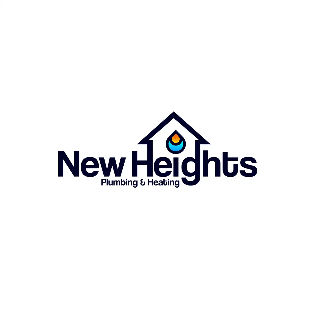
- A flame and drop together. The clearest way to say "plumbing and heating" in one small shape, useful for firms that also fit boilers, furnaces or heat pumps.
- A wrench. Very common and therefore hard to make distinctive. Use it only if it's drawn simply and does something clever, like forming a letter.
- A mascot. A character can be memorable on a van, but it needs proper illustration and a simplified icon version, or it fails tests 2 and 3. It suits a deliberately friendly, local brand, not a firm chasing commercial contracts.
A plumbing company logo is a short, heavy wordmark plus one simple trade cue (a drop, pipe bend, roofline or flame), in two colours that also work in one, delivered with a square icon for Google Maps and social profiles and clear space for the licence or registration number.
What colours and fonts work for plumbing companies?
Blue is the default for plumbing because it reads as water and dependability. That is also the trap: if every plumber in your area uses mid-blue on white, another mid-blue logo disappears in the map results. Before choosing colours, search "plumber near me" in your own town and screenshot the logos that come up. Then pick a palette that is clearly different from the ones your customers will see next to yours.
- Keep blue, add a distinct accent. Navy or deep blue with orange, yellow or red is common for plumbing and heating firms, with the warm colour standing for heat.
- Go darker for a premium feel. Navy, charcoal or black with one bright accent looks more established than a light blue and stands out on white vans.
- Own a different colour. Green suits firms that lead with heat pumps or water-saving work. A strong orange or red can own a market where everyone else is blue. Check it still feels trustworthy.
- Fonts: heavy and simple. Bold sans-serifs read from distance and survive embroidery. Avoid thin weights and handwriting scripts for the name.
- Clear numerals. Your phone number will sit next to the logo on almost everything, so pick a typeface whose numbers are easy to read at a glance.
What has to sit next to the logo on a van, quote or website?
This is where plumbing branding differs most from other small businesses, and it's worth checking with your own licensing body before you order van graphics.
- California, US. Under Business and Professions Code section 7029.5, C-36 plumbing contractors must show their business name, permanent business address and contractor licence number on each side of every commercially registered vehicle, in characters at least 1.5 inches high. Other states and cities have their own rules, so check with your state board.
- UK gas work. Only businesses on the Gas Safe Register may show the Gas Safe logo. Gas Safe’s brand guidance asks registered businesses not to stretch or alter the logo and to use it alongside the trading name that is on the Register, and recommends including the registration number. Under the Digital Markets, Competition and Consumers Act 2024, showing a trust mark you aren't authorised to use is banned outright.
- Trade association badges. Membership logos must be removed if membership lapses, so keep them separate from your own logo.
The design takeaway is simple: never merge an accreditation mark into your own logo, and design the van and quote layouts with a fixed strip for credentials and contact details. That keeps the logo clean and makes the required details easy to update when a number or membership changes.
Should a plumbing company redesign its logo or start again?
If your name already has local recognition, refresh the logo rather than replace it. Keep the name, and usually the main colour, and fix what fails the six tests: thin lettering, a missing icon version, too much detail. Our logo redesign service is built for exactly that, and rebranding services for small businesses covers the bigger change when the name or direction has to move too. Van wraps are a real expense, so roll a new logo out in order: Google Business Profile, website and social profiles first, then quotes and invoices, then each van as it's due for new graphics.
How do we design a plumbing logo?
The short recommendation
Give your plumbing company a short, heavy wordmark with one simple trade cue, a palette that stands out from the other plumbers in your map results, and a logo system with a square icon and a one-colour version. Leave room for your licence or registration number, and never fold an accreditation mark into the logo itself. Once the logo is right, carry it into the rest of your marketing: our guide to social media graphic design for HVAC companies shows how a trade brand turns into seasonal ads, and a brand identity package for small businesses adds the colours, fonts and templates that keep vans, quotes and posts consistent. If you'd like us to design it, see our brand identity service.
Frequently asked questions
What should a plumbing company logo include?
A plumbing logo should include the business name in a heavy, easy-to-read typeface and, optionally, one simple trade cue such as a water drop, pipe bend, roofline or a flame-and-drop for plumbing and heating firms. Keep any descriptor like "Plumbing & Heating" as a separate line that can be dropped on small versions. It should come as a system: a full logo for vans and quotes, a square icon for Google Maps and social profiles, and a one-colour version for embroidery and single-colour printing.
What colours are best for a plumbing logo?
Blue and navy are the most common because they read as water and reliability, often paired with orange, yellow or red for heating. Because so many plumbers use blue, check the logos in your local map results first and choose a palette that looks different from your nearest competitors, for example navy with a bright accent, or a less common colour such as green or orange. Whatever you pick, the logo must still work in one colour on a van, a polo and a printed quote.
Can I put the Gas Safe logo in my plumbing company logo?
No. Keep it separate. Only businesses on the Gas Safe Register may display the Gas Safe logo, and its brand guidance asks businesses not to alter it and to show it alongside the registered trading name, ideally with the registration number. Showing a trust mark you aren't authorised to use is banned under the UK's Digital Markets, Competition and Consumers Act 2024. Place the Gas Safe logo and your number in a separate credentials area on the van, quote and website, so it can be updated without touching your own logo.
What size should my plumbing logo be for Google Business Profile?
Upload a square (1:1) version of your logo. Guides to Google Business Profile commonly recommend 720 × 720 pixels, with 250 × 250 as the minimum, as a JPG or PNG. Use your icon or a stacked version rather than a long horizontal wordmark, because a wide logo shrunk into a square becomes unreadable at the small size shown in Google Maps results.
Want this done for you?
FRPROTECH is a Top Rated Plus Upwork agency with 3,000+ projects delivered across 30+ countries. Tell us your goals and we'll handle the rest.

Written by Faisal Rizwan, CEO & Founder of FRPROTECH. 8+ years and 3,000+ projects building brands and websites for clients in 30+ countries, with a 100% Job Success Score as a Top Rated Plus freelancer on Upwork.