Logo Design for Cleaning Companies: A 2026 Guide to a Mark That Wins Local Trust and Books Jobs
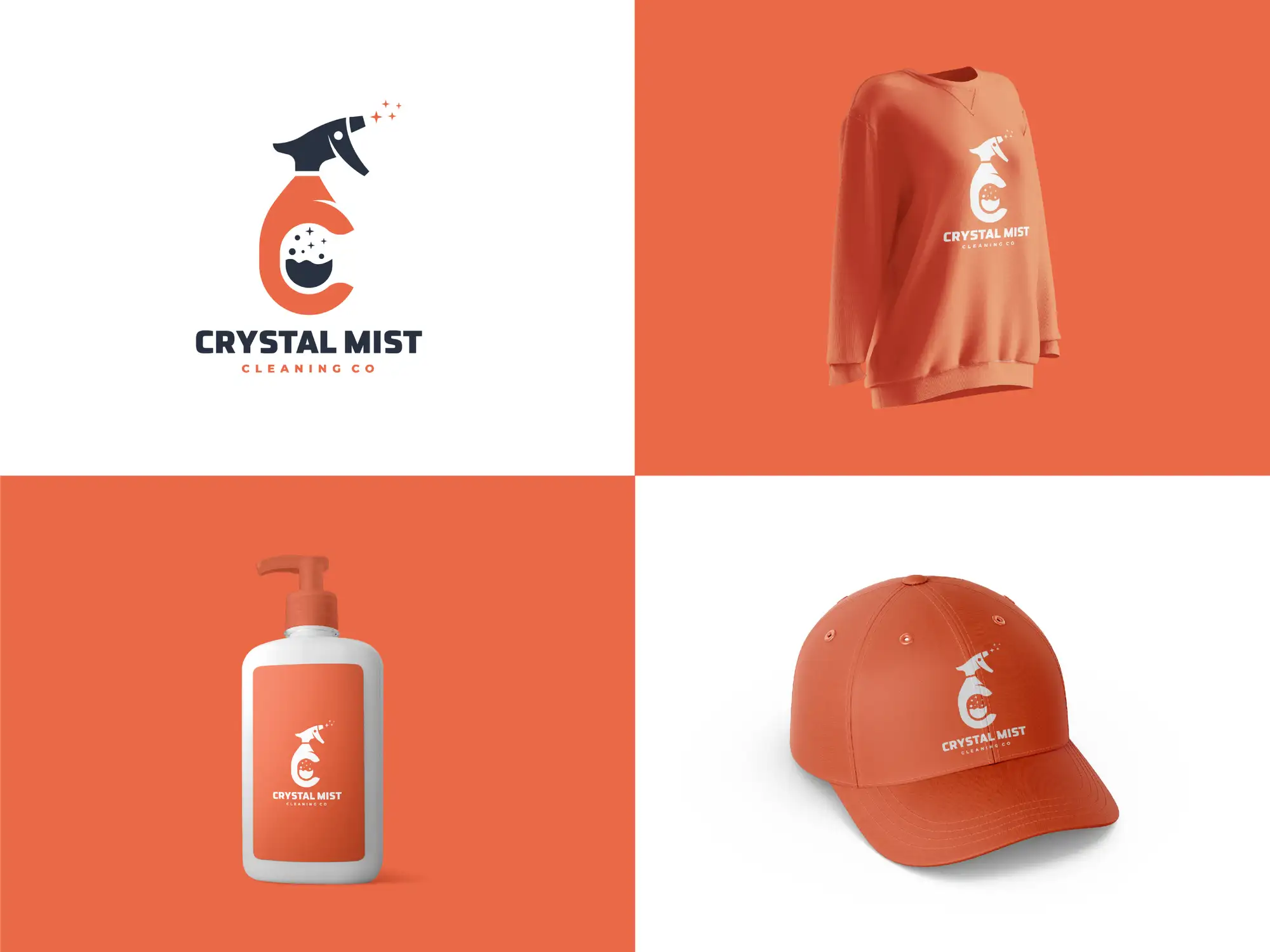
Logo design for cleaning companies is the work of creating a simple, instantly recognisable brand mark — logo, colours and typography — for a residential or commercial cleaning business, built to read as trustworthy, hygienic and professional on the places that actually win cleaning jobs: a van, a uniform polo, a door hanger, a Google Business Profile photo and a phone screen. For a cleaning business, the logo is rarely decoration — it is usually the first proof a stranger has that you are safe to let into their home or trusted to be alone in their office after hours. A clean, confident mark signals "insured, reliable, here to stay"; a clip-art bucket-and-bubbles logo stretched in a word processor signals the opposite, however good the actual cleaning is. The best cleaning logos in 2026 do four jobs at once: they look credible and hygienic at a glance, they read clearly on a van from across a car park, they still work shrunk to a round profile picture on Google or Facebook, and they hold the whole brand together across uniforms, invoices and flyers so the business looks like one established company rather than a person with a mop.
If you run a cleaning company and your current logo was made in a free generator or stretched out of a template, it is quietly costing you jobs every time a homeowner compares three local cleaners and picks the one that looks most professional. We design logos and complete brand identities for service businesses as a Top Rated Plus studio on Upwork — 8+ years, 3,000+ projects across 30+ countries and a 100% Job Success score — so the advice below is what we actually tell cleaning-business owners, not theory. It narrows our broader logo design service for startups and small businesses down to the cleaning niche specifically.
What makes a good cleaning company logo in 2026?
A strong cleaning logo is built for trust and legibility before it is built for cleverness. Because the buying decision is really a safety-and-reliability decision, the logo has to do the reassuring. The traits that matter most:
- It reads as clean and hygienic. Plenty of white space, a crisp sans-serif or a confident wordmark, and a tidy icon do more for a cleaning brand than any amount of detail. The design itself should feel freshly cleaned.
- It works tiny. Your logo spends most of its life as a small round profile photo on Google and Facebook, or a favicon on your booking page. If it is unreadable at the size of a thumbnail, the icon needs simplifying.
- It works big and at distance. A van or a shop shutter shows the logo at three metres to a passing driver. Fine lines and thin text vanish; a bold, simple mark reads instantly.
- It works in one colour. Uniforms are often embroidered, vehicles are sometimes vinyl-cut, and stamps and invoices may be mono. A logo that only survives in full colour is a logo that keeps breaking.
- It carries a clear name. For a local service, the business name is the asset people search and recommend. Legible, confident type usually matters more than a decorative symbol.
A cleaning company logo is the simple, trust-signalling brand mark — icon, wordmark, colours and type — that represents a residential or commercial cleaning business across its van, uniforms, profiles and paperwork, designed to read as professional and hygienic at any size and in a single colour.
What logo styles work best for a cleaning business?
There is no single right look — the best direction depends on who you clean for and how premium you want to feel. Four directions cover most cleaning companies that win work, and the table shows what each signals and who it suits.
| Direction | What it looks like | Signals / best for |
|---|---|---|
| Fresh & friendly | Bright blues, greens or teals, a rounded sans-serif, a simple sparkle, droplet or spray icon | Residential and domestic cleaners who want to feel approachable and trustworthy to homeowners |
| Clean & clinical | White space, a precise sans-serif, a single strong accent, minimal icon | Commercial, medical and office cleaning where hygiene and reliability are the whole pitch |
| Bold & local | A confident wordmark, a strong colour, a simple badge or monogram | Established local firms that want to own a town and look like the obvious, long-standing choice |
| Premium & specialist | Restrained palette, elegant type, a refined monogram, a single accent | High-end residential, luxury, end-of-tenancy or niche cleaning at a premium price point |
Whatever direction fits, resist the urge to pile in every cleaning cliché at once. A bucket, bubbles, a sparkle, a broom, a house and a water droplet in one logo reads as busy and amateur. One clear idea — a sparkle worked into a letter, a tidy droplet, a simple house mark — done well beats five ideas crammed together.
What colours and fonts should a cleaning company logo use?
Colour carries a lot of the trust signalling in this niche. Blues and teals are the most-used cleaning colours for good reason — they read as water, freshness, calm and reliability, which is exactly what a nervous first-time customer wants to feel. Greens signal eco-friendly and natural cleaning, a genuine selling point if you use non-toxic products. White and light neutrals reinforce the sense of cleanliness and space. A single warm accent — orange, yellow or a bright highlight — can make a blue-or-green cleaning brand feel friendlier and stand out in a sea of competitors who all defaulted to the same blue.
On type, favour a clean, legible sans-serif for the business name — it reads instantly on a van and at thumbnail size, and it feels modern and hygienic. Keep the logo to one or two typefaces. The most important test is the one-colour test: if your logo still looks right in solid navy or solid white, it will survive embroidery, vehicle vinyl and a black-and-white invoice. If you are choosing the palette from scratch, do it as part of a complete brand identity package for small businesses so your colours, logo and fonts are decided together rather than one at a time.
Where will your cleaning logo actually be seen — and why it changes the design?
A cleaning logo lives in more places than most small-business logos, and each surface quietly dictates part of the design. Design for where it will really appear, not just for how it looks on a white screen:
- The van or car. Often your single biggest advertising surface — it drives past hundreds of potential customers a day. The logo and phone number must read clearly at distance and at speed, which rewards a bold mark and a short, legible name.
- Uniforms and polos. Usually embroidered, which means fine detail and gradients disappear. You need a simplified one- or two-colour version of the logo that stitches cleanly.
- Your Google Business Profile and social photos. These show as a small round picture, so your icon has to be recognisable cropped to a circle — this is where most of your local discovery happens.
- Door hangers, flyers and quotes. Print needs vector artwork and a mono version, and your logo sits next to your trust signals (insured, DBS-checked, years in business) so it should feel settled and credible.
- Invoices, emails and booking pages. The logo becomes a small header and a favicon, so a clean icon that works at 32px matters more here than any flourish.
This is why the deliverable is never one file. You need horizontal and stacked layouts, a standalone icon for the circle, and full-colour, one-colour and reversed (white) versions, so the brand looks deliberate everywhere instead of stretched and recoloured on the fly.
Residential vs commercial cleaning: should the logo be different?
The underlying principles are the same, but the emotional job shifts. A residential cleaner is asking a homeowner to trust a stranger inside their home, so the brand can lean warmer, friendlier and more personal — approachable colour, a human tone, a mark that feels safe. A commercial or office cleaner is pitching facilities managers and business owners on reliability, consistency and hygiene at scale, so the brand usually reads cleaner, more corporate and more restrained. If you serve both, build one flexible brand with a professional core and let the warmth come from your photography and copy rather than from two different logos — splitting your identity in two just dilutes the recognition you are trying to build. A business that has outgrown a hobby-era look should treat this as a logo redesign or a fuller rebrand for a growing small business, not a quick patch.
What files do you need from your logo designer?
A cleaning logo that looks fine on screen can still fail on a van or a uniform if you were only handed a single low-resolution image. Make sure your designer delivers a proper kit, and that you own the editable source files:
- Vector source files (AI, SVG, PDF) so the logo scales from a 32px favicon to a full van wrap without blurring or pixelating.
- Full-colour, one-colour and reversed (white) versions, so the logo works on a white quote, a coloured polo and a dark van or shutter.
- Horizontal, stacked and icon-only layouts, so it fits a wide van panel, a square flyer and a round profile photo without being squashed.
- High-resolution PNGs with transparent backgrounds for everyday use in documents, social posts and your booking system.
- Your exact colour codes and font names (HEX, RGB and CMYK, plus any Pantone), so sign-writers, embroiderers and printers reproduce the brand consistently every time.
Logo design mistakes that make a cleaning company look cheap
A handful of recurring mistakes separate a cleaning brand that looks established from one that looks like a side hustle. Most are easy to avoid once you know to look for them:
- Free-generator or template logos. Thousands of other cleaners use the same bucket-and-bubbles clip art. A generic mark makes you look interchangeable in exactly the moment a customer is choosing between you and the next firm.
- Too much detail. A logo crammed with a house, a broom, bubbles, a sparkle and tiny text turns into a smudge on a van at distance and a dot on a profile photo. Simplify ruthlessly.
- Thin lines and pale colours. They vanish when embroidered, vinyl-cut or printed small. Design for bold reproduction, not just a crisp screen.
- No one-colour version. If the logo only exists in full colour, it keeps breaking on uniforms, stamps and mono invoices — and gets recreated badly by whoever needs it.
- A stretched or recoloured logo. Squashing one file to fit every space, or changing its colours ad hoc, signals improvisation. A proper file kit removes the temptation.
- An illegible or trendy font. If the business name is hard to read on a passing van, you have lost the one thing a local customer needs to remember and search.
How to brief a designer for your cleaning company logo
The quality of the logo depends as much on the brief as on the designer. Before you start, get clear on a few things so the designer can reach a strong result in fewer rounds:
- Who you clean for. Domestic homeowners, offices and commercial clients, end-of-tenancy, or a speciality like eco or medical — this decides how warm or corporate the brand should feel.
- Your name and any tagline. The exact business name and whether a strapline ("insured & trusted", "eco cleaning") should sit in the lockup.
- Where it will live. Tell the designer up front about vans, embroidered uniforms, door hangers and your Google profile, so the logo is designed for those surfaces from the start.
- Three cleaning brands you rate — and why. Pointing at marks you admire and saying what you like (the colour, the simplicity, the icon) gives the designer a precise target.
- Your must-have files and timeline. Ask for the full kit above, and share any deadline (a van booked in for wrapping, a launch) so the process is paced correctly.
Your logo is the start, not the whole brand. The same colours, type and mark should carry through your van, your uniforms, your flyers and your social media marketing, so a customer who sees your van, then finds you on Google, then gets a quote recognises one consistent, trustworthy business at every step. If you want a sense of budget before you start, our guide to how much a logo design costs for a small business sets realistic expectations. And if you would rather have it done properly the first time, professional logo and brand identity design is exactly the work we do — 3,000+ projects across 30+ countries, with public Upwork reviews to back it up.
Frequently asked questions
How much does a logo for a cleaning company cost?
It varies widely by who makes it. A free online generator or a very cheap marketplace gig costs little but usually produces a generic, template mark with no source files and no one-colour versions — which quietly costs you jobs and is expensive to fix later. A professional logo designed specifically for your cleaning business, delivered as a full file kit with vector files, colour variations and layouts for vans, uniforms and profiles, costs more but is a one-off investment that makes the business look established for years. Prices depend on scope (logo only versus a full brand identity), the designer's experience and your deadline, so treat any single figure with caution and compare what is actually delivered, not just the headline price — our small-business logo cost guide breaks the ranges down in detail.
What colour is best for a cleaning company logo?
Blues and teals are the most popular and the safest starting point, because they read as water, freshness, calm and reliability — exactly the feelings that reassure a first-time customer. Greens work well if you want to signal eco-friendly or non-toxic cleaning. White and light neutrals reinforce a sense of cleanliness and space. Because so many cleaning firms default to the same blue, adding one warm accent colour (an orange or a bright highlight) is a simple way to look friendlier and stand out locally. Whatever you choose, make sure the logo still works in a single solid colour so it survives embroidery, vehicle vinyl and mono printing.
What should a cleaning company logo include?
At minimum it should include your business name in clear, legible type, and usually a simple icon that hints at cleaning without resorting to clip art — a sparkle worked into a letter, a tidy water droplet, a spray or a simple house mark. Keep it to one clear idea and one or two colours. Just as important as the mark itself is the kit it comes in: horizontal and stacked layouts, an icon-only version for round profile photos, and full-colour, one-colour and reversed versions, plus vector source files. That is what lets the same logo look professional on a van, an embroidered polo, a door hanger and a Google Business Profile.
How long does it take to design a cleaning company logo?
For a logo on its own, with a clear brief, expect roughly one to two weeks including revisions. A complete brand identity — logo plus a defined colour palette, fonts, and guidelines for how to use them across your van, uniforms and marketing — usually takes two to four weeks because more pieces have to be designed and made consistent. The biggest delays come from a vague brief or slow feedback, so being clear up front about who you clean for, where the logo will appear and which files you need is the fastest route to a finished brand you can start putting on a van.
Want this done for you?
FRPROTECH is a Top Rated Plus Upwork agency with 3,000+ projects delivered across 30+ countries. Tell us your goals and we'll handle the rest.
Written by the FRPROTECH design team. 8+ years building brands and websites for clients in 30+ countries, with a 100% Job Success Score on Upwork.