Logo Design for Gyms and Fitness Studios: 6 Tests a Logo Has to Pass Before It Goes on the Merch
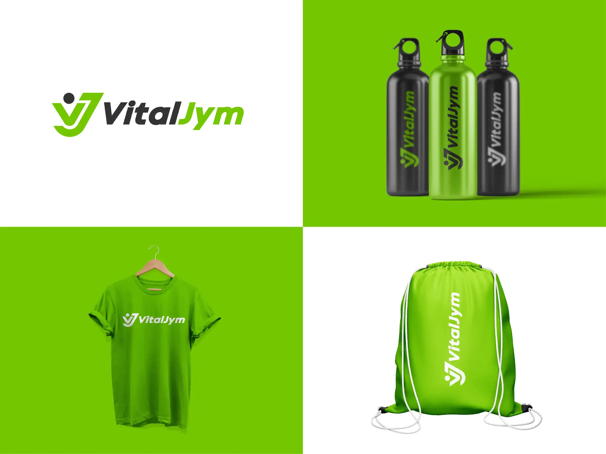
A good gym logo is one your members would happily wear. It reads on a screen-printed T-shirt, a water bottle and a tiny booking-app icon, it tells people what kind of gym you are (a strength gym, a boutique studio, a yoga space) before they read the name, and it doesn't look like the other three neon-green-on-black dumbbell logos in your town. In practice that means a bold, simple wordmark, at most one symbol, two colours that also work in one, and a square icon version from day one.
We design logos and brand identities as a Top Rated Plus studio on Upwork, with 8+ years and 3,000+ projects across 30+ countries, including marks for gyms, coaches and wellness businesses. This guide covers what makes a fitness logo different, the six tests we run before a client sees a concept, which styles suit which kind of gym, and a real gym identity we designed. If you already have a logo and want the feed to match it, our guide to social media graphic design for fitness brands picks up where this one ends.
Why is a gym logo different from other small-business logos?
Most small-business logos are seen. A gym logo is also worn, and that changes the brief.
- It's merchandise. T-shirts, hoodies, shakers, bottles and bags are a revenue line for many gyms and free advertising every time a member wears them outside. A logo that only looks good on a white screen won't sell a single hoodie.
- It lives in apps. Members book classes and check in through an app, so your logo spends most of its life as a small square on a phone home screen or a circle on an Instagram profile.
- It's seen at architectural scale. The same mark goes on the shopfront, a feature wall, floor decals and sometimes the plates and benches. Fine detail that disappears at app size can look clumsy at three metres.
- The category is crowded with clichés. Dumbbells, flexed arms, skulls, lightning bolts and neon green on black are everywhere, so the obvious idea is almost always the one your competitors already use.
What are the 6 tests a gym logo has to pass?
These are the checks we run on every gym and fitness studio concept. Each one comes from a place the logo will actually be used.
| Test | What it checks | How gym logos usually fail it |
|---|---|---|
| 1. The T-shirt test | Does it screen-print in one or two flat colours, white on a dark shirt and dark on a light one? | Gradients, glows, photo textures and thin outlines that fill in or vanish on fabric |
| 2. The app-icon test | Is the icon recognisable in a small square and inside a circular profile crop? | A long wordmark squeezed into a square until the letters blur, or a mark that loses its edges in a circle |
| 3. The wall test | Does it still look intentional painted three metres wide on a feature wall or shopfront? | Clip-art details and thin strokes that look cheap when enlarged |
| 4. The "what kind of gym?" test | Can someone tell strength gym from yoga studio before reading the name? | A generic swoosh that could be a bank, or an aggressive mark on a calm studio |
| 5. The five-year test | Will it still look current after the trend it borrows from has faded? | Skulls, "beast mode" lettering, glitch effects and whatever is trending on fitness TikTok this year |
| 6. The name test | Is the name easy to read, yours to use and still the clearest part of the logo? | Over-stylised lettering, or a name built on someone else's trademark |
The first two tests decide most concepts. If a logo fails the T-shirt or app-icon test we drop it, however good it looks in a presentation, because merch and phones are where members see it most. That's the reasoning behind a responsive logo design system: one logo, redrawn as a full lockup, a compact version and an icon, each legible where it's used.
Which logo style suits which kind of gym?
"Gym" covers very different businesses. The logo should match the experience inside the door, because that's the promise people are buying.
| Type of gym | What members want to feel | Logo direction that tends to fit |
|---|---|---|
| Strength, powerlifting or functional box | Serious, earned, community | Heavy condensed lettering, badge or monogram shapes, one strong accent colour |
| Boutique HIIT, cycle or bootcamp | Energy, momentum, a bit of fun | Italic or forward-leaning type, a bold signature colour, a mark that animates well |
| Yoga, Pilates or barre studio | Calm, balance, care | Lighter weights, generous spacing, softer colours, an abstract or organic symbol |
| Personal trainer or online coach | Expertise, a real person behind it | A clear name-led wordmark, sometimes a monogram, room for a credential line |
| Budget or 24-hour gym | Easy, accessible, always open | Very simple, high-contrast wordmark built for signage and the app |
| Women-only or wellness-led gym | Safe, welcoming, confident | Confident type without hyper-aggressive cues, a palette that isn't the default black and neon |
A gym logo is a bold, simple wordmark plus at most one symbol, in two flat colours that also work in one, delivered with a square icon for apps and profiles. Pick the style from the experience inside the gym, not from what other gyms use, and test it on a T-shirt and a phone before anything else.
Which symbols work for a gym or fitness studio logo?
You need one idea, not a collage. These are the options we see work, from the safest to the riskiest:
- A letter or monogram. The strongest choice for most gyms: short, ownable and easy to put on a plate, a shirt sleeve or an app icon. It also survives a change of programming better than a picture of one kind of equipment.
- An abstract mark that suggests movement. A forward slant, a rising shape or a figure built from simple strokes, like the V-and-J figure above. It says "fitness" without saying "dumbbell".
- One piece of equipment, drawn simply. A kettlebell or a barbell plate can work for a strength-focused coach or gym if it's drawn with a clean silhouette. Our logo for a strength and durability coach puts a solid kettlebell in front of two crossed bars, next to the name in wide orange capitals: one shape, one accent colour, readable at small sizes.
- A badge or crest. Popular with strength gyms and boxes because it looks like team kit. Keep the text inside it minimal, and design a simpler icon for small sizes or it fails the app-icon test.
- A mascot or animal. Memorable on a wall and on merch, but hard to make distinctive (there are a lot of lions, wolves and bulls) and it needs a simplified version for small sizes.
What colours and fonts work for gym logos?
Black with neon green, red or yellow is the default for fitness, which is why it stops being distinctive. Before choosing, search "gym near me" in your own area and screenshot the logos in the map results and on the apps your members use. Then choose a palette that clearly differs from the ones your customers see next to yours.
- One signature colour you can own. It will end up on walls, merch and every social post, so pick one strong colour and use neutrals around it. A single well-chosen accent looks more premium than three bright ones.
- Check it on fabric. Bright colours look different screen-printed on cotton than on a phone, so ask for the logo's colours as Pantone references as well as screen values.
- Fonts: bold, simple and readable at speed. Heavy sans-serifs, condensed or italic, suit high-energy gyms. Lighter, more open type suits studios. Avoid distressed and brush fonts for the name itself; they rarely survive small sizes or embroidery.
- Mind the dark backgrounds. Many gym brands live on black: dark apps, dark interiors, black merch. Make sure there is a reversed (light-on-dark) version that is just as strong as the main one.
Can I use "CrossFit" or another programme's name in my gym logo?
Only if you're licensed to. CrossFit is a trademark, and CrossFit's own affiliate FAQ says affiliation is what gives a gym the legal right to use the CrossFit name for business and promotional purposes; affiliates also need their gym name approved. If a gym later disaffiliates, it loses the right to the name, so everything carrying it (signage, merch, the logo) has to change. Branded programmes and franchised class formats often come with similar licence rules, so check your agreement before a designer puts their name anywhere near yours.
The design takeaway: build your logo around a name you own, and keep any affiliation or programme badge as a separate element on the website, signage and merch. If the relationship changes, you swap the badge, not the brand. If you are moving away from an affiliate name now, that's a rebrand rather than a refresh, and our guide to rebranding services for small businesses covers how to make the change without losing members who knew you by the old name.
Should a gym redesign its logo or start again?
If members already know and wear your current logo, refresh it rather than replace it. Keep the name and usually the main colour, and fix whatever fails the six tests: a missing icon, gradients that won't print, lettering too thin for embroidery. Our logo redesign service is built for that. Roll a new logo out cheapest-first: app, Google Business Profile, website and social profiles, then the next merch order, then signage and walls when they're due.
How do we design a gym logo?
The short recommendation
Give your gym a bold, simple wordmark with at most one symbol, chosen to match the experience inside, in two flat colours that also work in one. Get a square icon and a reversed version from the start, test every concept on a T-shirt and a phone, and keep any affiliation badge separate from your own logo. Then carry the logo into a full system: a brand identity package for small businesses adds the colours, fonts and templates that keep walls, merch and posts consistent. If you'd like us to design it, see our brand identity service.
Frequently asked questions
What makes a good gym logo?
A good gym logo is simple enough to screen-print on a T-shirt in one or two colours, recognisable as a small app icon, and clearly matched to the kind of gym it represents. In practice that means a bold, readable wordmark, at most one symbol (a monogram, an abstract movement mark or one simply drawn piece of equipment), flat colours with no gradients, and a square icon version for apps and social profiles. It should also look different from the other gyms in your area, which usually means avoiding the default dumbbell and neon-on-black.
What colours are best for a fitness logo?
There is no single best colour. High-energy gyms often use one bright accent such as green, orange, red or yellow with black or charcoal, while yoga and Pilates studios usually suit softer, calmer palettes. Because black with neon is so common in fitness, check the logos in your local map results first and pick one signature colour your competitors don't use. Make sure it prints well on fabric and has a light-on-dark version for black merch and dark apps.
Should a gym logo include a dumbbell?
Usually not. Dumbbells are so common in gym logos that they make a brand look like everyone else, and they tie you to free weights if your programming changes. A monogram or an abstract mark that suggests movement is more ownable. If equipment is central to what you do, for example a kettlebell coach or a strength gym, one piece of equipment drawn as a clean, simple silhouette can still work.
What size should a gym logo be for the app and Google Business Profile?
Use a square version of your logo for both. Google recommends 720 × 720 pixels for a Business Profile logo, with 250 × 250 as the minimum, and booking apps and social profiles also crop to squares or circles. Use your icon or a stacked version rather than a long horizontal wordmark, and check it inside a circle too, because a wide logo shrunk into a small square becomes unreadable.
Want this done for you?
FRPROTECH is a Top Rated Plus Upwork agency with 3,000+ projects delivered across 30+ countries. Tell us your goals and we'll handle the rest.

Written by Faisal Rizwan, CEO & Founder of FRPROTECH. 8+ years and 3,000+ projects building brands and websites for clients in 30+ countries, with a 100% Job Success Score as a Top Rated Plus freelancer on Upwork.