Logo Design for Fintech Startups: What Works in 2026
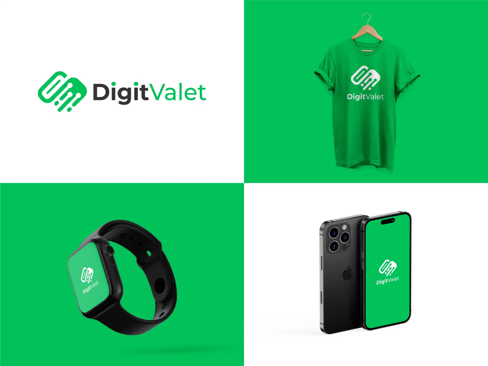
Logo design for fintech startups is the work of building a brand mark that signals trust, security and competence in the split second before a user decides whether to hand over their money or their data. A good fintech logo has to do two jobs at once: look as safe and established as a bank, and feel as modern and effortless as a startup. In practice that means a simple, geometric mark with a clean sans-serif wordmark; a standalone icon that stays legible at app-icon and favicon size; a restrained, deliberate colour palette; and full vector files so the mark holds up on a payments screen, an app store tile, an investor deck and a compliance footer alike. In 2026, the strongest fintech logos are moving away from the generic blue-and-swoosh sameness of the last decade toward distinctive, ownable marks — often with a custom letterform, a warmer palette, or subtle motion — that could only belong to one company. Get the logo right and it quietly does trust-building work every time a nervous first-time user looks at it; get it wrong and it plants doubt at the exact moment you need confidence.
In finance, the logo is not decoration — it is a trust signal on the most sensitive screen your product has. We design logos and full brand identities for startups as a Top Rated Plus studio on Upwork — 8+ years, 3,000+ projects across 30+ countries and a 100% Job Success score — including fintech, payments and wallet products where the mark has to survive a KYC flow, an app icon, and a due-diligence deck without looking cheap. This guide is the working version of what we tell fintech founders: what a fintech logo must achieve, why the category is different from designing a logo for a café or an agency, the styles that fit different fintech products in 2026, the mistakes that erode trust, and how to choose the right designer. It sits alongside our logo design service for startups, narrowed to the fintech niche.
What makes a good fintech startup logo?
A good fintech logo earns trust fast, works everywhere your product touches money, and is distinctive enough to remember. Because a fintech user is deciding whether your product is safe with their savings, the mark carries an emotional load a normal logo doesn't. The traits that matter most:
- Reads as trustworthy and competent — clean, considered and stable, not busy or gimmicky. Users read visual polish as a proxy for how carefully you'll handle their money.
- Legible at app-icon and favicon size — a fintech logo lives as a tiny rounded square on a phone home screen and a 16px browser tab. If the icon turns to mush at 32px, it fails where it's seen most.
- A strong standalone symbol — a mark that works without the wordmark, so it can be the app icon, the loading state, the card face and the notification badge.
- A restrained, deliberate colour palette — one or two confident colours, not a rainbow. Colour choice signals category and personality (more on this below).
- A clean, modern wordmark — usually a geometric or humanist sans-serif, kerned properly, that says 'engineered and current' rather than 'clip-art'.
- Delivered as vectors, in every variation — full-colour, one-colour, reversed-out and mono versions in SVG/EPS, so it holds up on a dark payments screen, a white statement and a printed card.
A fintech logo is a trust signal, not an ornament: its real job is to make a first-time user feel safe enough to enter their card details or connect their bank account. Every design decision — the geometry, the colour, the weight of the type — should be judged against that one question: does this make me trust you with my money?
Why is logo design different for fintech startups?
Fintech logo design is different because the stakes for the viewer are money and personal data, and the emotional starting point is caution, not curiosity. A restaurant logo can be playful and get a smile; a payments logo that looks playful can read as unserious — and 'unserious' is the last thing you want next to a field asking for a bank login. Three pressures make the category its own discipline:
- Trust is the whole game. Users are handing over money and sensitive data, often to a brand they've known for five minutes. The logo has to close that trust gap on sight, before a single word of copy is read.
- It has to feel regulated without being stuffy. Fintech competes with banks on credibility and with startups on experience. The mark has to borrow the stability people associate with established finance while shedding the dated, bureaucratic feel that makes traditional banks look slow.
- It lives in high-stakes, high-scrutiny contexts. The same logo sits on an app icon, a payment-confirmation screen, an investor deck, a partnership page and a security/compliance footer. It's scrutinised by users, investors and partners, and it has to look equally at home in all of them.
This is why fintech founders should think about the logo as part of a system, not a one-off drawing. The colour, type and mark you choose will run through your app UI, your onboarding, your card design and your pitch deck — so it pays to design the logo knowing where it has to travel. If that's the road you're on, our explainer on logo design vs brand identity draws the line between the mark itself and the wider system it anchors, and a brand identity package for small businesses covers what a full system includes.
What fintech logo styles work in 2026?
There's no single 'correct' fintech logo — the right style depends on what your product does and who it's for. A consumer budgeting app and a B2B infrastructure API should not look the same. The table below maps the styles that are working in 2026 to the kind of fintech they suit, so you can pick a direction that fits your product rather than copying whatever competitor you saw last.
| Style | What it looks like | Best for |
|---|---|---|
| Geometric lettermark / monogram | A single letter or two built from clean geometric shapes, tight and iconic | Payments, infrastructure and B2B fintech that need an ownable app icon |
| Minimalist abstract symbol | A simple abstract mark suggesting motion, growth, connection or security | Wallets, investing and neobanks wanting a distinctive standalone icon |
| Clean wordmark with a custom detail | A geometric sans-serif wordmark with one bespoke letterform tweak | Brands whose name is short and strong enough to be the logo itself |
| Warm / humanist mark | Softer curves, a warmer palette, a trace of hand-drawn character | Consumer finance aiming to feel approachable, not intimidating |
| Motion-ready dynamic mark | A simple mark designed to animate on load, payment and confirmation | App-first products that live in onboarding and transaction moments |
Two shifts are worth calling out for 2026. First, the category is finally breaking out of the blue-and-generic-swoosh template: distinctive marks with a genuine point of view — a custom letterform, a proprietary colour, a symbol that actually means something — now read as more credible than the safe-but-forgettable option, because sameness itself has started to look like a red flag. Second, warmth is in: rich neutrals, off-whites with character and considered accent colours beyond the old blue-green spectrum help a fintech feel human rather than machine-made. If colour is where you're stuck, our guide on how to choose brand colours walks through the psychology and the practical testing.
A note on motion
In 2026 a fintech logo increasingly needs to behave, not just sit still. Because so much of a fintech's brand is experienced inside an app — a launch animation, a loading state, a payment-confirmation tick, an onboarding celebration — the strongest marks are designed from the start to animate cleanly. You don't need a moving logo on day one, but choosing a simple, geometric mark that can animate later is a cheap piece of future-proofing.
What should the fintech logo design process include?
A logo you can actually build a fintech brand on is more than a single exported PNG. A proper engagement should deliver a usable, ownable system:
- Discovery — a short brief on what your product does, who it's for, your positioning against banks and rivals, and where the logo has to work (app icon, card, deck, web).
- Concepts with rationale — two or three distinct directions, each explained, not forty random options with no thinking behind them.
- Refinement — a set number of revision rounds on the chosen direction, tested at real sizes including app-icon and favicon.
- The full mark set — primary logo, standalone icon, horizontal and stacked lockups, and one-colour and reversed versions.
- Colour and type — the exact colour values and the typeface(s) that carry from the logo into your app UI and marketing.
- Vector file package — SVG, EPS, PDF and PNG exports, plus the editable source file, so you're never locked out of your own brand.
- Usage guidance — clear space, minimum sizes and misuse rules so the logo stays consistent as your team and product grow.
If you're raising, remember the same mark has to carry your investor materials too — a logo that looks sharp on a deck cover does quiet credibility work in a pitch. That overlap is exactly why we often design the logo and the deck together for founders; our pitch deck design for SaaS founders guide covers the wider deck, and our brand identity service covers the full system.
What are the most common fintech logo mistakes?
Most weak fintech logos fail in predictable ways. Avoid these and you're most of the way to a mark that works:
- Generic blue swoosh syndrome — defaulting to the same blue gradient and abstract arc as a hundred other fintechs. It's safe, forgettable, and in 2026 the sameness itself reads as low-effort.
- Illegible at small sizes — a detailed mark that looks great on a portfolio shot but turns to a smudge as an app icon or favicon, which is where users actually see it.
- No standalone icon — a wordmark-only logo with nothing to use as the app icon, avatar or loading mark, forcing an awkward retrofit later.
- Over-designed and gimmicky — too many effects, gradients or clever tricks that make a money product look unserious and, worse, untrustworthy.
- No vector files — accepting only a PNG or JPG, so the logo can't scale, can't be recoloured, and can't be handed to a developer or printer without pixelation.
- Trend-chasing with no substance — copying whatever's fashionable without a reason it fits your product, which ages badly and says nothing about you.
How do you choose a fintech logo designer or service?
The safest choice is a designer who understands that a fintech logo is a trust and systems problem, not just a nice drawing. When you're comparing options, look for:
- Relevant portfolio — work for fintech, SaaS, app or other trust-sensitive products, shown at real sizes (including the app icon), not just on flattering mock-ups.
- A systems mindset — someone who asks where the logo has to work and designs the icon, colour and type to travel into your UI, not a one-off mark in isolation.
- Clear deliverables in writing — the full vector set, source files, variations and usage guidance named up front, so you own your brand.
- Concepts and revisions defined — how many directions you'll see and how many revision rounds are included, so scope is clear.
- Proof and reviews — verifiable social proof (a Top Rated Plus Upwork profile, case studies, real client outcomes) rather than a stock gallery.
Whether you brief a freelancer, a studio or a specialist marketplace designer, the deciding factor isn't the lowest quote — it's whether the person understands that in fintech, the logo is doing trust work on your most sensitive screens. Brief them on what your product does, who's nervous about using it and why, and where the mark has to appear, and you'll get a logo that earns confidence instead of merely decorating the header. When you're ready, our logo design service for startups and brand identity work is built for exactly this, and you can see the range across our portfolio.
Frequently asked questions
What makes a good fintech startup logo?
A good fintech logo earns trust on sight, works everywhere your product touches money, and is distinctive enough to remember. In practice that means a simple, geometric mark and a clean sans-serif wordmark; a standalone icon that stays legible at app-icon and favicon size; a restrained colour palette; and full vector files in every variation (colour, one-colour and reversed) so it holds up on a payments screen, an app store tile and an investor deck alike. Because a fintech user is deciding whether to trust you with their money, the mark should be judged on one thing above all: does it make a first-time user feel safe?
What colours work best for a fintech logo?
Blue has dominated fintech because it reads as stable and trustworthy, but in 2026 that ubiquity is a liability — a generic blue makes you blend into a hundred competitors. The stronger approach is a restrained, deliberate palette that fits your specific positioning: one or two confident colours rather than a rainbow, chosen for the personality you want (calm and secure, energetic and modern, or warm and approachable). There's a clear move toward warmer neutrals, off-whites with character and considered accent colours beyond the old blue-green spectrum, which help a fintech feel human rather than machine-made. Test any palette at app-icon size and for colour-contrast accessibility before committing.
Does a fintech startup need a full brand identity or just a logo?
Most fintech startups need at least a small system, not just a single mark. Because the logo has to run through your app UI, onboarding, card design, website and pitch deck, a logo designed in isolation often breaks the moment it has to travel. A practical path is to start with a strong logo plus its core colour and type choices, then expand into a fuller brand identity (usage rules, UI colours, typography scale, iconography) as you grow. The key is to design the logo knowing where it has to work, so it anchors a system rather than fighting one later.
How long does it take to design a fintech logo?
A focused fintech logo project typically takes one to three weeks with an experienced freelancer or small studio: a few days for discovery and concepts, then revision rounds on the chosen direction, then finalising the full vector file set and variations. A logo bundled into a wider brand identity — with UI colours, typography and usage guidelines — usually takes three to six weeks. Rushing it is a false economy in fintech, because the mark is doing trust work on your most sensitive screens; it's worth the extra week to get an icon that's legible at app size and a system you won't have to redo after launch.
Want this done for you?
FRPROTECH is a Top Rated Plus Upwork agency with 3,000+ projects delivered across 30+ countries. Tell us your goals and we'll handle the rest.
Written by the FRPROTECH design team. 8+ years building brands and websites for clients in 30+ countries, with a 100% Job Success Score on Upwork.